


I cannot align the content to the center in a mat-form-field of angular material
these are my form-fields:
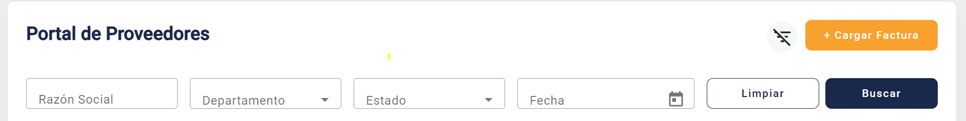
I need them to look like this:
enter image description here
I don’t know which angular material css class to touch/edit or cancel, I’ve done everything I can and I can’t align the content as I need.
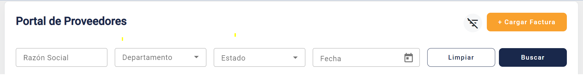
this happens to me when reducing the height of the mat-form-fields
HTML:
<div class="layout">


    <div class="contenedor">


        <div class="contenedorTxt">
            <h4 class="txtClass">Portal de Proveedores</h4>

            <mat-icon (click)="toggleAccordion()">
                {{ isAccordionOpen ? 'filter_list_off' : 'filter_list' }}
            </mat-icon>

            <button mat-button class="btnCargarFactura" routerLink="cargar-factura">+ Cargar Factura</button>

        </div>

        <div class="accordion" [ngClass]="{'open': isAccordionOpen}">

            <form action="" class="formClass">

                <!-- RAZON SOCIAL -->
                <mat-form-field appearance="outline" class="input-razon-social">
                    <!-- <mat-label>Razón Social</mat-label> -->
                    <input matInput placeholder="Razón Social">
                </mat-form-field>


                <!-- DEPARTAMENTO -->
                <mat-form-field appearance="outline" class="input-razon-social">
                    <mat-label>Departamento</mat-label>
                    <mat-select>
                        <mat-option value="opcion1">Opción 1</mat-option>
                        <mat-option value="opcion2">Opción 2</mat-option>
                        <mat-option value="opcion3">Opción 3</mat-option>
                    </mat-select>
                </mat-form-field>


                <!-- ESTADO -->
                <mat-form-field appearance="outline" class="input-razon-social">
                    <mat-label>Estado</mat-label>
                    <mat-select>
                        <mat-option value="opcion1">Opción 1</mat-option>
                        <mat-option value="opcion2">Opción 2</mat-option>
                        <mat-option value="opcion3">Opción 3</mat-option>
                    </mat-select>
                </mat-form-field>


                <!-- FECHA -->
                <mat-form-field appearance="outline" class="input-razon-social">
                    <mat-label>Fecha</mat-label>
                    <input matInput [matDatepicker]="picker">
                    <mat-datepicker-toggle matIconSuffix [for]="picker"></mat-datepicker-toggle>
                    <mat-datepicker #picker></mat-datepicker>
                </mat-form-field>


                <div class="btnsForm">
                    <button mat-button class="btnLimpiar" type="button">Limpiar</button>
                    <button mat-button class="btnBuscar" type="button">Buscar</button>
                </div>


            </form>


            <!-- <div class="contenedorCargarFactura">
                <button mat-button class="btnCargarFactura">+ Cargar Factura</button>
            </div> -->


        </div>


        <!-- TABLA -->
        <components-table style="width: 100%;"></components-table>

    </div>
</div>
SCSS:
@use '../../../proveedores-theme.scss' as v;


// ESPACIADO
.layout {
    display: flex;
    padding: 24px;
    flex-direction: column;
    align-items: center;
    gap: 10px;
    align-self: stretch;
}


.contenedor {
    display: flex;
    padding: 24px;
    flex-direction: column;
    align-items: flex-start;
    gap: 16px;
    align-self: stretch;

    border-radius: 8px;
    background: var(--background-light-paper, #ffffff);
    box-shadow: 0px 12px 24px -4px rgba(145, 158, 171, 0.12), 0px 0px 2px 0px rgba(145, 158, 171, 0.20);


}


.contenedorTxt {
    display: flex;
    justify-content: center;
    align-items: center;
    gap: 10px;
    align-self: stretch;

    // TEXTO
    .txtClass {
        flex: 1 0 0;
        color: var(--CP-Blue-Dark, #19284B);

        font-family: Roboto;
        font-size: 24px;
        font-style: normal;
        font-weight: 700;
        line-height: 36px;
    }


    mat-icon {
        font-size: 28px;

        display: flex;
        width: 40px;
        height: 40px;
        // padding: 8px;
        justify-content: center;
        align-items: center;
        border-radius: 50px;
        background: var(--action-light-hover, rgba(145, 158, 171, 0.08));
    }
}


.accordion {
    display: none;
    padding: 16px 0px 0px;
    flex-direction: column;
    justify-content: flex-end;
    align-items: flex-start;
    align-self: stretch;
    // border-bottom: 1px solid var(--CP-Celeste-Light, #E9F0FF);
}

.mat-mdc-form-field {
    flex-direction: row !important;
}

.input-razon-social {
    height: 40px !important;
}


.formClass {
    display: flex;
    width: 100%;
    // align-items: flex-end;
    // align-items: baseline;
    justify-content: center !important;
    align-items: center !important;
    align-content: center !important;
    gap: 16px;

    .btnsForm {
        display: flex;
        gap: 8px;
    }

}


::ng-deep {
    .mat-mdc-text-field-wrapper.mdc-text-field--outlined .mdc-text-field__input {
        // display: flex !important;
        // justify-content: center !important;
        // align-content: center !important;
        // align-items: center !important;
        // flex-direction: column !important;
        // text-align: center !important;
    }
}

.open {
    display: block;
}

.mat-icon {
    cursor: pointer;
}


// BOTONES

.btnLimpiar {
    width: 146px;
    height: 40px !important;
    padding: 8px 16px;
    justify-content: center;
    align-items: center;
    gap: 8px;
    align-self: stretch;

    border-radius: 8px !important;
    border: 1px solid var(--CP-Blue-Dark, #19284B);
    background: var(--CP-Blanco, #FFFFFF);
    color: #19284B !important;
    // background: var(--grey-400, #C4CDD5) !important;
}


.btnBuscar {
    width: 146px;
    height: 40px !important;
    padding: 8px 16px;
    justify-content: center;
    align-items: center;
    gap: 8px;
    align-self: stretch;

    border-radius: 8px;
    background: var(--CP-Azul, #19284B);
    color: white !important;

}


.contenedorCargarFactura {
    // display: flex;
    width: 100%; //ACA
    align-items: center;
    gap: 16px;
}


.btnCargarFactura {
    height: 40px !important;
    // padding: 12px 16px;
    margin: 0px;
    justify-content: center;
    align-items: center;
    gap: 8px;
    align-self: stretch;

    //
    // height: 28px !important;


    border-radius: 8px;
    background: var(--CP-Orange, #F9A12D);
    color: white !important;


    ::ng-deep {
        .mdc-button__label {
            margin: 16px;
        }
    }
}


// ----RESPONSIVE----

// FORMULARIO RESPONSIVE PANTALLA GRANDE
@media screen and (min-width: 1385px) {

    .formClass {
        display: flex;
        gap: 16px;
        align-items: baseline;
    }

    mat-form-field {
        width: 100%;
    }

}

// FORMULARIO RESPONSIVE PANTALLA CHICA
// @media screen and (max-width: 860px) {

//     .formClass {
//         display: grid;
//         gap: 16px;
//         align-items: center;

//         .btnsForm {
//             display: flex;
//             gap: 8px;
//             flex-direction: column;
//         }

//         .btnLimpiar {
//             // display: flex;
//             width: 155.8px;
//             padding: 8px 16px;
//             justify-content: center;
//             align-items: center;
//             gap: 8px;
//             align-self: stretch;

//             border-radius: 8px !important;
//             border: 1px solid var(--CP-Blue-Dark, #19284B);
//             background: var(--CP-Blanco, #FFFFFF);
//             color: #19284B !important;
//             // background: var(--grey-400, #C4CDD5) !important;
//         }

//         .btnBuscar {
//             // display: flex;
//             width: 155.8px;
//             padding: 8px 16px;
//             justify-content: center;
//             align-items: center;
//             gap: 8px;
//             align-self: stretch;

//             border-radius: 8px;
//             background: var(--CP-Azul, #19284B);
//             color: white !important;

//         }
//     }


//     // .open {
//     //     display: block;
//     // }

//     // .mat-icon {
//     //     cursor: pointer;
//     // }


//     .contenedorCargarFactura {
//         display: flex;
//         width: auto;
//         margin-top: 8px;

//         .mat-button {
//             width: auto !important;
//         }
//     }

//     .btnCargarFactura {
//         width: auto !important;
//     }


// }
EXAMPLE IN NETLIFY:
https://6537af4e13745f22f72d635a–aquamarine-faloodeh-25b1cb.netlify.app/
give me or explain to me what kind of angular material to touch
2
Answers
You can apply the
text-centerclass to themat-form-fieldelement.Then in your SCSS you can define the
text-centerclass to center the contentI did these to get the items centered:
and