skip to Main Content

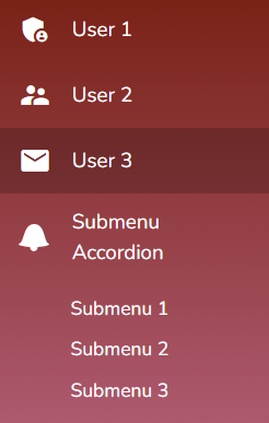
I am using Angular Material 14 with Angular 15 and below is the code to display Menu items with mat-nav-list

<mat-nav-list role="list">
    <a mat-list-item role="listitem" class="list-item-setting" matTooltipPosition="right" routerLinkActive="active"
    [routerLinkActiveOptions]="{exact:true}" class="admin-link">
    <mat-icon class="list-item-setting">user1</mat-icon>
    <span>User 1</span>
    </a>

    <a mat-list-item role="listitem" class="list-item-setting" matTooltipPosition="right" routerLinkActive="active"
    [routerLinkActiveOptions]="{exact:true}" class="admin-link">
    <mat-icon class="list-item-setting">user2</mat-icon>
    <span class="nowrap">User 2</span>
    </a>

    <a mat-list-item role="listitem" class="list-item-setting" matTooltipPosition="right" routerLinkActive="active"
    [routerLinkActiveOptions]="{exact:true}" class="admin-link">
    <mat-icon class="list-item-setting">user3</mat-icon>
    <span class="nowrap">User 3</span>
    </a>
    <mat-accordion>
    <mat-expansion-panel hideToggle [(expanded)]="panelOpenState" class="mat-elevation-z0">
      <mat-expansion-panel-header>
        <mat-panel-title style="text-align: left">
          <img src="../../../../assets/images/icon_bell.svg">
          <span class="add-padding-to-mat-panel-header"><a class="list-item-setting" routerLinkActive="active">Submenu
              Accordion</a></span>
        </mat-panel-title>
      </mat-expansion-panel-header>
      <div>
        <mat-panel-description mat-list-item role="listitem" id="notificationListId"
          class="mat-panel-description-setting"><a class="list-item-setting" routerLinkActive="active"
            [routerLinkActiveOptions]="{exact:true}">Submenu 1
          </a></mat-panel-description>
        <mat-panel-description mat-list-item role="listitem" id="subscriberGroupsId"
          class="mat-panel-description-setting"><a class="list-item-setting" routerLinkActive="active"
            [routerLinkActiveOptions]="{exact:true}" style="white-space: nowrap;">Submenu 2</a></mat-panel-description>
        <mat-panel-description mat-list-item role="listitem" id="allSubscribersId"
          class="mat-panel-description-setting"><a class="list-item-setting" routerLinkActive="active">Submenu
            3</a></mat-panel-description>
      </div>
    </mat-expansion-panel>
    </mat-accordion>
</mat-nav-list>

And below is the Menu list that appears with this code..

Shadow Band

The CSS Code related to the Menu is below…

.mat-panel-description-setting {
    color: $white;
    padding-top: 10px;
    padding-left: 30px;
    flex-basis: 100%;
}

.mat-expansion-panel-header {
    padding: 0 16px !important;
}
  
.list-item-setting {
    padding: 0!important;
    padding-left: 16px;
    color: $white;
}

.add-padding-to-mat-panel-header {
    color: $white;
    padding-left: 16px;
}

How can I make the same effect for the Submenu Accordion Description items on selection of any one of the Submenu items in the list. I mean to say, if user selects Submenu 2, then it should highlight with Band(Shadow effect) that I have shown in the picture for that Submenu 2 item.

I tried using <mat-nav-list></mat-nav-list> for the Accordion Submenu items and it is not accepting there..

EDIT

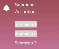
With the code given in the Answer, I am getting as below screenshot. I have changed your code little bit like – using @HostListener instead of document.addEventListener. The grey background is not going away on click of 2nd Submenu item. And the width is covering only to that text.

Submenu Accordion

Can anyone throw some light on this..

2

Answers


  1. You need to add some JavaScript. The logic is as follows:

    • If any mat-list-item element is clicked, highlight the clicked mat-list-item element, but set the background-color to transparent to all other mat-list-item elements and all submenus.
    • If any submenu is clicked, highlight the clicked submenu, but set the background-color to transparent to all other submenus and all mat-list-item elements.

    See the comments in the code below.

    list-overview-example.ts

    import { Component } from '@angular/core';
    
    /**
     * @title Basic list
     */
    @Component({
      selector: 'list-overview-example',
      templateUrl: 'list-overview-example.html',
    })
    export class ListOverviewExample {}
    
    // Wait for the DOM to be fully loaded
    document.addEventListener('DOMContentLoaded', () => {
      // Select all elements with class '.mat-panel-description-setting'
      const submenues = document.querySelectorAll('.mat-panel-description-setting');
      // Select all elements with class '.mat-list-item'
      const listItems = document.querySelectorAll('.mat-list-item');
    
      // Function to reset the background color of all elements
      function resetBackgroundColors() {
        // Reset the background color of '.mat-panel-description-setting' elements
        submenues.forEach((submenu) => {
          const submenuElement = submenu as HTMLElement;
          submenuElement.style.backgroundColor = 'transparent';
        });
    
        // Reset the background color of '.mat-list-item' elements
        listItems.forEach((listItem) => {
          const listItemElement = listItem as HTMLElement;
          listItemElement.style.backgroundColor = 'transparent';
        });
      }
    
      // Add click event listeners to '.mat-panel-description-setting' elements
      submenues.forEach((submenu) => {
        const submenuElement = submenu as HTMLElement;
    
        submenuElement.addEventListener('click', () => {
          resetBackgroundColors(); // Reset all background colors
          submenuElement.style.backgroundColor = 'lightgrey'; // Highlight the clicked submenu
        });
      });
    
      // Add click event listeners to '.mat-list-item' elements
      listItems.forEach((listItem) => {
        const listItemElement = listItem as HTMLElement;
    
        listItemElement.addEventListener('click', () => {
          resetBackgroundColors(); // Reset all background colors
          listItemElement.style.backgroundColor = 'lightgrey'; // Highlight the clicked mat-list-item
        });
      });
    });
    
    /**  Copyright 2023 Google LLC. All Rights Reserved.
        Use of this source code is governed by an MIT-style license that
        can be found in the LICENSE file at https://angular.io/license */
    

    list-overview-example.html

    <mat-nav-list>
      <a
        mat-list-item
        role="listitem"
        class="list-item-setting"
        id="emailTemplatesId"
        matTooltipPosition="right"
        routerLinkActive="active"
      >
        <mat-icon class="list-item-setting">email</mat-icon>
        <span class="nowrap add-padding">User 1</span>
      </a>
      <a
        mat-list-item
        role="listitem"
        class="list-item-setting"
        id="emailTemplatesId"
        matTooltipPosition="right"
        routerLinkActive="active"
      >
        <mat-icon class="list-item-setting">email</mat-icon>
        <span class="nowrap add-padding">User 2</span>
      </a>
      <a
        mat-list-item
        role="listitem"
        class="list-item-setting"
        id="emailTemplatesId"
        matTooltipPosition="right"
        routerLinkActive="active"
      >
        <mat-icon class="list-item-setting">email</mat-icon>
        <span class="nowrap add-padding">User 3</span>
      </a>
      <a>
        <mat-accordion>
          <mat-expansion-panel hideToggle>
            <mat-expansion-panel-header>
              <mat-panel-title style="text-align: left">
                <mat-icon class="list-item-setting">email</mat-icon>
                <span class="list-item-setting add-padding">Submenu accordion</span>
              </mat-panel-title>
            </mat-expansion-panel-header>
            <div>
              <mat-panel-description class="mat-panel-description-setting"
                ><a class="list-item-setting add-padding" routerLinkActive="active"
                  >Submenu 1</a
                ></mat-panel-description
              >
              <mat-panel-description class="mat-panel-description-setting"
                ><a class="list-item-setting add-padding" routerLinkActive="active"
                  >Submenu 2</a
                ></mat-panel-description
              >
              <mat-panel-description class="mat-panel-description-setting"
                ><a class="list-item-setting add-padding" routerLinkActive="active"
                  >Submenu 3</a
                ></mat-panel-description
              >
            </div>
          </mat-expansion-panel>
        </mat-accordion>
      </a>
    </mat-nav-list>
    
    <!-- Copyright 2023 Google LLC. All Rights Reserved.
        Use of this source code is governed by an MIT-style license that
        can be found in the LICENSE file at https://angular.io/license -->
    

    styles.scss

    .mat-expansion-panel-header {
      padding: 0 16px !important;
    }
    
    table {
      border-collapse: collapse;
    }
    
    .add-padding {
      padding-left: 16px;
    }
    

    Output:

    Screenshot

    See the live demo.

    Login or Signup to reply.
  2. Posting a more "Angular" approach to this problem as the current solution offered, while it certainly solves the problem, it does leverage what I would consider to be Angular anti patterns.

    Leverage @ViewChildren to retrieve ElementRef from the DOM via the MatListItem class.

    @ViewChildren(MatListItem, { read: ElementRef }) listItems!: QueryList<ElementRef>;
    

    Import Renderer2 for styling of the elements.

    Using Renderer2 ensures vended compilations are compliant with regard to specified targets.

    constructor(private renderer: Renderer2) {}
    

    Function to hanleSelectionState.

    // Function to reset the background color of all elements
    public handleSelectionState(e: any) {
      // loop over all elements to remove any is-active attributes
      this.listItems.forEach((listItem) => {
        this.renderer.removeAttribute(listItem.nativeElement, 'is-active', '');
      });
      // use target on click event to set attribute is-active 
      this.renderer.setAttribute(e.currentTarget, 'is-active', '');
    }
    

    Add CSS to styles.scss for the is-active attribute

    [is-active] {
      background-color: lightgray;
    }
    

    In the HTML bind the click event to the hanleSelectionState function

    <mat-list-item (click)="handleSelectionState($event)">
      <mat-icon class="list-item-setting">email</mat-icon>
      <span class="add-padding">User 1</span>
    </mat-list-item>
    

    STACKBLITZ

    https://stackblitz.com/edit/stackblitz-starters-sidenav-xrwfts?file=src%2Fapp%2Flist-overview-example.ts

    Login or Signup to reply.
Please signup or login to give your own answer.
Back To Top
Search