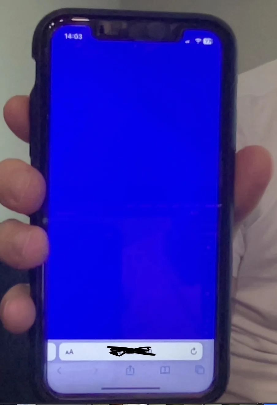
I’m trying to have a background-image cover the entire viewport for mobile devices for my React project.
- model: iPhone 11
- os: 16.5.1
I’ve noticed 2 issues:
1)
When I set the background-color of a <body> tag => it covers the entire screen
@media screen and (max-width: 450px) {
  body {
    background-color: blue;
    background-size: cover;
    -webkit-background-size: cover;
    -moz-background-size: cover;
    -o-background-size: cover;
    height: 100%;
    overflow: hidden;

  }
}
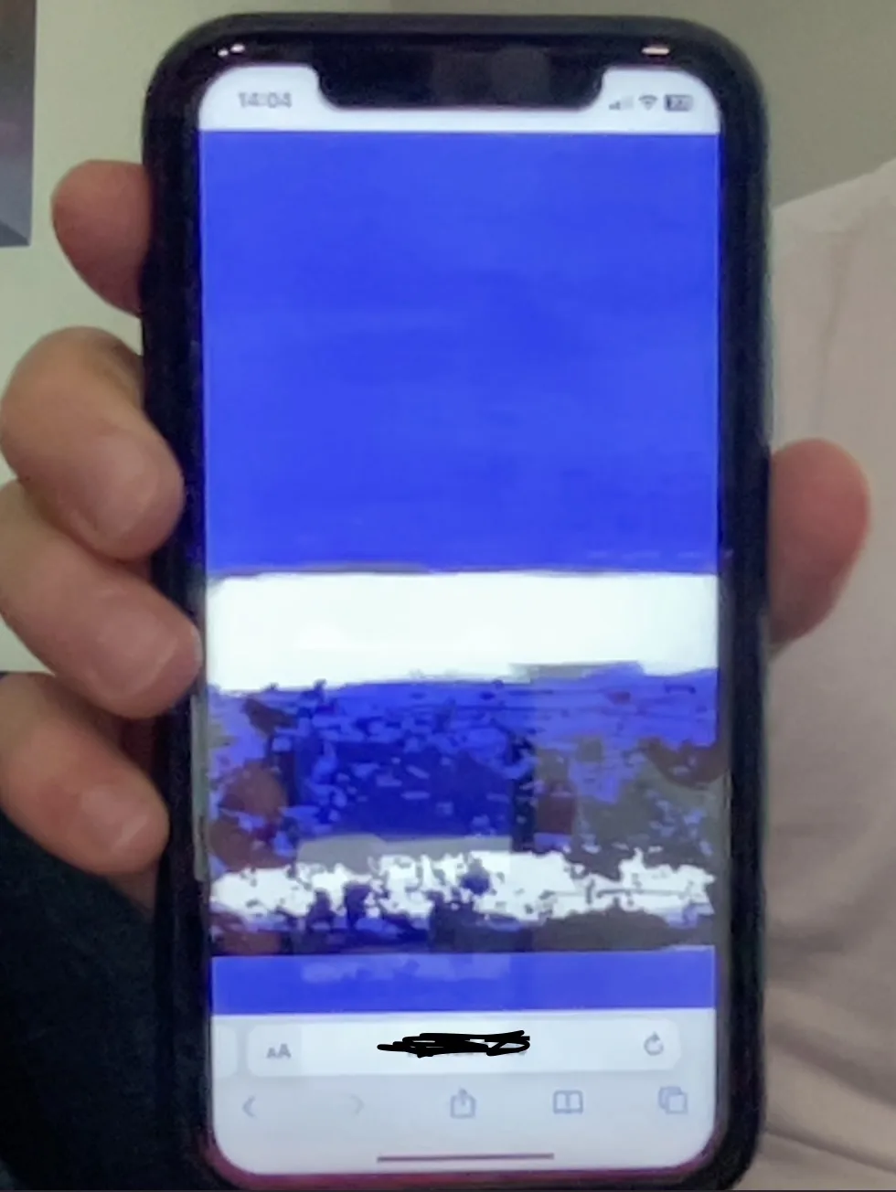
BUT, when I use a background-image to set the background it does not
@media screen and (max-width: 450px) {
  body {
    background-color: blue;
    background-size: cover;
    -webkit-background-size: cover;
    -moz-background-size: cover;
    -o-background-size: cover;
    height: 100%;
    overflow: hidden;

  }
}
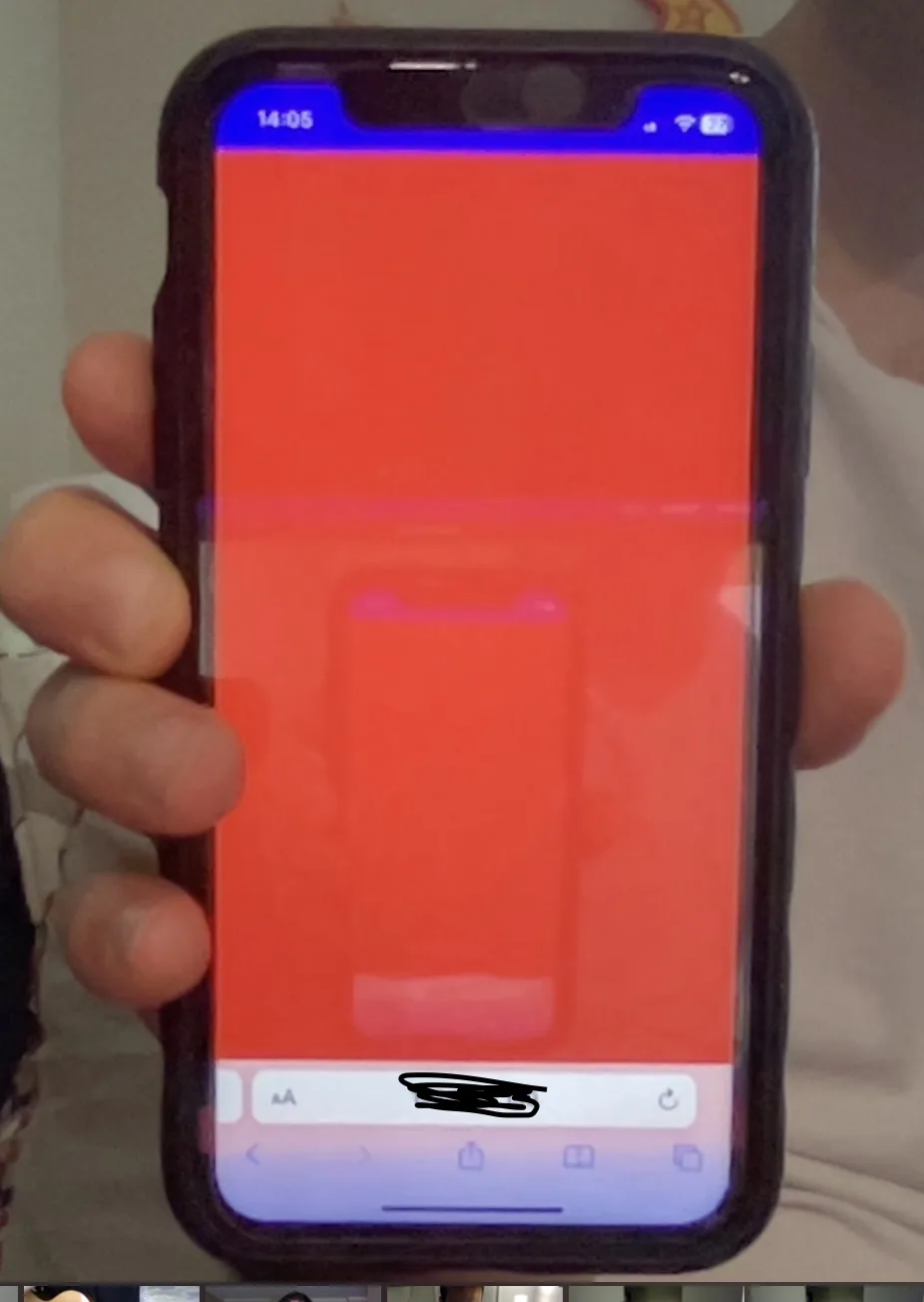
When I try to set any background property, for any sort of child element of the <body> tag to cover the entire screen => it doesn’t work
background-color
@media screen and (max-width: 450px) {
  body {
    background-color: blue;
  }
}

#app {
  background-color: red;
  height: 100vh;
  width: 100vw;
  -webkit-background-size: cover;
  -moz-background-size: cover;
  -o-background-size: cover;
  background-size: cover;
  overflow: hidden;
}
–background-image
I’ve re-adjusted my css rules many times according to some sources I’ve found:
=>
@media screen and (max-width: 450px) {
  body {
    background-attachment: scroll;
    background-image: url("image url");
    -webkit-background-size: cover;
    -moz-background-size: cover;
    -o-background-size: cover;
    background-size: cover;
    height: 100%;
    overflow: hidden;
  }
}
… same issue
=>
@media screen and (max-width: 450px) {
  body {
    background-image: url("https://res.cloudinary.com/ducqdbpaw/image/upload/v1685200227/FABIO/2017/Sanzogni_Significance_14_36_x_48_silver_leaf_oil_on_canvas_mouygv.jpg") no-repeat center center fixed;
    -webkit-background-size: cover;
    -moz-background-size: cover;
    -o-background-size: cover;
    background-size: cover;
    height: 100%;
    overflow: hidden;
  }
}
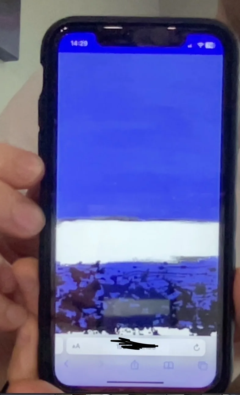
..shows no image
Ultimately, I want this image to cover the entire background. Either through the <body> tag or the <App/> tag for my React project. Any ideas?
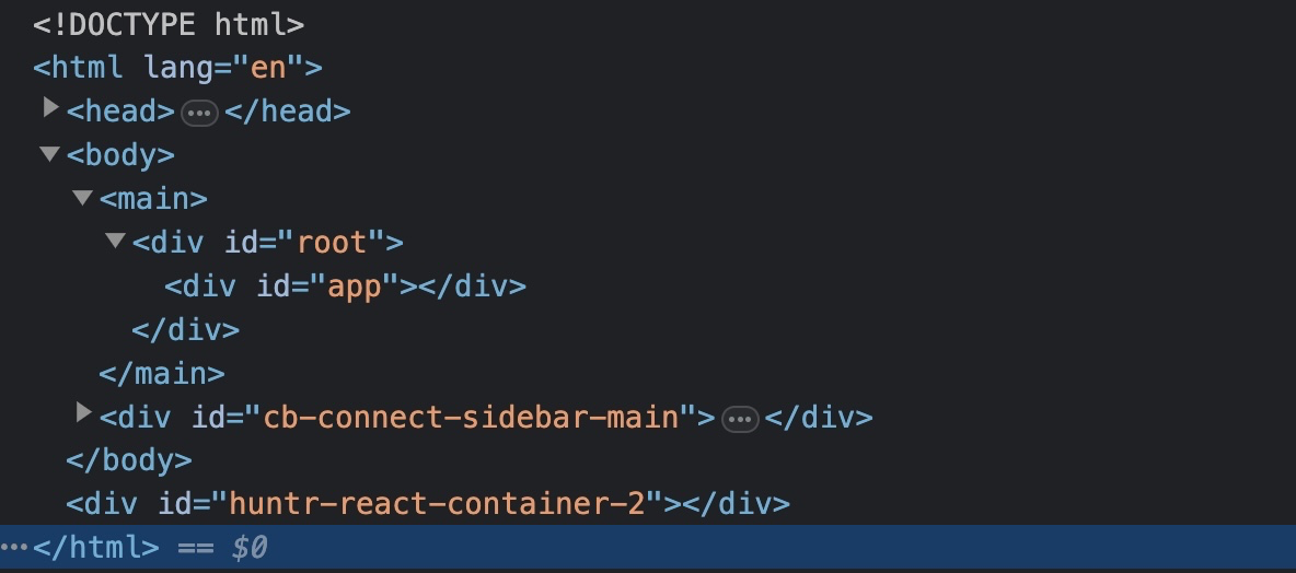
the html of my app


2
Answers
The solution is simple. Just use
backgroundinstead ofbackground-imagelike this:In a background property you can add background-color , repeat , no-repeat and other image attributes, but in the background-image property you are only allowed to add image nothing else.
dear.
To have a background image cover the entire viewport for mobile devices in your React project, you can try the following approach:
Set the background image on the tag:
css:
body {
background-image: url("your-image-url");
background-size: cover;
background-repeat: no-repeat;
background-position: center center;
}
Make sure the and elements have 100% height:
css:
html, body {
height: 100%;
}
Set the component to cover the entire viewport:
import React from ‘react’;
const App = () => {
return (
{/* Your app content */}
);
};
export default App;
css:
.app {
height: 100vh;
}
By combining these steps, the background image should cover the entire viewport on mobile devices. Make sure to replace
"your-image-url"with the actual URL of your image.If you’re still experiencing issues, it’s possible that there might be conflicting CSS rules or other factors affecting the layout. In that case, it would be helpful to see the HTML structure and any additional CSS styles applied to identify the underlying problem.
Hope this would help you.