skip to Main Content

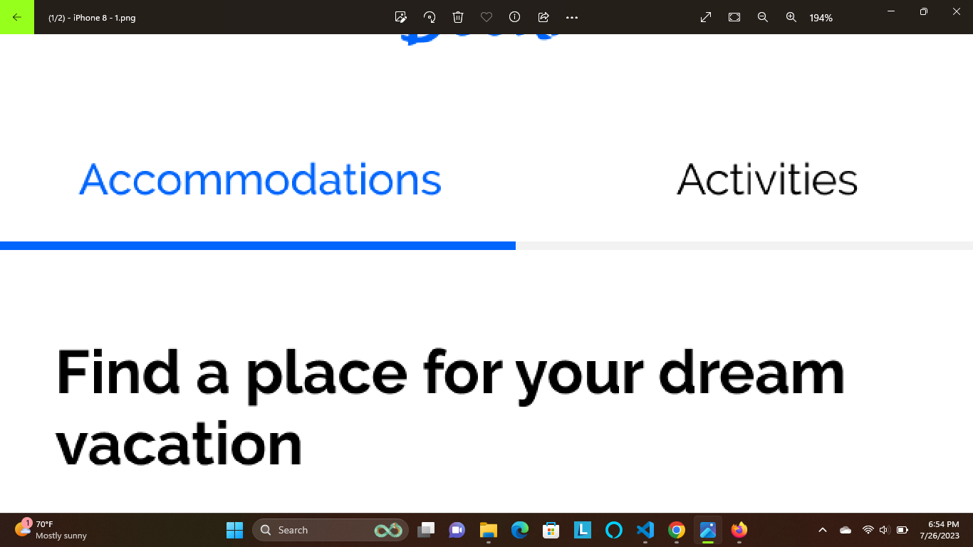
I have two links in a nav bar that need to sit perfectly centered and 50/50 on the page. That part I struggled with but finally got them to sit right. I needed a grey bottom border to span the entire page and when you hover the grey under the links needed to turn blue. Here’s an example:

example

Here’s what i have for the html:

    <div class="topnav">
        <a class="accommodations" href="#accommodations">Accommodations</a>
        <a class="activities" href="#activities"> Activities </a>
    </div>

Here’s what I have for the mobile css:

.topnav {
    padding-top: 17px;
    border-bottom: solid 3px #808080;
    text-align: center;
    display: flex;
    border-top: none;
    padding-bottom: 10px;
}

.topnav a {
    width: 50%;
    padding-top: 17px;
    border-top: none;
}

.topnav a:hover {
    padding-top: 17px;
    border-top: none;
    border-bottom: solid 3px #0065fc;
    padding-bottom: 10px;
}

When I add the hover affect it does have the blue bar however, instead of covering the grey it appears on top and seems to push the grey bar down. On the desktop dimensions the hover has to appear at the top with a space between the words and the bar which is why I have the padding on the top. Without it the words move when you hover over them.

I’ve tried adjusting/adding/removing the padding on the bottom, adding a border bottom to the individual elements rather than the whole, and even played with negative margins just to see if by some miracle it made this problem go away. It does sort of work with adding a border bottom to the individual elements but the border doesn’t span the entire page and instead stops just after activities with this weird gap on the right.

I would also like to add that I have maybe a months worth of experience with coding, and by experience i mean trial by fire and no direct teacher so everything I know is from various books, googling, and free coding camps. I am probably doing something very obviously wrong and I apologize but any help would be greatly appreciated because I can tell you begging it to work hasn’t helped yet.

–update–
okay so i found that if i remove the border from the .topnav and instead put it on the individual the hover works the way I want it to however i’m still running into the issue of the border not spanning the entire page and instead having the weird space on the right side after activities.

2

Answers


  1. You could do something like this.
    For your css style

      .nav-container {
        border-bottom: solid 3px #808080;
        width: 100%;
      }
    
      .topnav {
        padding-top: 17px;
        text-align: center;
        display: flex;
        max-width: 1200px; /* You can remove this part if you need full width */
        margin: auto;
      }
      
      .topnav a {
        width: 50%;
        padding-bottom: 10px;
        padding-top: 17px;
        border-top: none;
      }
    
      .topnav a:hover {
        border-bottom: solid 3px #0065fc;
        margin-bottom: -3px;
      }
    

    For your HTML

    <div class="nav-container">
      <div class="topnav">
        <a class="accommodations" href="#accommodations">Accommodations</a>
        <a class="activities" href="#activities"> Activities </a>
      </div>
    </div>
    
    Login or Signup to reply.
  2. I think you should definitely try it.This is a Card but this card have color’s animated border.in this example I’m using tailwind css.

    cdn link

      <script src="https://cdn.tailwindcss.com"></script>
    
    <!-- Include the Tailwind CSS and Animate.css links in your HTML file, if you haven't already -->
    <link href="https://cdn.jsdelivr.net/npm/[email protected]/dist/tailwind.min.css" rel="stylesheet">
    <link href="https://cdnjs.cloudflare.com/ajax/libs/animate.css/4.1.1/animate.min.css" rel="stylesheet">
    <link rel="stylesheet" href="https://fonts.googleapis.com/icon?family=Material+Icons">
    

    css

     <style>
        @keyframes neon-border-animation {
    
            0%,
            100% {
                border-color: #00899e;
    
            }
    
            50% {
                border-color: #35c1ff;
    
            }
        }
    
        .neon-border {
            animation: neon-border-animation 2s infinite;
            box-shadow: 0 0 10px #00b8d4;
        }


        .card.neon-border:hover {
            border-image: linear-gradient(45deg, #b300ff, #ff00ff, #ff6f00);
            border-image-slice: 1;
        }
    
        footer {
            / position: fixed;/ left: 0;
            bottom: 0;
            width: 100%;
            background-color: #1a202c;
            padding: 1rem;
            color: #ffffff;
        }
    </style>
    

    html

      <div class="card bg-zinc-700 border-2 border-transparent  shadow-md p-3  neon-border max-w-xs">
        <div class="flex items-center mb-3">
            <div class="rounded-md bg-white p-1 mr-3">
                <img src="images/Rabort.png" alt="artists" class="w-10 h-10 object-cover rounded-md">
            </div>
            <div class="flex flex-col items-start">
                <div class="text-left">
                    <p class="text-white font-bold">@Devid_Miller</p>
                </div>
                <div class="text-left">
                    <p class="text-green-500 font-bold text-lg">14.55 ETH</p>
                </div>
            </div>
        </div>
    </div>
    

    I’m trying my best I hope this is very helpful for you.

    Login or Signup to reply.
Please signup or login to give your own answer.
Back To Top
Search