overflow-wrap: break-word works great in Chrome but in Firefox it doesn’t seem to work in my specific case: when there’s a float element that occupies space next to the text, Firefox doesn’t take the floating element’s width into account
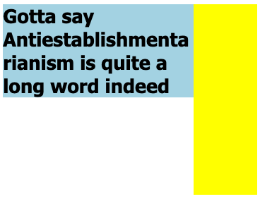
Screenshot from chrome (this is the desired output)
The long word ‘Antiestablishmentarianism’ is broken since it can’t fit the available space – other words that do fit remain intact.
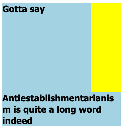
Screenshot from the failed rendering in Firefox
The long word isn’t broken as nicely as in Chrome, but pushed down below the yellow floating element. However there is still word-breaking going on – the very last letter m ended up on a separate row. It seems FF is word-breaking as if the yellow floating element didn’t take up any space.
So the question is: Is there any way to make Firefox render the word-break as nicely as Chrome without removing the float element? (I know, I could probably add more HTML wrappers and use flex or something instead – but I’d prefer to keep the current structure)
section {
  width: 400px;
  background: lightblue;
}

section h1 {
  font-size: 30px;
  font-family: Tahoma;
  overflow-wrap: break-word;
}

.yellow-box {
  width: 100px;
  height: 300px;
  float: right;
  background: yellow;
}
<section>
  <span class="yellow-box"></span>
  <div>
    <h1>
      Gotta say Antiestablishmentarianism is quite a long word indeed
    </h1>
  </div>
</section>
PS: I don’t wanna use break-all because it’ll break more words than necessary
But the interesting thing is that if you use word-break: break-all; in Firefox it works perfectly and the floating element’s width IS taken into consideration
Screenshot using break-all
As you can see the word ‘indeed’ is also broken, which is not OK
All screenshots in this post were taken using Chrome 114 and FF 114


2
Answers
You could use grid instead, this way you can keep the same structure of HTML and just change the CSS.
Using the
grid-column-startproperty on theyellow-boxallows you to move it to the second column without changing it’s position in the HTML. Then you just need to make sure it stays in the first row withgrid-row: 1/2. You’ll also need to make it so that only the div is getting the lightblue background but that’s simple to change.Since the
.yellow-boxis floating, you have to reset the BFC of h1 so it doesn’t lay under the floating box. see: https://developer.mozilla.org/en-US/docs/Web/Guide/CSS/Block_formatting_context