 Question posted in


Problem solved. thanks for ideas from answers.
i want to make this element in middle in mobile. i tried couple trick like "text-algin:center" but it didn’t work.
can anyone help me to get the css code for that?
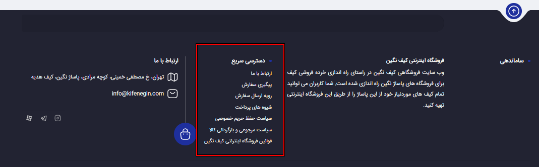
element in footer:
link image 1: https://phpout.com/wp-content/uploads/2024/04/ir1zf.png
in desktop it is good.
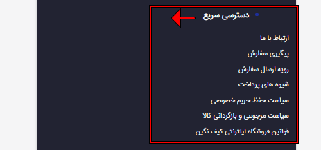
link image 2: https://phpout.com/wp-content/uploads/2024/04/1MMqq.png
in mobile i want
website: https://xxxx.xx/ (edited)
2
Answers
although @AngYC comments wasn't the right answer but it help me to figure out. .footer_list ul li is main key. solution:
Change the column class of the
footer_listcontainer fromcol-6tocol-12to set the column width to100%in the mobile screen resolution. Secondly, remove thefloatCSS property from the.footer_list ul lielement. That’s it, Make sure that you havetext-align: center;CSS property set to the desired element (li) or its container. (Which is already the case in the provided website link). I hope this helps you.My personal suggestion: Using
floatis the old-school way of styling in CSS. I recommend you to learn the new Flexbox and CSS Grid. My recommended YouTube channel name is: "Slaying The Dragon"Learn CSS Grid: https://youtube.com/watch?v=EiNiSFIPIQE
Learn CSS Flexbox: https://youtube.com/watch?v=phWxA89Dy94