skip to Main Content

This is an example of the desktop version on the left and the mobile version on the right.

enter image description here

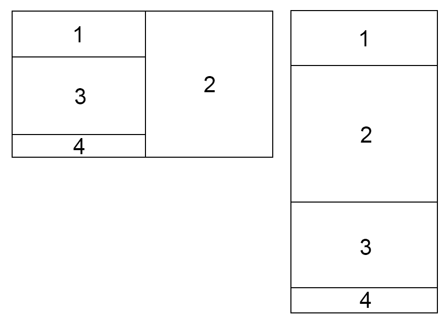
On desktop I want to put the div 2 on the right and separating the parent div into two sections, I have tried flexbox (shrink, grow, directions…) but I was unable to achieve this result.

Is it even possible to do?

Thank you!

2

Answers


  1. You can achieve that by combining flex and grid alongside tailwind breakpoints. So on mobile devices is just flex column and on desktop is grid with 2 columns and 3 rows where second element spans across the three rows:

        <div className="flex flex-col md:grid grid-cols-2 grid-rows-3">
            <div className="border-2 border-indigo-600 p-3">1</div>
            <div className="border-2 border-indigo-600 p-3 col-start-2 row-span-3">
              2
            </div>
            <div className="border-2 border-indigo-600 p-3">3</div>
            <div className="border-2 border-indigo-600 p-3">4</div>
          </div>
    

    Here’s a link to test: https://stackblitz.com/edit/react-epcw4d?file=src%2FApp.js,src%2Findex.js

    Login or Signup to reply.
  2. Like this

    div {
      outline: 1px solid black;
    }
    .container {
      display: grid;
    }
    .one {
      grid-area: one;
    }
    .two {
      grid-area: two;
    }
    .three {
      grid-area: three;
    }
    .four {
      grid-area: four;
    }
    
    @media only screen and (max-width: 600px) {
      .container{
        grid-template-columns: 1fr;
        grid-template-rows: 1fr;
        grid-template-areas:
          "one"
          "two"
          "three"
          "four";
      }
    }
    
    @media only screen and (min-width: 600px) {
      .container{
        grid-template-columns: repeat(2, 1fr);
        grid-template-rows: 1fr;
        grid-template-areas:
          "one two"
          "three two"
          "four two";
      }
    }
    <div class=container>
      <div class=one>1
      </div>
      <div class=two>2
      </div>
      <div class=three>3
      </div>
      <div class=four>4
      </div>
    </div>
    Login or Signup to reply.
Please signup or login to give your own answer.
Back To Top
Search