skip to Main Content
<style>
  .heading-container {
    clip-path: polygon(0% 24.75%, 49.5% 49.88%, 99% 75%, 0% 75%);
    background: #000;
    padding: 20px;
  }
  
  h1 {
    color: white;
  }
</style>
<div style="background-color:pink">
  <div class="heading-container">
    <h1>Lorem Ipsum Heading Test Lorem Ipsum Heading Test</h1>
  </div>
</div>

enter image description here

How could I go about achieving a result where the full sentence is visible however the text which is currently white that is being cut off is black on the pink background.

enter image description here

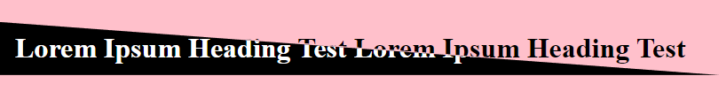
So its something like the above?

2

Answers


  1. You can do this with a background combined with mix-blend-mode and filter

    .heading-container {
      background: linear-gradient(to bottom left, #0000 50%, #fff 50.1%); /* transparent and white in the gradient */
      padding: 20px;
      isolation: isolate; /* don't blend with bottom layer*/
      filter: invert(1); /* invert the coloration (white -> black and black -> white) */
    }
    
    h1 {
      color: white; /* also white here */
      mix-blend-mode: difference; /* difference between white and white will give black so the text will be half white and half black */
    }
    <div style="background-color:pink">
      <div class="heading-container">
        <h1>Lorem Ipsum Heading Test Lorem Ipsum Heading Test</h1>
      </div>
    </div>
    Login or Signup to reply.
  2. I’m pretty sure that there are better ways (see @TemaniAfif’s answer), but a simple solution is to use two layers of text:

    .wrapper {
      position: relative;
    }
    
    .heading-container {
      padding: 20px;
    }
    
    .clipped {
      position: absolute;
      top: 0;
      left: 0;
      clip-path: polygon(0% 24.75%, 49.5% 49.88%, 99% 75%, 0% 75%);
    }
    

    Do note that this doesn’t work very well when you try to select the text.

    Try it:

    .wrapper {
      position: relative;
      background: pink;
    }
    
    .heading-container {
      padding: 20px;
    }
    
    .clipped {
      position: absolute;
      top: 0;
      left: 0;
      clip-path: polygon(0% 24.75%, 49.5% 49.88%, 99% 75%, 0% 75%);
      background: #000;
    }
    
    h1 {
      color: black;
    }
    
    .clipped h1 {
      color: white;
    }
    <div class="wrapper">
      <div class="heading-container">
        <h1>Lorem Ipsum Heading Test Lorem Ipsum Heading Test</h1>
      </div>
      <div class="heading-container clipped">
        <h1>Lorem Ipsum Heading Test Lorem Ipsum Heading Test</h1>
      </div>
    </div>
    Login or Signup to reply.
Please signup or login to give your own answer.
Back To Top
Search