skip to Main Content

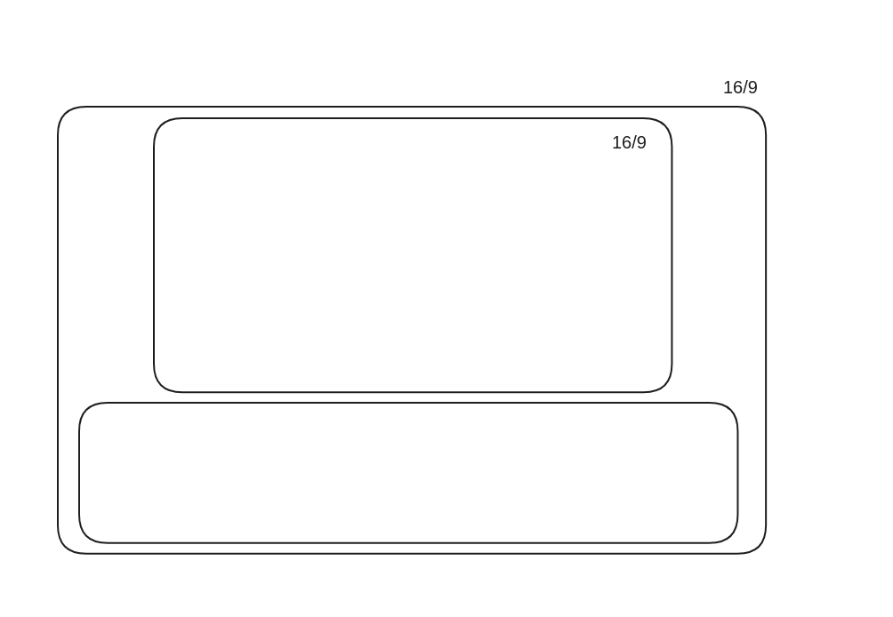
enter image description hereI have parent div with aspect-ratio: 16/9; and inside that div I have another div with same ratio, but I also have some content with that child inside, when I set child aspect-ratio it’s move content down and change height of the parent and parent lose the ratio? Is there a way for preventing this? codepen

<div class="container">
    <div class="container-2"></div>
    <div class="content">
        Lorem ipsum dolor sit amet consectetur, adipisicing elit. Quibusdam quisquam, tempore harum commodi beatae earum aperiam! Beatae et nulla alias.
    </div>
</div>
.container {
    aspect-ratio: 16/9;
    background: #ccc;

    
    .content {
        font-size: 2rem;
        padding: 1rem;
    }
    .container-2 {
        aspect-ratio: 16/9;
        max-height: 100%;
        background: blue;
    }
}

2

Answers


  1. Use CSS grid

    .container {
        aspect-ratio: 16/9;
        background: #ccc;
        display: grid;
        grid-template-rows: 1fr auto; /* the first row will take the available space */
        
        .content {
            font-size: 2rem;
            padding: 1rem;
        }
        .container-2 {
            aspect-ratio: 16/9;
            min-height: 100%; /* 100% height of the available space */
            margin: auto; /* center */
            background: blue;
        }
    }
    <div class="container">
        <div class="container-2"></div>
        <div class="content">
            Lorem ipsum dolor sit amet consectetur, adipisicing elit. Quibusdam quisquam, tempore harum commodi beatae earum aperiam! Beatae et nulla alias.
        </div>
    </div>
    Login or Signup to reply.
  2. The first child is 100vw wide so it’s not going conform the way you want unless, at minimum, you limit the height of the container.

    Limit the height of the container to a maximum of 100vh and then, using a flexbox column, make the first child as large as possible with flex:1.

    .container {
      aspect-ratio: 16/9;
      background: #ccc;
      display: flex;
      flex-direction: column;
      max-height: 100vh;
      align-items: center;
      gap: 1em;
      
      .content {
        padding: 1rem;
        background: lightgreen;
        margin: 0 1em;
      }
      .container-2 {
        flex: 1;
        aspect-ratio: 16/9;
        background: blue;
      }
    }
    <div class="container">
    
      <div class="container-2"></div>
    
      <div class="content">
        Lorem ipsum dolor sit amet consectetur, adipisicing elit. Quibusdam quisquam, tempore harum commodi beatae earum aperiam! Beatae et nulla alias.
      </div>
    </div>
    Login or Signup to reply.
Please signup or login to give your own answer.
Back To Top
Search