


I am working on my web page and I am using a ngb-alert component to show the user an alert when they first login. I have got the alert working just fine. However, I have noticed that the close button is jacked up and I have not been able to figure out why.
Here are some code snippets that I am working with:
**HTML COMPONENT**

<span>
    <ngb-alert type="primary" (close)="close()" [dismissible]="dismissible"> {{errorMessage}}</ngb-alert>
</span>


**TYPESCRIPT COMPONENT**

import { Component, Input } from '@angular/core';

@Component({
  selector: 'app-ngbd-error-message',
  templateUrl: './error-message.component.html',
  styleUrls: ['./error-message.component.less']
})

export class NgbdErrorMessageComponent {
  @Input() errorMessage: string;
  @Input() close: () => void;
  @Input() dismissible = true;
}

**LESS STYLING**
@import url('../../../global-less/color-variables.less');

:host {
  width: 100%;
  height: 100%;
}
:host .alert {
  margin: 0;
}
:host .alert-dismissible .close {
  padding: .6rem 1rem;
}
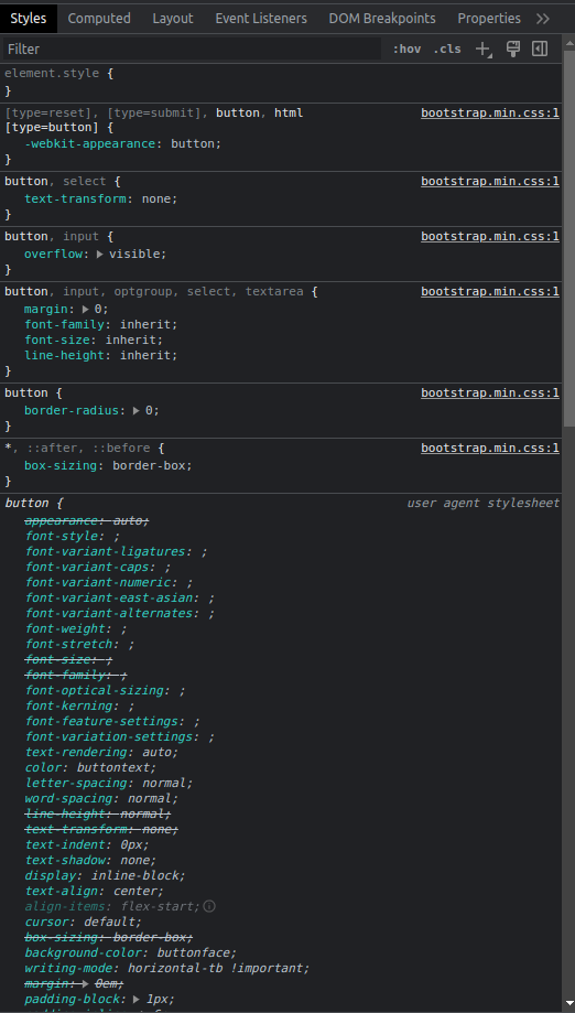
the class on for the button within the ngb-alert seems to be btn-close. Here is the rendered html element from within the webpage
<ngb-alert _ngcontent-ng-c2763413438="" role="alert" type="primary" ng-reflect-type="primary" ng-reflect-dismissible="true" class="alert alert-primary show fade alert-dismissible">Amidst a cascade of sparkling emerald leaves, the whimsical hedgehog orchestrated a symphony with a violin.<button type="button" aria-label="Close" class="btn-close"></button><!--bindings={ "ng-reflect-ng-if": "true" }--></ngb-alert>
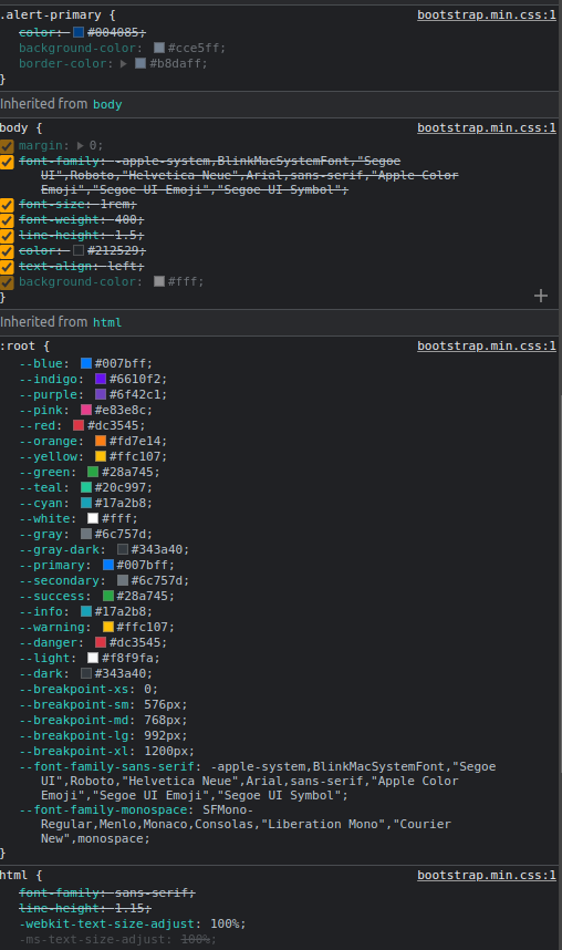
Here is the Rendered styles top to bottom
Here is what it looks like on the webpage:
Here is what I am using
-
angular- 16.2.2
-
ngboostrap – 15.0.1
I have looked into
- Overlapping Styles
- Incorrect version of ngbootstrap
- Missing dependencies
2
Answers
I finally got it working by upgrading my project's Bootstrap. My ng-boostrap and Bootstrap versions were out of line and resulted in some conflicts
The "Output" in ngb-alert" is "closed" not "close"
BTW, instead use an
@Inputthat makes that in your parent you need to have some likeYou can use
@Outputin your componentNOTE: Don’t forget in your .css include the bootstrap.min.css (or the scss of the bootstrap)
a stackblitz
Update the button close have as class bt-close. This it’s well defined in boostrap.min.css. We can also get in the own page of the boostrap