skip to Main Content

I am using Boostrap grid system as it is, using the 12-col system, which is fine. My designer asked me to move the Tablet to 8-col system (100% of the width should be 8 equal columns, no gutters etc).

Is it possible? if so, what should I define?

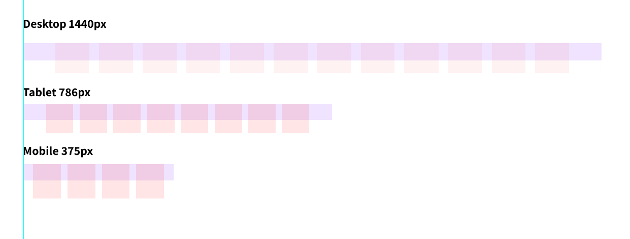
Here is the screenshot of the grid system required. The mobile 4-cols is irrelevant, since it is very easy to use the default col system for the design. I have issue with the tablet. for example, for 4-col element is easy (use .col-6), but for 3 or 5 cols, it can’t be translated to 12-col system.

enter image description here

2

Answers


  1. Chosen as BEST ANSWER

    I've actually found a simple way. it's kind of override, but it works perfectly for my needs. Here the simple code for that, you can change the class names and the media queries widths for your needs.

    @media (min-width: 750px) and (max-width: 990px) {
        .col-8-c-1 { width: 12.5%; }
        .col-8-c-2 { width: 25%; }
        .col-8-c-3 { width: 37.5%; }
        .col-8-c-4 { width: 50%; }
        .col-8-c-5 { width: 62.5%; }
        .col-8-c-6 { width: 75%; }
        .col-8-c-7 { width: 87.5%; }
        .col-8-c-8 { width: 100%; }
    
        .col-8-p-0{
            padding: 0;
        }
    }
    

    And the HTML should look something like this:

    <div class="col-12 col-8-c-6">full width, and 6 out of 8 cols on tablets<div>
    

  2. Unfortunately, it is not correctly doable with the default Bootstrap Grid. As you already know, the Bootrapgrid is a 12-column layout and you would need blocks with 1.5 columns width.

    I would recommend the usage of a default CSS-Grid here:

    :root {
      --col: 4;
    }
    
    @media only screen
      and (min-width: 786px) {
        :root {
          --col: 8;
        }
    }
    
    @media only screen
      and (min-width: 1440px) {  
        :root {
          --col: 12;
        }
    }
    
    .container {
      display: grid;
      grid-template-columns: repeat(var(--col), 1fr);
      gap: 0.5em;
    }
    
    
    /* for demonstration purpose only */
    .container > div {
      border: 2px dashed red;
      min-height: 1vh;
      display: flex;
      justify-content: center;
      align-items: center;
    }
    <div class="container">
      <div>1</div>
      <div>2</div>
      <div>3</div>
      <div>4</div>
      <div>5</div>
      <div>6</div>
      <div>7</div>
      <div>8</div>
      <div>9</div>
      <div>10</div>
      <div>11</div>
      <div>12</div>
    </div>

    If you need to support the deprecated IE and as such are required to use Flexbox then you need the following formula: (100% - ((columns - 1) * gap-size)) / columns

    :root {
      --col: 4;
      --gap: 0.5em;
    }
    
    @media only screen
      and (min-width: 786px) {
        :root {
          --col: 8;
        }
    }
    
    @media only screen
      and (min-width: 1440px) {  
        :root {
          --col: 12;
        }
    }
    
    .container {
      display: flex;
      flex-wrap: wrap;
      gap: var(--gap);
    }
    
    .container > div {
      width: calc((100% - ((var(--col) - 1) * var(--gap))) / var(--col));
    }
    
    
    /* for demonstration purpose only */
    .container > div {
      box-sizing: border-box;
      border: 2px dashed red;
      min-height: 1vh;
      display: flex;
      justify-content: center;
      align-items: center;
    }
    <div class="container">
      <div>1</div>
      <div>2</div>
      <div>3</div>
      <div>4</div>
      <div>5</div>
      <div>6</div>
      <div>7</div>
      <div>8</div>
      <div>9</div>
      <div>10</div>
      <div>11</div>
      <div>12</div>
    </div>
    Login or Signup to reply.
Please signup or login to give your own answer.
Back To Top
Search