skip to Main Content

I’m trying to get a very specific "art nouveau" result on some paper surface because designers like to make us suffer. I’m working on a NextJS project with MUI as my main design solution, but have a lot of CSS going on in the back.

Here is what I’m trying to do (don’t mind imperfections at the bottom of the frame):

Visual result of a paper with multiple complex inner borders

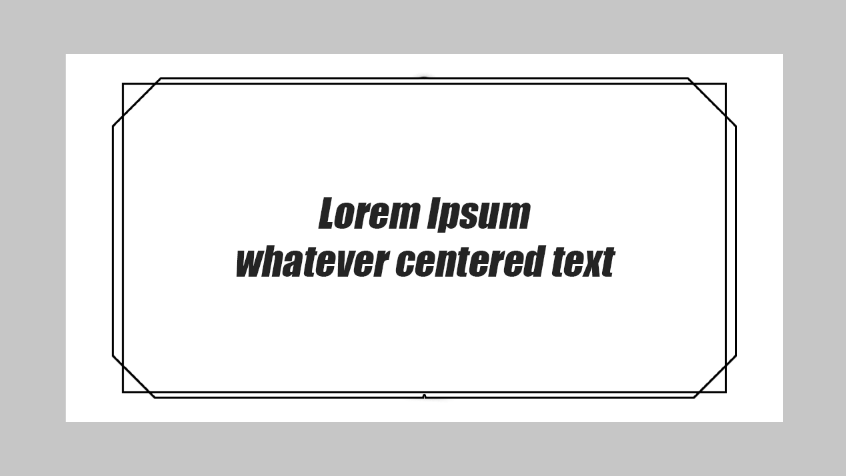
The main objective to achieve are those inner borders with "cut corners", but I can’t just use a plain image or .svg because they need to have specific colors and sizes.

The ideal would be that they fit their parent width and height in order to be fully responsive, because the Paper will eventually be turned into a component to contain text, images, etc.

How do I make such borders?

My actual code structure is quite simple:

<div className="mainWrapper">
   <div className="border1">
      // any text or content
   </div>
</div>
  • Initially, I tried to make something with the ::after pseudo-element and the clip-path property, but unfortunately it does not support borders, and calculations in order to make it responsive were way too complicated…

  • I tried using the <canvas> with useRef (because my project uses SSR, so I had to wrap the canvas logic inside of a useEffect) but results were far from what I’m trying to do…

3

Answers


  1. Chosen as BEST ANSWER

    I think I've found a way but it's really tiring... (and complex because CSS):

        const styles = {
            mainSurface: {
                width: "100%",
                backgroundColor: "blue"
            },
            bordersContainer: {
                backgroundColor: "blue!important",
                content: "''",
                position: "relative"
            },
            borderTL: {
                content: "''",
                position: "absolute",
                height: 32,
                width: 32,
                top: 16,
                left: 16,
                backgroundColor: "transparent",
                borderRight: "4px solid",
                borderColor: "red",
                transform: "rotate(45deg)"
            },
            borderBL: {
                content: "''",
                position: "absolute",
                height: 32,
                width: 32,
                bottom: 16,
                left: 16,
                backgroundColor: "transparent",
                borderTop: "4px solid",
                borderColor: "red",
                transform: "rotate(45deg)"
            },
            borderTR: {
                content: "''",
                position: "absolute",
                height: 32,
                width: 32,
                top: 16,
                right: 16,
                backgroundColor: "transparent",
                borderBottom: "4px solid",
                borderColor: "red",
                transform: "rotate(45deg)"
            },
            borderBR: {
                content: "''",
                position: "absolute",
                height: 32,
                width: 32,
                bottom: 16,
                right: 16,
                backgroundColor: "transparent",
                borderLeft: "4px solid",
                borderColor: "red",
                transform: "rotate(45deg)"
            },
    
            borderLeft: {
                position: "absolute",
                content: "''",
                height: "calc(100% - 104px)",
                width: 32,
                top: 52,
                backgroundColor: "transparent",
                borderRight: "4px solid",
                borderColor: "red",
            },
            borderRight: {
                position: "absolute",
                content: "''",
                height: "calc(100% - 104px)",
                width: 32,
                top: 52,
                right: 0,
                backgroundColor: "transparent",
                borderLeft: "4px solid",
                borderColor: "red",
            },
            borderTop: {
                position: "absolute",
                content: "''",
                height: 32,
                width: "calc(100% - 104px)",
                top: 0,
                left: 52,
                backgroundColor: "transparent",
                borderBottom: "4px solid",
                borderColor: "red",
            },
            borderBottom: {
                position: "absolute",
                content: "''",
                height: 32,
                width: "calc(100% - 104px)",
                bottom: 0,
                left: 52,
                backgroundColor: "transparent",
                borderTop: "4px solid",
                borderColor: "red",
            },
            contentBox: {
                height: "100%",
                width: "100%",
                py: 6,
                px: 8,
                position: "relative"
            }
        }
    
        return (
            <>
               <Box sx={styles.mainSurface}>
                   <Box sx={styles.bordersContainer}>
                       <Box sx={styles.borderTL}></Box>
                       <Box sx={styles.borderTR}></Box>
                       <Box sx={styles.borderBL}></Box>
                       <Box sx={styles.borderBR}></Box>
                       <Box sx={styles.borderLeft}></Box>
                       <Box sx={styles.borderRight}></Box>
                       <Box sx={styles.borderTop}></Box>
                       <Box sx={styles.borderBottom}></Box>
                       <Box sx={styles.contentBox}>
                           {props.children}
                       </Box>
                   </Box>
               </Box>
            </>
        )


    Giving something like this, clean and responsive:

    enter image description here

    Now, adding another "classic" bordered frame will be easier. Thanks to anyone who tried to help! I hope this'll be useful to someone else in the future!

    I'll try to optimize it and upload it somewhere eventually...


  2. This can easily be done with one after pseudo element and linear gradients

    HTML:

    <div class="container">Lorem Epsum</div>
    

    Try this codepen:

    https://codepen.io/Starnas/pen/rNQoXvG?editors=1100

    Login or Signup to reply.
  3. I have an online generator for the difficult shape and the other one should be easy: https://css-generators.com/custom-corners/

    .box {
      width: 400px;
      aspect-ratio: 2;
      margin: 50px;
      position: relative;
    }
    .box:before {
      content: "";
      position: absolute;
      inset: 0;
      background: red;
      clip-path: polygon(0 50.00px,50.00px 0,calc(100% - 50.00px) 0,100% 50.00px,100% calc(100% - 50.00px),calc(100% - 50.00px) 100%,50.00px 100%,0 calc(100% - 50.00px),0 50.00px,3px  calc(50.00px + 1.24px),3px calc(100% - 50.00px - 1.24px),calc(50.00px + 1.24px) calc(100% - 3px),calc(100% - 50.00px - 1.24px) calc(100% - 3px),calc(100% - 3px) calc(100% - 50.00px - 1.24px),calc(100% - 3px) calc(50.00px + 1.24px),calc(100% - 50.00px - 1.24px) 3px,calc(50.00px + 1.24px) 3px,3px calc(50.00px + 1.24px));
    }
    
    .box:after {
      content: "";
      position: absolute;
      inset: 10px;
      border: 3px solid red;  
    }
    <div class="box"></div>
    Login or Signup to reply.
Please signup or login to give your own answer.
Back To Top
Search