I have a set of elements that make up a menu:
.standardText {
  font-family: Brutel-Thin;
  color: aliceblue;
  letter-spacing: 3px;
  font-size: 25px;
}

.linksContainer {
  display: flex;
  flex-direction: column;
  justify-content: flex-start;
  align-items: flex-end;
  width: 100%;
}

.menuLink {
  display: flex;
  flex-direction: row;
  justify-content: flex-end;
  width: 100%;
  cursor: pointer;
}

.menuLinkInner {
  display: flex;
  flex-direction: row;
  justify-content: space-between;
  align-items: center;
  width: 80%;
  height: 3.5vh;
  border-top: 1px solid lightgrey;
  padding-right: 5px;
}

.menuLinkInner:hover {
  background: rgba(170, 170, 165, 0.10)
}

.menuLinkText {
  margin-left: 20px;
  margin-top: .3vh;
  color: grey;
}

.menuLinkIcon {
  height: 80%;
  display: flex;
  flex-direction: row;
  justify-content: flex-end;
}
<div id="permanentLinks" class="linksContainer">
<div class="menuLink">
<div class="menuLinkInner">
<div class="menuLinkText standardText">Profile</div>
<div class="menuLinkIcon">
<img src="core/img/icons/user.png" />
</div>
</div>
</div>
<div class="menuLink">
<div class="menuLinkInner">
<div class="menuLinkText standardText">Settings</div>
<div class="menuLinkIcon">
<img src="core/img/icons/setting.PNG" />
</div>
</div>
</div>
<div class="menuLink">
<div class="menuLinkInner">
<div class="menuLinkText standardText">Logout</div>
<div class="menuLinkIcon"></div>
</div>
</div>
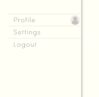
</div>These elements form a list, as depicted here:
Each menuLink item is a flex container, as is menuLinkInner, to achieve a margin area. The menuLinkInner element makes use of space-between to provide some distance between the text of the menu entry, and its icon, whilst homogenising the start points of the menu text entries.
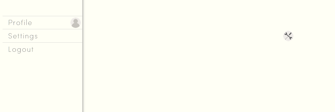
In theory, this should place the image at the end of the flex container, but in this case one icon has been pushed far to the right. It’s container (menuLinkIcon), itself a flex container, is vastly extended as if to take into account the original size of the image:
The image itself is large, being resized to fit the element it is inside. However, I am presuming that the image is resized solely based on the height of the parent element, and the parent element is taking the original width of the image, prior to resizing.
How do I prevent this behaviour, and encourage the parent element to assess the size of the image after assessing its maximum height? Should I simply resize the image? I would like to avoid this option, as the entire page (images included) is meant to be wholly resizeable to fit any resolution.


2
Answers
I have discovered that
<img>elements do not appear to necessarily obey unset, or "assumed" flex properties, such as those which come packaged with flex positioning and arrangement. The fix in this case was to directly apply a 100% height to the image, which sets it's height to 100% of that of it's parent element.This works in this specific scenario, only because I have encompassed the image in a parent flex element and because I have a set height for the assembly. In a scenario where the flex container relied on, for example,
space-around, this solution would not necessarily work.I don’t quite understand your issue here. I see the image, yes the icon is far off. But when I inspect your code, it doesn’t build what you were taking a picture of.
You nav has a width: 80%, while .menuLink takes up the whole page. There is no real sidenav.
Everything stays inside the container. It’s far away but that is because of the width: 80% and justify-content: space-between.
And even if I set #permanentLinks to width: 30%, everything stays where it belongs:
