skip to Main Content

I’m trying to use Flexbox to get a 3 by 3 grid of elements.

Here’s what I have:

export default function App() {
  return (
    <div
      style={{
        display: "flex",
        flexWrap: "wrap"
      }}
    >
      {Array.from({ length: 9 }, (_, index) => (
        <div
          style={{
            flex: 1,
            height: 200,
            backgroundColor: "gray",
            margin: 4,
            width: 150
          }}
        />
      ))}
    </div>
  );
}

distracted-wing-plyl7f

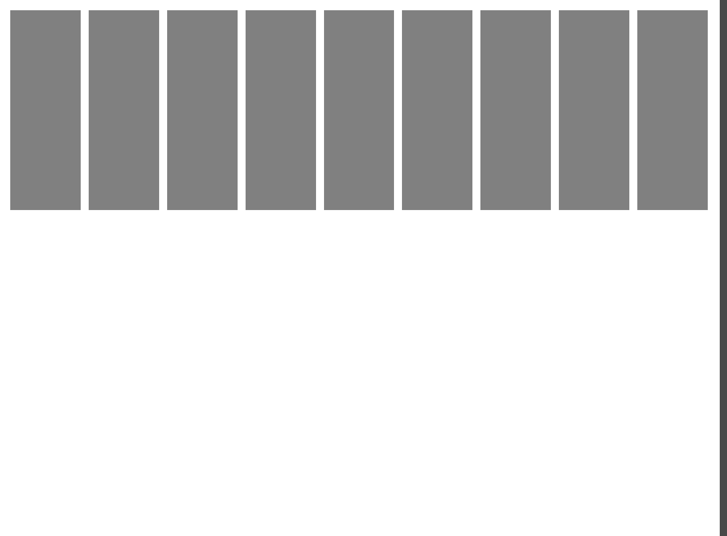
This renders the following:

img1

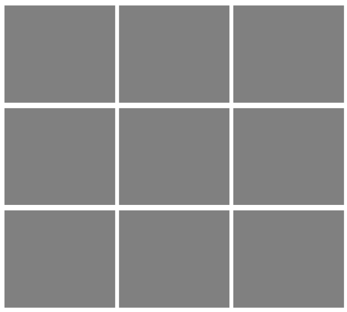
However, this is what I would like to do:

img2

What am I doing wrong here? I have to use Flexbox, I can’t use Grid, and I’ve tried to make use of flex-wrap, but it doesn’t seem to work, even if I specify a value for the width of a card.

2

Answers


  1. Using the CSS Grid for this purpose will be much easier, but if you want to stick with the flexbox approach for any reason, you can follow the following approach.

    The most vital thing about the CSS Flexbox is the flex property. The flex property stands for flex-grow, flex-shrink, and flex-basis.

    For your purpose, you should set the flex property in a way that allows three elements in a row, so we will do as follows:

    • Set the flex-grow to 1 to let each item in a row grow equally.
    • Set the flex-shrink to 0 to prevent each item from shrinking when insufficient space exists.
    • Finally, we will set the flex-basis to 33.3333% as we need three equal columns in each row. Also, if we need a gap between these elements, we have set the gap within the flex-basis property. Remember that if each element has a margin, the desired gap should be twice the margin. So for the 5px margin, we need a 10px gap and the final result for flex-basis will be calc(33.3333% - 10px).

    As an example, you can do something like the below:

    .flex-container {
      display: flex;
      flex-wrap: wrap;
    }
    
    .flex-item {
      /** Crucial parts */
      flex: 1 0 calc(33.3333% - 10px);
      box-sizing: border-box;
      margin: 5px;
      
      /** For illustration purposes */
      height: 100px;
      border: 1px solid #ccc;
      display: flex;
      align-items: center;
      justify-content: center;
    }
    <div class="flex-container">
      <div class="flex-item">1</div>
      <div class="flex-item">2</div>
      <div class="flex-item">3</div>
      <div class="flex-item">4</div>
      <div class="flex-item">5</div>
      <div class="flex-item">6</div>
      <div class="flex-item">7</div>
      <div class="flex-item">8</div>
      <div class="flex-item">9</div>
    </div>

    Important note: One crucial property to make this happen is box-sizing; we need to set its value to border-box. The border-box value will:

    Tell the browser to account for any border and padding in the values you specify for an element’s width and height.

    NOTE: You can learn more about CSS flexbox in CSS tricks website.

    Login or Signup to reply.
  2. Your current code sets up a Flexbox container with elements displayed in a row with flexWrap: "wrap", but to achieve a 3 by 3 grid, you need to make a few adjustments. Here’s how you can modify your code:

    export default function App() {
      return (
        <div
          style={{
            display: "flex",
            flexWrap: "wrap",
            width: "450px", // Set a specific width to limit the number of items per row
          }}
        >
          {Array.from({ length: 9 }, (_, index) => (
            <div
              key={index}
              style={{
                flex: "1 0 calc(33.333% - 8px)", // 33.333% width with 8px margin
                height: "200px",
                backgroundColor: "gray",
                margin: "4px",
              }}
            />
          ))}
        </div>
      );
    }
    

    In the modified code:

    1. I set a specific width for the flex container (width: "450px") to limit the number of items per row to three. Adjust this width as needed.
    2. I added a unique key to each element in the map to satisfy React’s requirement for keys when rendering lists of elements.
    3. I adjusted the flex property to distribute the items evenly, and I used calc to account for the margins and ensure there are three items per row.

    These changes should give you a 3 by 3 grid of elements using Flexbox. You can adjust the width and other styles to match your design requirements.

    Login or Signup to reply.
Please signup or login to give your own answer.
Back To Top
Search