skip to Main Content

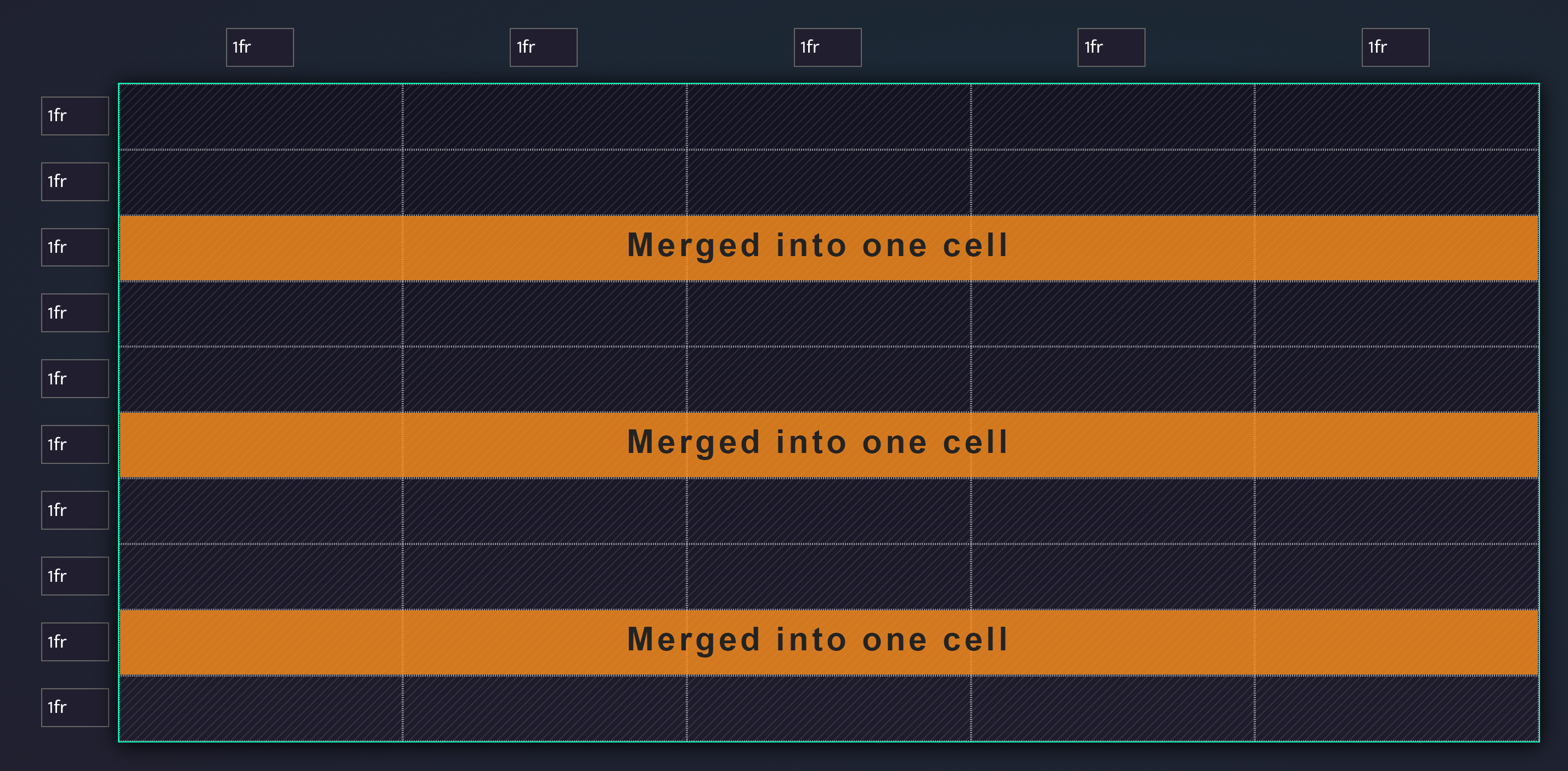
Not sure if this is possible, but I would like to have a CSS grid template where every Nth row (e.g. every third or fourth row) would merge cells into one… For example, here is a photo, what I want:

enter image description here

I know how to do this with <table> but have problem applying this to CSS grid.

2

Answers


  1. The best way would be to use the "subgrid" feature of CSS, but it’s not available in all browsers yet.

    If you have a fixed number of columns however you can do the same with only CSS. Here is an example with 4 columns and every 3rd row is "spanned".

    The important property to know is the "grid-column: span X"

    https://developer.mozilla.org/en-US/docs/Web/CSS/grid-column

    .grid {
      display: grid;
      grid-template-columns: 1fr 1fr 1fr 1fr;
      gap: 1rem;
    }
    
    .item {
      background: #ccc;
    }
    
    .item:nth-child(9n + 9) {
      grid-column: span 4;
    }
    <div class="grid">
      <div class="item">.</div>
      <div class="item">.</div>
      <div class="item">.</div>
      <div class="item">.</div>
      <div class="item">.</div>
      <div class="item">.</div>
      <div class="item">.</div>
      <div class="item">.</div>
      <div class="item">.</div>
      <div class="item">.</div>
      <div class="item">.</div>
      <div class="item">.</div>
      <div class="item">.</div>
    </div>
    Login or Signup to reply.
  2. I’d do this slightly differently than the previous answer.

    1. Use the :nth-child() pseudo-class to target the cell that you want to span across all columns.

    2. If the grid has 5 columns and you want every third row to span all columns, target the 11th child with 11n. If you wanted every fourth row, target the 16th child with 16n. Basically, it’s the number of cells in the previous rows plus one.

    3. Declare grid-column: 1 / -1 to span across the entire grid regardless of the number of columns

    .grid {
      display: grid;
      grid-template-columns: repeat(5, 1fr);
    }
    
    .grid div:nth-child(11n) {
      grid-column: 1 / -1;
      background-color: orange;
    }
    
    .grid div {
      height: 2em;
      background-color: silver;
      border: 1px solid;
    }
    <section class="grid">
      <div></div>
      <div></div>
      <div></div>
      <div></div>
      <div></div>
      <div></div>
      <div></div>
      <div></div>
      <div></div>
      <div></div>
      <div></div>
      <div></div>
      <div></div>
      <div></div>
      <div></div>
      <div></div>
      <div></div>
      <div></div>
      <div></div>
      <div></div>
      <div></div>
      <div></div>
      <div></div>
      <div></div>
      <div></div>
      <div></div>
      <div></div>
      <div></div>
      <div></div>
      <div></div>
      <div></div>
      <div></div>
      <div></div>
      <div></div>
      <div></div>
      <div></div>
      <div></div>
      <div></div>
    </section>
    Login or Signup to reply.
Please signup or login to give your own answer.
Back To Top
Search