 Question posted in


I want to use a CSS grid for the main layout of my application and I am struggling to find to right formula
Here is the structure of the design I want to achieve (Stackbliz here)
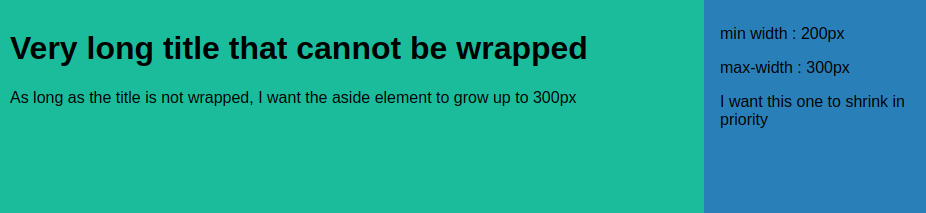
- The whole design should fill the space horizontally
- The main part (in green) contains a text that cannot be wrapped
- the aside part (in blue) contains some random text. I would like it to have a min-with of 200px and max-width of 300px
Here are the rules that I try to implement :
- On extra large screens : the aside part should have a width of 300px and the main part should take the remaining space
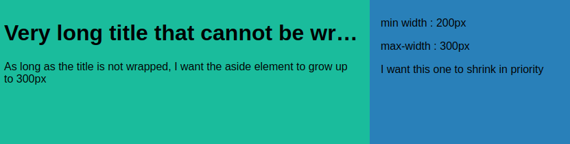
- If there is not enough space to display the title entirely, the aside part should shrink in priority, down to 200px
- If there is still not enough space for the title to be displayed entirely, the aside part should have a width of 200px and the main part should display a text-ellipsis on the title
Up to now, I have this :
#grid-wrapper {
  display: grid;
  height: 100vh;

  grid-template-columns: minmax(0, 100%) minmax(200px, 300px);
  grid-template-areas: 'area-main area-aside';
}

main {
  grid-area: area-main;
  background-color: #1abc9c;
  padding: 1rem;
}

main h1 {
  overflow-x: hidden;
  white-space: nowrap;
  text-overflow: ellipsis;
}

aside {
  grid-area: area-aside;
  background-color: #2980b9;
  padding: 1rem;
}
The result I get is almost correct except that the aside part does not shrink to 200px
2
Answers
i think either the question here:
CSS grid wrapping
or using display flex can help you
fit-content and min-width might be what you are looking for :
example: