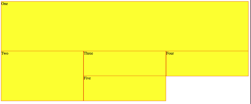
I have a simple grid:
I’m trying to get all the items vertically aligned within the limit they have, but item Two to on the same vertical line of Three
h1, p {
  font-family: Lato;
}

.wrapper {
  display: grid;
  grid-template-columns: repeat(3, 1fr);
  grid-auto-rows: 100px;
}

.wrapper div {
  background-color: yellow;
  border: 1px solid red;
  height: 100%;
}

.box1 {
  grid-column-start: 1;
  grid-column-end: 4;
  grid-row-start: 1;
  grid-row-end: 3;
}

.box2 {
  grid-column-start: 1;
  grid-row-start: 3;
  grid-row-end: 5;
}
<div class="wrapper">
<div class="box1">One</div>
<div class="box2">Two</div>
<div class="box3">Three</div>
<div class="box4">Four</div>
<div class="box5">Five</div>
</div>If I change the .wrapper div to:
.wrapper div {
  background-color: yellow;
  border: 1px solid red;
  align-self: center;
}
.wrapper div {
  background-color: yellow;
  border: 1px solid red;
  align-self: center;
}

h1, p {
  font-family: Lato;
}

.wrapper {
  display: grid;
  grid-template-columns: repeat(3, 1fr);
  grid-auto-rows: 100px;
}

.box1 {
  grid-column-start: 1;
  grid-column-end: 4;
  grid-row-start: 1;
  grid-row-end: 3;
}

.box2 {
  grid-column-start: 1;
  grid-row-start: 3;
  grid-row-end: 5;
}
<div class="wrapper">
<div class="box1">One</div>
<div class="box2">Two</div>
<div class="box3">Three</div>
<div class="box4">Four</div>
<div class="box5">Five</div>
</div>I’ll get that alignment, but item Two will be vertically centered within its container, not at the same line of item Three:
Is it possible to have item Two and Three at the vertical center of item Three with CSS grid?
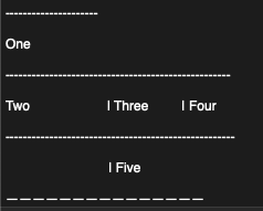
Something like:
The idea is that item Two doesn’t go between Three and Five, but at the exact vertical line of item Three


2
Answers
You can do like the following for the grid-layout:
For the alignment of the items inside the boxes you could use e.g.
display: flex;andalign-items: center;. There are other options if you don’t like the flex option you can also do it withdisplay: blocki.e. with absolute positioning and transform – but I’d not recommend it.I have written a longer answer a few years ago but it still holds true:
How do I center content in a div using CSS?
If you put the contents of box2 into its own element you could use the ‘old-fashioned’ way of placement – alter the top by 25% and then adjust upwards by half that element’s own height to get it positioned correctly.