skip to Main Content

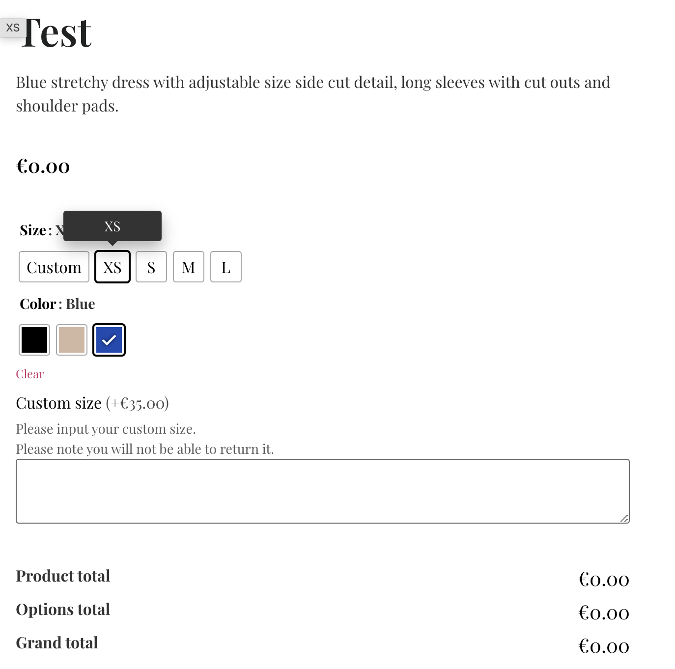
I would like to hide the custom size input table when the size selected is anything but Custom.

enter image description here

Test product https://scale-11.com/product/test-2/

Sizes boxes:

<li aria-checked="true" tabindex="0" data-wvstooltip="Custom" class="variable-item button-variable-item button-variable-item-custom selected" title="Custom" data-title="Custom" data-value="custom" role="radio" data-wvstooltip-out-of-stock=""><div class="variable-item-contents"><span class="variable-item-span variable-item-span-button">Custom</span></div></li>
<li aria-checked="false" tabindex="0" data-wvstooltip="XS" class="variable-item button-variable-item button-variable-item-xs" title="XS" data-title="XS" data-value="xs" role="radio" data-wvstooltip-out-of-stock=""><div class="variable-item-contents"><span class="variable-item-span variable-item-span-button">XS</span></div></li>
<li aria-checked="false" tabindex="0" data-wvstooltip="S" class="variable-item button-variable-item button-variable-item-s" title="S" data-title="S" data-value="s" role="radio" data-wvstooltip-out-of-stock=""><div class="variable-item-contents"><span class="variable-item-span variable-item-span-button">S</span></div></li>
<li aria-checked="false" tabindex="0" data-wvstooltip="M" class="variable-item button-variable-item button-variable-item-m" title="M" data-title="M" data-value="m" role="radio" data-wvstooltip-out-of-stock=""><div class="variable-item-contents"><span class="variable-item-span variable-item-span-button">M</span></div></li>
<li aria-checked="false" tabindex="0" data-wvstooltip="L" class="variable-item button-variable-item button-variable-item-l" title="L" data-title="L" data-value="l" role="radio" data-wvstooltip-out-of-stock=""><div class="variable-item-contents"><span class="variable-item-span variable-item-span-button">L</span></div></li>

Custom size input box

    <div class="wapf-field-group" data-group="p_2333">
<div class="wapf-field-row">
<div class="wapf-field-container wapf-field-textarea" style="width:100%;" for="643aefd5dc8e8">
<div class="wapf-field-label wapf--above"><label><span>Custom size</span> <span class="wapf-pricing-hint">(+€35.00)</span></label></div><div class="wapf-field-description">Please input your custom size.<br> Please note you will not be able to return it. </div>
<div class="wapf-field-input">
<textarea name="wapf[field_643aefd5dc8e8]" class="wapf-input" data-is-required="" data-field-id="643aefd5dc8e8" data-wapf-price="35" data-wapf-pricetype="fixed"></textarea>
</div>
</div>
</div>
</div>
<script>
const name = document.querySelector(".wapf-field-group");
const btn = document.querySelector(".button-variable-item-s, .button-variable-item-S,.button-variable-item-m, .button-variable-item-l");

   btn.addEventListener("click", dontDisplay);
      function dontDisplay() {
        name.style.display = "none";
}
const form = document.querySelector(".wapf-field-group");
const customButton = document.querySelector(".button-variable-item-custom");

   btn.addEventListener("click", display);
      function display() {
        customButton.style.display = "block";
}
</script>

What happens now is that when I enter the product the table is visible and disappears when size S is selected and does not appear again when needed?

2

Answers


  1. Why do you initiate two times your form ? It’s initiate in name and then form.

    And the second time you change the display of the button and not the form.

    Login or Signup to reply.
  2. One approach to the problem is below, with explanatory comments in the code:

    // Simple utility functions
    const D = document,
      get = (selector, context = D) => context.querySelector(selector),
      getAll = (selector, context = D) => [...context.querySelectorAll(selector)];
    
    // creating a custom Event in order to trigger a 'click' event on page-load:
    const fauxClick = new Event('click'),
      // retrieving an Array of all items matching the supplied CSS
      // selector:
      options = getAll('.variable-item'),
      // a named Arrow function that handles the visibility of relevant
      // elements; this function takes one argument 'node', a reference
      // to a specific DOM node:
      conditionalShow = (node) => {
    
        // if the node has a custom data-* - data-checked-show - attribute:
        if (node.dataset.checkedShow) {
          // we check if "true" is equal to the node's 'aria-checked'
          // attribute (the value of this attribute is a CSS selector)
          // for the elements to be shown if this element's aria-checked
          // attribute is "true":
          let checkedState = 'true' === node.getAttribute('aria-checked');
    
          // we retrieve an Array of elements that match that selector, and
          // use Array.prototype.forEach() to iterate over each element
          // that is found:
          getAll(node.dataset.checkedShow).forEach(
            (el) => {
              // 'el' is a reference to the current Element of the Array of
              // Element-nodes over which we're iterating, and here we update
              // the opacity of the element to a numeric representation of
              // the Boolean true/false we retrieved in the checkedState
              // variable; true evaluates to 1, and false to 0:
              el.style.opacity = Number(checkedState)
            })
        }
      },
      // the named Arrow function that handles the 'click' event on the .variable-item
      // elements, this function takes one argument, 'evt', passed automagically from
      // EventTarget.addEventListener():
      optionSelection = (evt) => {
    
        // the element that was clicked, and reflects the user's choice,
        // evt.currentTarget retrieves the value of the currentTarget property
        // of the Event Object and is the element to which the event-listener
        // was bound:
        let chosen = evt.currentTarget;
    
        // we find all the children (child elements) of the chosen-option's
        // parentNode (this is converted to an Array using the Array-literal
        // and the spread syntax), and iterate over that Array of elements:
        [...chosen.parentNode.children].forEach(
          // 'el' is a reference to the current Element of the Array of
          // Elements:
          (el) => {
            // here we set the 'aria-checked' attribute-value to the result
            // of the assessment; therefore it's set to true (coerced to "true"
            // when assigned as an attribute-value) for the chosen element,
            // but false for all siblings:
            el.setAttribute('aria-checked', el === chosen);
            // we then call the conditionalShow() function, passing the
            // current el to that function:
            conditionalShow(el);
          });
    
      };
    
    // iterating over all the previously-retrieved ".variable-item" elements:
    options.forEach(
      // passing in a reference to the current element of the Array of
      // elements, and in the function body we bind the optionSelection()
      // function as the event-handler for the 'click' event:
      (opt) => opt.addEventListener('click', optionSelection)
    );
    
    // here we filter the ".variable-item" Array of Elements, to retain only
    // those for which
    options.filter(
      // "true" is equal to the attribute-value of the "aria-checked" attribute:
      (el) => "true" === el.getAttribute('aria-checked')
    ).forEach(
      // and on those elements we dispatch the previously-created "click" event,
      // so that the dependent elements are shown/hidden on page-load:
      (el) => el.dispatchEvent(fauxClick)
    );
    :root {
      --offset-x: 0.25rem;
      --offset-y: 0.25rem;
      --shadowColor: hsl(300deg 0% 0% / 0.4);
      --scale: 1;
      --spread: 0.1rem;
      --transitionDuration: 300ms;
    }
    
    *,
     ::before,
     ::after {
      box-sizing: border-box;
      margin: 0;
      padding: 0;
    }
    
    body {
      block-size: 100vh;
      font-family: system-ui;
      font-size: 16px;
      font-weight: 400;
      line-height: 1.5;
      padding-block: 1rem;
      padding-inline: 4%;
    }
    
    ul,
    li {
      list-style-type: none;
    }
    
    section {
      border: 2px solid currentColor;
      border-radius: 0.5rem;
      display: grid;
      gap: 1rem;
      grid-template-areas: 'product-name product-name' 'product-image product-options';
      grid-template-columns: 1fr 2fr;
      padding: 0.75rem;
    }
    
    h2 {
      grid-column: span 2;
    }
    
    img {
      grid-area: product-image;
      max-width: 100%;
      object-fit: cover;
    }
    
    form {
      display: grid;
      gap: 1rem;
      grid-area: product-options;
      grid-template-columns: 1fr;
      place-content: start;
      width: 100%;
    }
    
    form>* {
      padding-block: 0.5rem;
      padding-inline: 1rem;
    }
    
    .options {
      align-items: start;
      display: flex;
      gap: 0.5rem;
      justify-content: start;
    }
    
    .variable-item {
      background-color: hsl(0deg 100% 100% / 1);
      border: 1px solid currentColor;
      border-radius: 0.5rem;
      cursor: pointer;
      filter: drop-shadow(var(--offset-x) var(--offset-y) var(--shadowSpread) var(--shadowColor));
      flex-basis: 3rem;
      scale: var(--scale, 1);
      text-align: center;
      transition: scale var(--transitionDuration);
      padding-block: 0.5rem;
      padding-inline: 0.75rem;
    }
    
    .color-options .variable-item {
      aspect-ratio: 1;
      background-color: var(--colorChoice);
      box-shadow: inset 0 0 0 0.25rem hsl(0deg 100% 100% / 1);
    }
    
    .variable-item[aria-checked=true] {
      --offset: 0.15rem;
      --scale: 1.1;
      --shadowSpread: 0.25rem;
      font-weight: 800;
    }
    
    .variable-item[data-wvstooltip-out-of-stock]:not([data-wvstooltip-out-of-stock=""]) {
      cursor: not-allowed;
      background-color: #ddd;
      color: #999;
    }
    
    .wapf-field-group {
      opacity: 0;
      transition: opacity var(--transitionDuration);
    }
    
    textarea {
      block-size: 4rem;
      display: block;
      inline-size: 90%;
      margin-inline: auto;
      resize: vertical;
    }
    <!-- I've chosen to use <section> elements to wrap around individual products,
         obviously adjust to your preferences: -->
    <section>
      <!-- a <h2> to represent the name of the product: -->
      <h2>Product One</h2>
      <!-- a product image: -->
      <img src="https://scale-11.com/wp-content/uploads/2023/02/blue-dress.jpg" alt="">
      <!-- I wasn't entirely sure how to wrap the various options, so while I used a <form>
           it's not necessary to do so; it just made "sense" to me and allowed for
           positioning within the grid: -->
      <form action="#">
        <!-- your <li> elements in the question weren't wrapped, so I opted to use an
             unordered list (<ul>), again: adjust to your own preferences: -->
        <ul class="options size-options">
          <!-- in the following element I added the "data-checked-show" custom
               attribute to hold a CSS selector for the element(s) to be
               shown when this element is "checked"/aria-checked="true": -->
          <li aria-checked="true" tabindex="0" data-wvstooltip="Custom" class="variable-item button-variable-item button-variable-item-custom selected" title="Custom" data-title="Custom" data-value="custom" role="radio" data-wvstooltip-out-of-stock="" data-checked-show=".custom-size">
            <div class="variable-item-contents"><span class="variable-item-span variable-item-span-button">Custom</span></div>
          </li>
          <li aria-checked="false" tabindex="0" data-wvstooltip="XS" class="variable-item button-variable-item button-variable-item-xs" title="XS" data-title="XS" data-value="xs" role="radio" data-wvstooltip-out-of-stock="">
            <div class="variable-item-contents"><span class="variable-item-span variable-item-span-button">XS</span></div>
          </li>
          <li aria-checked="false" tabindex="0" data-wvstooltip="S" class="variable-item button-variable-item button-variable-item-s" title="S" data-title="S" data-value="s" role="radio" data-wvstooltip-out-of-stock="">
            <div class="variable-item-contents"><span class="variable-item-span variable-item-span-button">S</span></div>
          </li>
          <li aria-checked="false" tabindex="0" data-wvstooltip="M" class="variable-item button-variable-item button-variable-item-m" title="M" data-title="M" data-value="m" role="radio" data-wvstooltip-out-of-stock="">
            <div class="variable-item-contents"><span class="variable-item-span variable-item-span-button">M</span></div>
          </li>
          <li aria-checked="false" tabindex="0" data-wvstooltip="L" class="variable-item button-variable-item button-variable-item-l" title="L" data-title="L" data-value="l" role="radio" data-wvstooltip-out-of-stock="">
            <div class="variable-item-contents"><span class="variable-item-span variable-item-span-button">L</span></div>
          </li>
        </ul>
        <!-- I added this <ul> to contain the color options because it seemed workable, but wasn't featured in your posted
             code (and may have been irrelevant): -->
        <ul class="options color-options">
          <li aria-checked="false" tabindex="0" data-wvstooltip="Red" class="variable-item button-variable-item button-variable-item-r" title="Black" data-title="Black" data-value="b" role="radio" data-wvstooltip-out-of-stock="" style="--colorChoice: #000"></li>
          <li aria-checked="false" tabindex="0" data-wvstooltip="Green" class="variable-item button-variable-item button-variable-item-n" title="Nude" data-title="Nude" data-value="n" role="radio" data-wvstooltip-out-of-stock="" style="--colorChoice: #d1b7a4"></li>
          <li aria-checked="true" tabindex="0" data-wvstooltip="Blue" class="variable-item button-variable-item button-variable-item-blue" title="Blue" data-title="Blue" data-value="b" role="radio" data-wvstooltip-out-of-stock="" style="--colorChoice: #174ab3"></li>
        </ul>
        <!-- this was added to the <form> because, while it was in the question it wasn't associated in any obvious
             way with the rest of the HTML; so I had to guess how it fit together (but it should still work so
             long as you update the selector in the "data-checked-show" attribute-value) -->
        <div class="wapf-field-group custom-options custom-size" data-group="p_2333">
          <div class="wapf-field-row">
            <div class="wapf-field-container wapf-field-textarea" for="643aefd5dc8e8">
              <div class="wapf-field-label wapf--above">
                <label><span>Custom size</span> <span class="wapf-pricing-hint">(+€35.00)</span></label></div>
              <div class="wapf-field-description">Please input your custom size.<br> Please note you will not be able to return it. </div>
              <div class="wapf-field-input">
                <textarea name="wapf[field_643aefd5dc8e8]" class="wapf-input" data-is-required="" data-field-id="643aefd5dc8e8" data-wapf-price="35" data-wapf-pricetype="fixed"></textarea>
              </div>
            </div>
          </div>
        </div>
      </form>
    </section>

    JS Fiddle demo.

    References:

    Login or Signup to reply.
Please signup or login to give your own answer.
Back To Top
Search