


This is my code:
.gallery {
  display: flex;
  overflow-x: auto;
  resize: both;
  background-color: rgb(200, 200, 200);
  padding: 10px;
  height: 200px;
}

.item {
  display: flex;
  flex: 0 0 auto;
  max-width: 100%;
}

.item img {
  max-width: 100%;
  max-height: 100%;
  object-fit: contain;
}

.description {
  margin-right: 30px;
  margin-left: 5px;
  writing-mode: vertical-rl;
  transform: rotate(180deg);
  text-align: center;
}
<div class="gallery">
<div class="item">
<img src="https://upload.wikimedia.org/wikipedia/commons/thumb/1/1e/Wald018.jpg/256px-Wald018.jpg">
<div class="description">One</div>
</div>
<div class="item">
<img src="https://upload.wikimedia.org/wikipedia/commons/thumb/2/2d/Ung_norsk_furuskog_og_morgent%C3%A5ke.jpg/256px-Ung_norsk_furuskog_og_morgent%C3%A5ke.jpg">
<div class="description">Two</div>
</div>
<div class="item">
<img src="https://upload.wikimedia.org/wikipedia/commons/thumb/f/fa/Swedish_Spruce_Forest.jpg/297px-Swedish_Spruce_Forest.jpg">
<div class="description">Three</div>
</div>
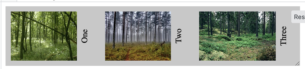
</div>If the container size can contain the full width of each item, all spaces between are the same and look the way they should:
But if not, then for example such stuff can happen:
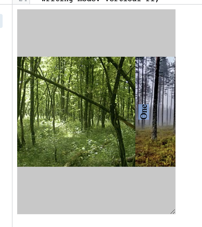
In this case, the margins of .description get ignored. But this must not happen. The spaces should be calculated like before, the .description should keep its space and margin, just the images have to adjust to the container size.
What is the easiest way to fix that? I can’t change the complete structure since it’s already implemented in a complex website structure. Is there maybe just one flexbox setting that can be used to fix it?
Addition: Thanks for the answers. I just realized that the solution doesn’t work well for videos. here is what can happen:
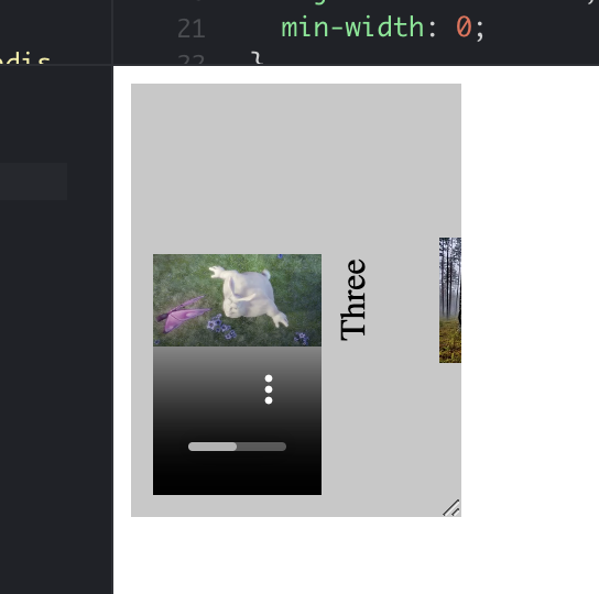
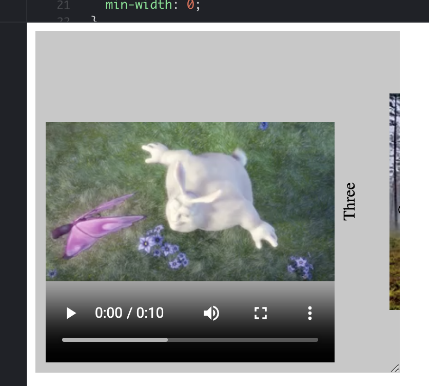
So the video container is bigger than the video. Does anyone have an idea how to fix that?
3
Answers
Try removing the
max-widthfrom.itemEven though u explained its confusing.
From what i got from ur question is that u want to kept ur spaces between images.
Add gap property (flex objects gap b/w)
you could also view "justify-content" property of flex
adding
min-width:0to the image should fix it