


I need to center elements when i visit from mobile. On desktop is looking ok.
Desktop:
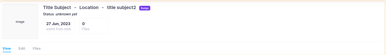
Mobile:
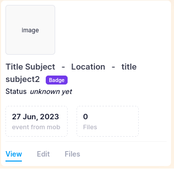
Desired mobile:
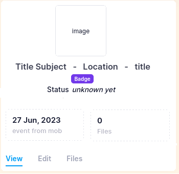
I use Bootstrap 5.3.0. I tried with row and col but the i don’t get the desktop result as i want.
<link rel="stylesheet" href="https://cdn.jsdelivr.net/npm/[email protected]/dist/css/bootstrap.min.css" integrity="sha384-rbsA2VBKQhggwzxH7pPCaAqO46MgnOM80zW1RWuH61DGLwZJEdK2Kadq2F9CUG65" crossorigin="anonymous">

<div class="d-flex flex-wrap flex-sm-nowrap mb-0">
  <div class="text-center">
    <!--begin::Image-->
    <div class="d-flex justify-content-center align-items-center flex-shrink-0 bg-light rounded w-100px h-100px w-lg-150px h-lg-150px me-7 mb-4 border border-secondary">
      <img class="mw-50px mw-lg-75px" src="https://via.placeholder.com/100" alt="image">
    </div>
    <!--end::Image-->
  </div>
  <!--begin::Wrapper-->
  <div class="flex-grow-1">
    <!--begin::Head-->
    <div class="d-flex justify-content-between align-items-start flex-wrap mb-2">
      <!--begin::Details-->
      <div class="d-flex flex-column">
        <!--begin::Status-->
        <div class="align-items-center mb-1">
          <a class="text-gray-800 text-hover-primary fs-2 fw-bold me-3" href="#">Title Subject</a>
          <span class="text-gray-800 text-hover-primary fs-2 fw-bold me-3">-</span>
          <span class="text-gray-800 text-hover-primary fs-2 fw-bold me-3">Location</span>
          <span class="text-gray-800 text-hover-primary fs-2 fw-bold me-3">-</span>
          <span class="text-gray-800 text-hover-primary fs-2 fw-bold me-3">title subject2</span>
          <span class="badge badge-info me-auto">Badge</span>
        </div>
        <!--end::Status-->
        <!--begin::Description-->
        <div class="d-flex flex-wrap fw-semibold">
          <span class="me-2 fs-5 text-white-400">Status</span>
          <span class="mb-0 fs-5 text-white-400">
                        <em>unknown yet</em>
                    </span>
        </div>
        <!--end::Description-->
        <!--begin::User id-->
        <div class="d-flex flex-wrap fw-semibold mb-0 fs-5 text-gray-400 d-none" id="legal_case_id">20</div>
        <!--end::User id-->
      </div>
      <!--end::Details-->
    </div>
    <!--end::Head-->
    <!--begin::Info-->
    <div class="d-flex flex-wrap justify-content-start">
      <!--begin::Stats-->
      <div class="d-flex flex-wrap">
        <!--begin::Stat-->
        <div class="border border-gray-300 border-dashed rounded min-w-125px py-3 px-4 me-6 mb-3">
          <!--begin::Number-->
          <div class="d-flex align-items-center">
            <div class="fs-4 fw-bold">27 Jun, 2023</div>
          </div>
          <!--end::Number-->
          <!--begin::Label-->
          <div class="fw-semibold fs-6 text-gray-400">event from mob</div>
          <!--end::Label-->
        </div>
        <!--end::Stat-->
        <!--begin::Stat-->
        <div class="border border-gray-300 border-dashed rounded min-w-125px py-3 px-4 me-6 mb-3">
          <!--begin::Number-->
          <div class="d-flex align-items-center">
            <div class="fs-4 fw-bold counted" data-kt-countup="true" data-kt-countup-value="0" data-kt-initialized="1">0</div>
          </div>
          <!--end::Number-->
          <!--begin::Label-->
          <div class="fw-semibold fs-6 text-gray-400">Files</div>
          <!--end::Label-->
        </div>
        <!--end::Stat-->
      </div>
      <!--end::Stats-->
    </div>
    <!--end::Info-->
  </div>
  <!--end::Wrapper-->
</div>
2
Answers
You’d set justification to center for mobile (default), then override it for larger breakpoints, as
justify-content-center justify-content-md-start.Your horizontal list needs refactoring, too. It’s not quite centered. It needs tweaking or refactoring to use flex features rather than margins.
Add the following:
mx-autoto center the imagetext-sm-start text-centerto center the Title Subject – Location – title subject2 on mobileme-sm-auto mx-auto d-sm-inline d-tableto center the badge on mobilejustify-content-sm-start justify-content-centerto center the status on mobileSee the snippet below.