skip to Main Content

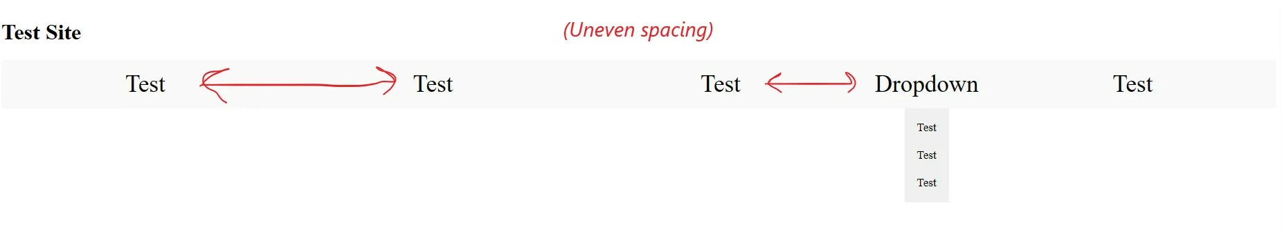
Upon adding a dropdown menu element to my navbar the nicely spaced elements have become uneven. I would like them to be evenly spaced.

This is my ideal spacing (but without dropdown)

This is with uneven spacing with the added dropdown element

<!DOCTYPE html>
<html>
<head>
    <title>Test Site</title>
    <style>
        * {
            text-decoration: none;
            color: inherit;
        }

        /* CSS styles for the navbar */
        .navbar {
            display: flex;
            flex-wrap: wrap;
            justify-content: space-between;
            background-color: #f9f9f9;
            position: static;
            align-items: center;
            width: 100%;
            box-sizing: border-box;
            font-family: HarlowSolid;
        }

        .navbar-item {
            border-style: none;
            padding: 15px;
            font-size: 35px;
            cursor: pointer;
            flex: 1;
            text-align: center;
            display: flex;
            justify-content: center;
            align-items: center;
        }

        @media screen and (max-width: 700px) {
            .navbar {
                display: flex;
                flex-wrap: wrap;
                justify-content: left;
                align-items: center;
            }

            .navbar-item {
                width: 100%;
                flex: 100%;
                text-align: center;
                padding-top: 30px;
                padding-bottom: 30px;
            }
        }

        .dropdown {
            display: inline-block;
            position: relative;
        }

        .dropdown-content {
            display: block;
            position: absolute;
            background-color: #f0f0f0;
            padding: 8px;
            left: 50%; /* Center the dropdown content horizontally */
            transform: translateX(-50%); /* Adjust horizontally to align with the dropdown */
            top: 100%;
            z-index: 999;
            font-size: 17px;
            text-align: left;
            width: auto; /* Set the width to match the content width */
        }

        .dropdown:hover .dropdown-content {
            display: block;
        }

        .dropdown-content a {
            display: block;
            padding: 10px;
        }
    </style>
</head>
<body>
    <div class="header">
        <!-- Content of the header -->
        <h1>Test Site</h1>
    </div>
  
    <div class="navbar">
        <!-- Navbar items -->
        <div class="navbar-item">Test</div>
        <div class="navbar-item">Test</div>
        <div class="navbar-item">Test</div>
      
        <div class="dropdown">
            <div class="navbar-item">Dropdown</div>
            <div class="dropdown-content">
                <a href="#">Test</a>
                <a href="#">Test</a>
                <a href="#">Test</a>
            </div>
        </div>
      
        <div class="navbar-item">Test</div>
    </div>
</body>
</html>

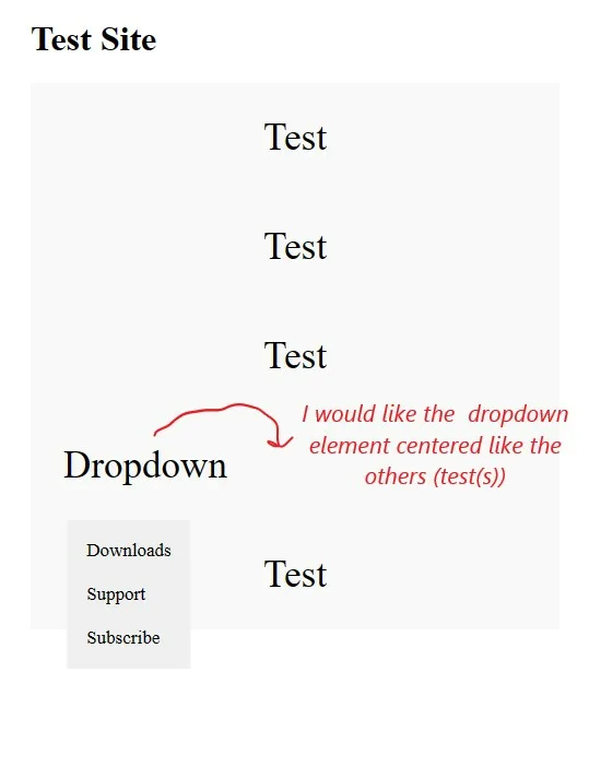
Another problem I’d like help with is with this feature I added for mobile viewing (when the browser window is resized below 700px)

The problem is the dropdown div element is not centered with the rest of the menu items when the page is collapsed.

This image should help explain the problem

(I have cut a lot of the main superfluous code just to make it easier to answer my questions)

The project required the menu elements to be reordered and a second dropdown added. Unfortunately the menu spacing became an issue and I couldn’t figure out how to get the spacing result I wanted. I now can’t figure out how to fix the problem.

With the second issue with the centering of the dropdown div element I tried studying flex but I’m still not sure of the solution.

2

Answers


  1. mobile-view desktop-view

      <!DOCTYPE html>
        <html>
          <head>
            <title>Test Site</title>
            <style>
              * {
                text-decoration: none;
                color: inherit;
              }
        
              /* CSS styles for the navbar */
              .navbar {
                display: flex;
                flex-wrap: wrap;
                justify-content: space-between;
                background-color: #f9f9f9;
                position: static;
                align-items: center;
                width: 100%;
                box-sizing: border-box;
                font-family: HarlowSolid;
              }
        
              .navbar-item {
                border-style: none;
                padding: 15px;
                font-size: 35px;
                cursor: pointer;
                flex: 1;
                text-align: center;
                display: flex;
                justify-content: center;
                align-items: center;
                background: red;
              }
        
              .dropdown {
                margin: 0 auto;
                display: flex;
                flex: 1;
              }
        
              @media screen and (max-width: 700px) {
                .navbar {
                  display: flex;
                  flex-wrap: wrap;
                  justify-content: left;
                  align-items: center;
                }
        
                .navbar-item {
                  width: 100%;
                  flex: 100%;
                  text-align: center;
                  padding-top: 30px;
                  padding-bottom: 30px;
                }
              }
        
              .dropdown {
                display: inline-block;
                position: relative;
              }
        
              .dropdown-content {
                display: block;
                position: absolute;
                background-color: #f0f0f0;
                padding: 8px;
                left: 50%; /* Center the dropdown content horizontally */
                transform: translateX(
                  -50%
                ); /* Adjust horizontally to align with the dropdown */
                top: 100%;
                z-index: 999;
                font-size: 17px;
                text-align: left;
                width: auto; /* Set the width to match the content width */
              }
        
              .dropdown:hover .dropdown-content {
                display: block;
              }
        
              .dropdown-content a {
                display: block;
                padding: 10px;
              }
            </style>
          </head>
          <body>
            <div class="header">
              <!-- Content of the header -->
              <h1>Test Site</h1>
            </div>
        
            <div class="navbar">
              <!-- Navbar items -->
              <div class="navbar-item">Test</div>
              <div class="navbar-item">Test</div>
              <div class="navbar-item">Test</div>
        
              <div class="dropdown">
                <div class="navbar-item">Dropdown</div>
                <div class="dropdown-content">
                  <a href="#">Test</a>
                  <a href="#">Test</a>
                  <a href="#">Test</a>
                </div>
              </div>
        
              <div class="navbar-item">Test</div>
            </div>
          </body>
        </html>
    
    
      [1]: https://i.stack.imgur.com/LrX35.png
    
    Login or Signup to reply.
  2. mobile-viewhi try this code i changed

    <!DOCTYPE html>
    <html>
      <head>
        <title>Test Site</title>
        <style>
          * {
            text-decoration: none;
            color: inherit;
          }
    
          /* CSS styles for the navbar */
          .navbar {
            display: flex;
            flex-wrap: wrap;
            justify-content: space-between;
            background-color: #f9f9f9;
            position: static;
            align-items: center;
            width: 100%;
            box-sizing: border-box;
            font-family: HarlowSolid;
          }
    
          .navbar-item {
            border-style: none;
            padding: 15px;
            font-size: 35px;
            cursor: pointer;
            flex: 1;
            text-align: center;
            display: flex;
            justify-content: center;
            align-items: center;
            background: red;
          }
    
          .dropdown {
            margin: 0 auto;
            display: flex;
            flex: 1;
          }
    
          @media screen and (max-width: 700px) {
            .navbar {
              display: flex;
              flex-wrap: wrap;
              justify-content: left;
              align-items: center;
            }
    
            .navbar-item {
              flex: 100%;
              text-align: center;
              padding-top: 30px;
              padding-bottom: 30px;
            }
          }
    
          .dropdown {
            display: inline-block;
            position: relative;
          }
    
          .dropdown-content {
            display: block;
            position: absolute;
            background-color: #f0f0f0;
            padding: 8px;
            left: 50%; /* Center the dropdown content horizontally */
            transform: translateX(
              -50%
            ); /* Adjust horizontally to align with the dropdown */
            top: 100%;
            z-index: 999;
            font-size: 17px;
            text-align: left;
            width: auto; /* Set the width to match the content width */
          }
    
          .dropdown:hover .dropdown-content {
            display: block;
          }
    
          .dropdown-content a {
            display: block;
            padding: 10px;
          }
        </style>
      </head>
      <body>
        <div class="header">
          <!-- Content of the header -->
          <h1>Test Site</h1>
        </div>
    
        <div class="navbar">
          <!-- Navbar items -->
          <div class="navbar-item">Test</div>
          <div class="navbar-item">Test</div>
          <div class="navbar-item">Test</div>
    
          <div class="dropdown">
            <div class="navbar-item">Dropdown</div>
            <div class="dropdown-content">
              <a href="#">Test</a>
              <a href="#">Test</a>
              <a href="#">Test</a>
            </div>
          </div>
    
          <div class="navbar-item">Test</div>
        </div>
      </body>
    </html>
    
    Login or Signup to reply.
Please signup or login to give your own answer.
Back To Top
Search