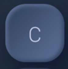
I want to make this button design and for now I cannot get it right, I was playing with backgroundBlendMode but it’s impossible for me.
Widget buildButton(String value) {
  return Container(
    margin: const EdgeInsets.all(5.0),
    decoration: BoxDecoration(
      borderRadius: BorderRadius.circular(20.0),
      gradient: const LinearGradient(
        colors: [
          Color(0xFF546486),
          Color(0xFF394A68),
        ],
        begin: Alignment.topLeft,
        end: Alignment.bottomRight,
      ),
    ),
    child: Container(
      margin: const EdgeInsets.all(5.0),
      decoration: BoxDecoration(
        borderRadius: BorderRadius.circular(20.0),
        gradient: const LinearGradient(
          colors: [
            Color(0xFF394A68),
            Color(0xFF546486),
          ],
          begin: Alignment.topLeft,
          end: Alignment.bottomRight,
        ),
        boxShadow: const [
          BoxShadow(color: Color(0xFF394A68), blurRadius: 5.0),
        ],
      ),
      child: Center(
        child: Text(
          value,
          style: const TextStyle(
            color: Color(0XFFBCC6DF),
            fontSize: 30.0,
          ),
        ),
      ),
    ),
  );
}
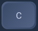
This is what I got so far, feel free to change everything you want or need.
Current result
Expected result


2
Answers
Hello please provide more code in which you are looking for as per my understanding i designed it here is the code
here is the output
hope it works!!!!!!
You should remove the
marginon bothContainersbecause they cause a noticeable line differencial in colors.In your second Container, you can use a
RadialGradientinstead for a circular gradient to create the darker color on the outer layer. Use transparency in the inner layer to show the LinearGradient behind the container.I am also using
withOpacityfor better blending. You can adjust it based on how intensive/darker you want the color to be on the outer layer. You can also add moreColors.transparentto increase the radius in the center.You also need to move the
boxShadowto the first Container, because it’s the main parent that carries all the widgets. If you have it in the second container, with the colors transparent and opacity, it will be all shadowed.Here’s the full code that should get you close enough to expected result: