skip to Main Content

I have a problem with vertically aligning text using flex in my web application using Tailwind. Here is part of my code:

<div className="flex flex-col gap-4">
  <div className="font-bebas bg-font-color ">
    <h1 className="text-font-color text-4xl flex flex-row gap-2 items-end">nothing but 
    <p className="text-secondary text-5xl self-end">the best</p></h1>
  </div>
  <h2 className="text-secondary font-nautigal text-5xl">Frank Sinatra</h2>
</div>

My goal is to have the text "nothing but" and "the best" in the same line. How can I achieve this?


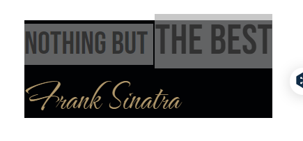
how it looks now

2

Answers


  1. Chosen as BEST ANSWER

    It does seems to me like the proper way, but it works. I had to set bigger text line-heigt to 45px and the smaller one to 15px.

                  <h2 className="text-font-color text-7xl  
                   leading-[15px]">nothing but 
                  </h2>
    
                  <h1 className="text-secondary text-9xl leading-[45px] ">the best</h1>
    

    1. Use <span> instead of <p>
    2. wrap both text in <span>

    hope this will work as you expected.

    <div className="flex flex-col gap-4">
        <div className="font-bebas bg-font-color ">
            <h1 className="text-font-color text-4xl flex items-center flex-row gap-2">
                <span>nothing but</span>
                <span className="text-secondary text-5xl self-end">the best</span>
            </h1>
        </div>
        <h2 className="text-secondary font-nautigal text-5xl">Frank Sinatra</h2>
    </div>
    
    Login or Signup to reply.
Please signup or login to give your own answer.
Back To Top
Search