skip to Main Content

Here’s what I want to achieve. There’s a red sidebar on the left, width fixed with 160px. Meanwhile I want to keep the blue box in the center of the page if possible, with the maximum width of 240px.

But when there’s no enough space, I do not want the blue box to overlap the red box, so the blue box doesn’t have to be centered anymore (figure 3).

When there’s even less room, the blue box should be shrinked to fit in the available space (figure 4).

enter image description here

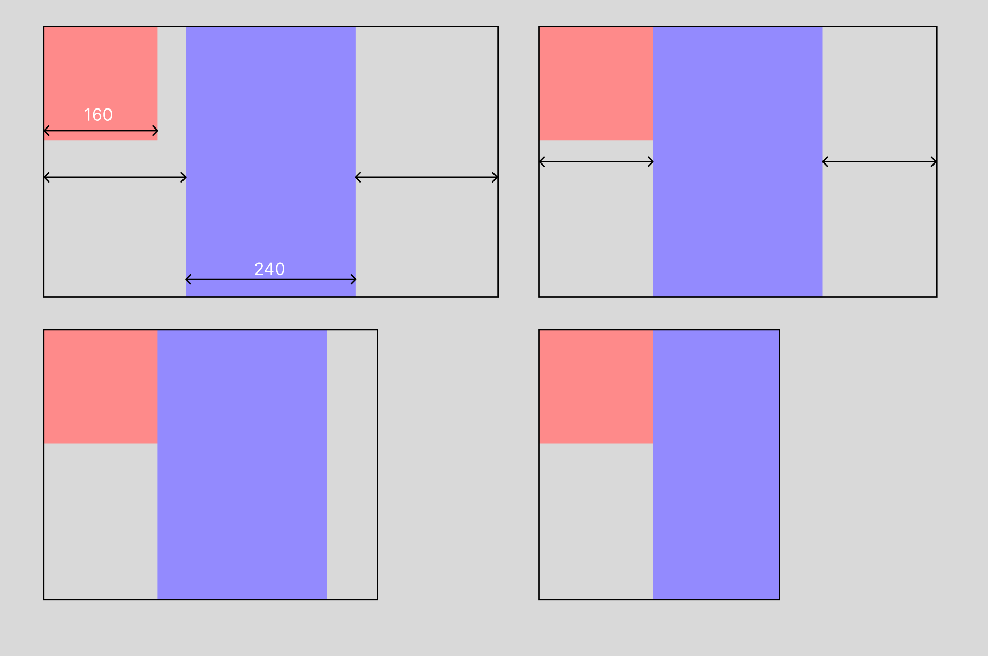
I’m trying to use position: absolute on the red box but it causes overlapping. Any suggestions?

* {
  box-sizing: border-box;
}

body {
  margin: 0;
  height: 100vh;
}

section {
  width: 100%;
  height: 100%;
  display: flex;
  justify-content: center;
}

side {
  width: 160px;
  height: 160px;
  background-color: salmon;
  flex: 0 0 160px;
  justify-self: start;
  position: absolute;
  left: 0;
}

main {
  width: 240px;
  height: 100%;
  background-color: steelblue;
  flex: 0 1 240px;
}
<section>
  <side></side>
  <main></main>
</section>

2

Answers


  1. Just add a margin on an appropriate media query:

    * {
      box-sizing: border-box;
    }
    
    body {
      margin: 0;
      height: 100vh;
    }
    
    section {
      width: 100%;
      height: 100%;
      display: flex;
      justify-content: center;
    }
    
    side {
      width: 160px;
      height: 160px;
      background-color: salmon;
      flex: 0 0 160px;
      justify-self: start;
      position: absolute;
      left: 0;
    }
    
    main {
      width: 240px;
      height: 100%;
      background-color: steelblue;
      flex: 0 1 240px;
    
      @media screen and (width < 560px) {
        margin-inline: 160px auto;
      }
    }
    <section>
      <side></side>
      <main></main>
    </section>
    Login or Signup to reply.
  2. use grid layout

    * {
        box-sizing: border-box;
      }
    
      body {
        margin: 0;
        height: 100vh;
      }
    
      section {
        width: 100%;
        height: 100%;
        display: grid;
        grid-template-columns: 1fr auto 1fr;
      }
    
      side {
        width: 160px;
        height: 160px;
        background-color: salmon;
      }
    
      main {
        width: 240px;
        height: 100%;
        background-color: steelblue;
      }
    <section>
      <side></side>
      <main></main>
    </section>
    Login or Signup to reply.
Please signup or login to give your own answer.
Back To Top
Search