


I’m building a features section of an e-commerce website and was wondering how I’d be able to keep the boxes the same size. They currently change depending on the size of the media but I want to keep all the boxes the same size. Currently looks like this depending on the size of the SVG. Alternatively, is it possible to make all the svgs the same size? 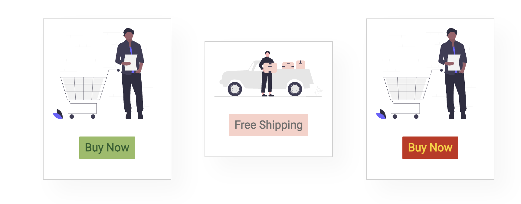
 #feature{
  display: flex;
  align-items: center;
  justify-content: space-between;
  flex-wrap: wrap;
}
#feature .fe-box{
  width: 180px;
  text-align: center;
  padding: 15px 15px;
  justify-content: center;
  box-shadow:20px 20px 34px rgba(0, 0, 0, .03) ;
  border: 1px solid #D3D3D3;
  margin:15px 0;
}

#feature img {
  display: flex;
  flex: 1;
  order: 1;
  width: 100%;
  flex-wrap: wrap;
  align-content: center;
  align-items: center;
  justify-content: center;
  flex-direction: row;
  margin-bottom: 10px;
}

#feature .fe-box:hover{
  box-shadow:-10px 10px 50px rgba(0, 0, 0, .25) ;
}

#feature .fe1 h3{
  display: inline-block;
  padding:9px 9px 9px 9px;
  line-height: 1;
  border-radius: 1px;
  background: #97BC62;
  color: #2C5F2D;
}
#feature .fe2 h3{
  display: inline-block;
  padding:9px 9px 9px 9px;
  line-height: 1;
  border-radius: 1px;
  background: #FAD0C9;
  color: #6E6E6D;
}
#feature .fe3 h3{
  display: inline-block;
  padding:9px 9px 9px 9px;
  line-height: 1;
  border-radius: 1px;
  background: #c72d1b;
  color: #FDD20E;
}
#feature .fe4 h3{
  display: inline-block;
  padding:9px 9px 9px 9px;
  line-height: 1;
  border-radius: 1px;
  background: #97BC62;
  color: #2C5F2D;
}
#feature .fe5 h3{
  display: inline-block;
  padding:9px 9px 9px 9px;
  line-height: 1;
  border-radius: 1px;
  background: #97BC62;
  color: #2C5F2D;
}
<section id="feature" class="fe-pad">
<div class="fe-box fe1">
<img src="/img/emptycart.svg">
<h3>Buy Now</h3>
</div>
<div class="fe-box fe2">
<img src="/img/freeship.svg">
<h3>Free Shipping</h3>
</div>
<div class="fe-box fe3">
<img src="/img/emptycart.svg">
<h3>Buy Now</h3>
</div>
<div class="fe-box">
<img src="/img/emptycart.svg">
<h3>Buy Now</h3>
</div>
<div class="fe-box">
<img src="/img/emptycart.svg">
<h3>Buy Now</h3>
</div>
</section>
2
Answers
If you want to keep boxes at the fixed size you can try this code:
Now boxes will have a fixed width of "180px", and the content inside each box will not affect the box size.
You just need to specify the box’s height:
Then by doing this, the button will be at the bottom of the image not the bottom of the box, what we can do is by adding:
on the box, and:
on the button styling