skip to Main Content

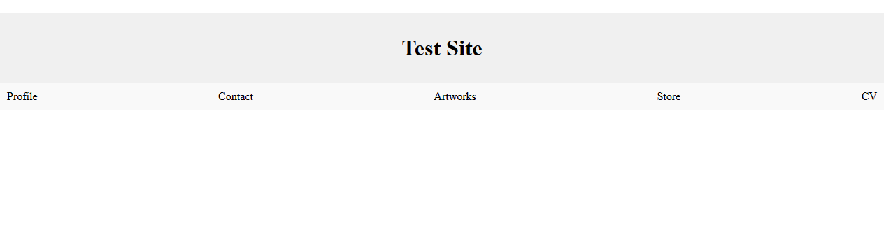
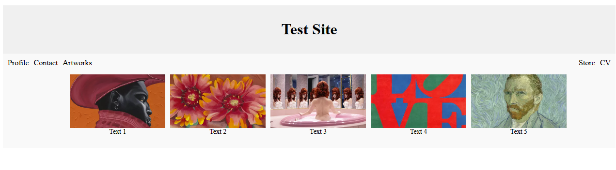
I have a dropdown menu setup but I don’t want there to be a gap in the .navbar element when it is opened. This is between the artwork and store element. Before the (artwork) dropdown element is clicked the .nav bar is in its desired state but when it is clicked a gap appears between artwork and store – as you can see in the images.

Before Artwork element clicked

After Artwork element clicked (dropdown appears but gap present)

<!DOCTYPE html>
<html>
<head>
    <title>Dropdown Menu with Thumbnails and Text</title>
    <style>
        .navbar {
            display: flex;
            justify-content: space-between;
            background-color: #f9f9f9;
            padding: 10px;
            position: static;
        }
        
        .navbar-item {
            margin-right: 10px;
        }
        
        .dropdown {
            position: relative;
            display: inline-block;
        }
        
        .dropdown-content {
            display: none;
            background-color: #f9f9f9;
             /* Set the width to 500 pixels */
            padding: 10px;
            left: 50%; /* Center the dropdown horizontally */


        }
        
        .dropdown:hover .dropdown-content {
            display: block;
        }
        
        .thumbnails-row {
            display: flex;
            justify-content: flex-start;
            align-items: center;
            flex-wrap: nowrap; /* Change to nowrap to keep thumbnails in a single line */
            padding: 5px;
            overflow-x: auto; /* Add horizontal scrolling when necessary */
        }
        
        .thumbnail-container {
            display: flex;
            flex-direction: column;
            align-items: center;
            justify-content: center; /* Center the thumbnail elements horizontally and vertically */
            margin-right: 10px;
        }
        
        .thumbnail {
            width: 100%;
            max-width: 300px;
            height: auto;
            cursor: pointer;
            object-fit: cover;
        }
        
        .thumbnail-text {
            font-size: 14px;
        }
        
        .header {
            background-color: #f0f0f0;
            padding: 10px;
            text-align: center;
        }
        
        /* Adjust margin-right for the last navbar item */
        .navbar-item:last-child {
            margin-right: 0;
        }
    </style>
</head>
<body>
   <div class="header">
      <!-- Content of the header -->
      <h1>Test Site </h1>
  </div>
  
  <div class="navbar">
      <div class="navbar-item">Profile</div>
      <div class="navbar-item">Contact</div>
      <div class="dropdown">
          <!-- Dropdown menu trigger element -->
          <span class="navbar-item" >Artworks</span>
          
          <!-- Dropdown menu content -->
          <div class="dropdown-content">
              <div class="thumbnails-row">
                  <!-- Thumbnail items -->
                  <div class="thumbnail-container">
                      <img src="/images/1.webp" alt="Thumbnail 1" class="thumbnail">
                      <span class="thumbnail-text">Text 1</span>
                  </div>
                  <div class="thumbnail-container">
                      <img src="/images/2.webp" alt="Thumbnail 2" class="thumbnail">
                      <span class="thumbnail-text">Text 2</span>
                  </div>
                  <div class="thumbnail-container">
                      <img src="/images/3.webp" alt="Thumbnail 3" class="thumbnail">
                      <span class="thumbnail-text">Text 3</span>
                  </div>
                  <div class="thumbnail-container">
                      <img src="/images/4.webp" alt="Thumbnail 4" class="thumbnail">
                      <span class="thumbnail-text">Text 4</span>
                  </div>
                  <div class="thumbnail-container">
                      <img src="images/5.webp" alt="Thumbnail 5" class="thumbnail">
                      <span class="thumbnail-text">Text 5</span>
                  </div>
              </div>
          </div>
      </div>
      <div class="navbar-item">Store</div>
      <div class="navbar-item">CV</div>
  </div>
</body>
</html>

I changed .dropdown-content to position: absolute; but I couldn’t figure out how to format it to be page width and centre aligned. With position: static; I get the alignment result I want but the navigation bar has a gap between artworks and store.

2

Answers


  1. You have to just update .dropdown-content from below code. and you will get what you want

       .navbar {
                display: flex;
                justify-content: space-between;
                background-color: #f9f9f9;
                padding: 10px;
                position: static;
            }
            
            .navbar-item {
                margin-right: 10px;
            }
            
            .dropdown {
                position: relative;
                display: inline-block;
            }
            
            .dropdown-content {           
                position: absolute;
                background-color: #f9f9f9;
                 /* Set the width to 500 pixels */
                padding: 10px;            
                left: 50%; /* Center the dropdown horizontally */
                top: 0
                position: absolute;
                transform: translateX(-50%)       
                
            }
            
            .dropdown:hover .dropdown-content {
                display: block;
            }
            
            .thumbnails-row {
                display: flex;
                justify-content: flex-start;
                align-items: center;
                flex-wrap: nowrap; /* Change to nowrap to keep thumbnails in a single line */
                padding: 5px;
                overflow-x: auto; /* Add horizontal scrolling when necessary */
            }
            
            .thumbnail-container {
                display: flex;
                flex-direction: column;
                align-items: center;
                justify-content: center; /* Center the thumbnail elements horizontally and vertically */
                margin-right: 10px;
                width            
            }
            
            .thumbnail {
                width: 100%;
                max-width: 300px;
                height: auto;
                cursor: pointer;
                object-fit: cover;
            }
            
            .thumbnail-text {
                font-size: 14px;
            }
            
            .header {
                background-color: #f0f0f0;
                padding: 10px;
                text-align: center;
            }
            
            /* Adjust margin-right for the last navbar item */
            .navbar-item:last-child {
                margin-right: 0;
            }
    <!DOCTYPE html>
    <html>
    <head>
        <title>Dropdown Menu with Thumbnails and Text</title>
    </head>
    <body>
       <div class="header">
          <!-- Content of the header -->
          <h1>Test Site </h1>
      </div>
      
      <div class="navbar">
          <div class="navbar-item">Profile</div>
          <div class="navbar-item">Contact</div>
          <div class="dropdown">
              <!-- Dropdown menu trigger element -->
              <span class="navbar-item" >Artworks</span>
              
              <!-- Dropdown menu content -->
              <div class="dropdown-content">
                  <div class="thumbnails-row">
                      <!-- Thumbnail items -->
                      <div class="thumbnail-container">
                          <img src="/images/1.webp" alt="Thumbnail 1" class="thumbnail">
                          <span class="thumbnail-text">Text 1</span>
                      </div>
                      <div class="thumbnail-container">
                          <img src="/images/2.webp" alt="Thumbnail 2" class="thumbnail">
                          <span class="thumbnail-text">Text 2</span>
                      </div>
                      <div class="thumbnail-container">
                          <img src="/images/3.webp" alt="Thumbnail 3" class="thumbnail">
                          <span class="thumbnail-text">Text 3</span>
                      </div>
                      <div class="thumbnail-container">
                          <img src="/images/4.webp" alt="Thumbnail 4" class="thumbnail">
                          <span class="thumbnail-text">Text 4</span>
                      </div>
                      <div class="thumbnail-container">
                          <img src="images/5.webp" alt="Thumbnail 5" class="thumbnail">
                          <span class="thumbnail-text">Text 5</span>
                      </div>
                  </div>
              </div>
          </div>
          <div class="navbar-item">Store</div>
          <div class="navbar-item">CV</div>
      </div>
    </body>
    </html>
    Login or Signup to reply.
  2. Posting this answer as a Community Wiki based on the comment from CBroe.

    Remove position: relative; from .dropdown, position
    .dropdown-content with:

    position: absolute; 
    left: 0; 
    right: 0; 
    

    And change .thumbnails-row to justify-content: center;

    Login or Signup to reply.
Please signup or login to give your own answer.
Back To Top
Search