skip to Main Content

I have multiple elements, which are not in a container, and I can’t put them into a container neither. For example:

<div class="code-line">Code line 1</div>
<div class="code-line">Code line 2</div>
<div class="code-line">Code line 3</div>
<div class="code-line">Code line 4</div>
<div class="code-line">Code line 5</div>
<div class="code-line">Code line 6</div>
<div class="code-line">Code line 7</div>
<div class="code-line">Code line 8</div>
<div class="code-line">Code line 9</div>
<div class="code-line">Code line 10</div>

With some minimal css:

.code-line {
  background-color: #e9dfba;
}

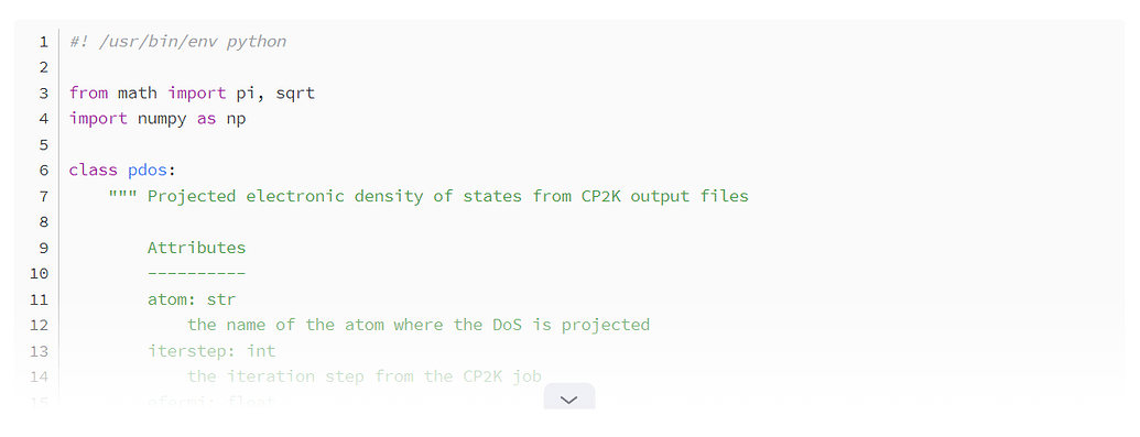
How could I achieve that the opacity is decreased on the last 4-5 lines and it has a continuous effect. Something similar like this:
enter image description here

About line 12, it gets a little less visible, and it proceeds to the last line it is barely visisble.

The best I could do, is to set the opacity on the lines (0.8, 0.6, 0.4, 0.2), but it is not seamless, because the horizontal lines (the difference in opacity between the elements) can be seen (it is barely visible on the picture, but it is definitely more visible on the screen):

enter image description here

4

Answers


  1. Rather than using opacity, which applies evenly across the entire element, you should use a gradient mask.

    The neatest way to superimpose a gradient on top of something is with an ::after pseudo-element. Your elements may not be in a specific container, but all elements are contained in the <body> element, so you could apply the gradient at that level. If you want the text to fade into the background, then make the gradient colour match the background colour, or if you want it all to fade to white, then make it a white gradient.

    body {
      background-color: #e9dfba;
      position: relative;
    }
    
    body::after {
      content: '';
      position: absolute;
      top: 0;
      bottom: 0;
      left: 0;
      right: 0;
      background: linear-gradient(180deg, rgba(233,223,186,0) 50%, rgba(233,223,186,1) 100%);
    }
    <div>Code line 1</div>
    <div>Code line 2</div>
    <div>Code line 3</div>
    <div>Code line 4</div>
    <div>Code line 5</div>
    <div>Code line 6</div>
    <div>Code line 7</div>
    <div>Code line 8</div>
    <div>Code line 9</div>
    <div>Code line 10</div>

    If there is really no container element you can use, and you only want to style the individual items, then you could just split the gradient into five and apply a section of it to each of the last five items.

    .d1 {
      background-color: #e9dfba;
      position: relative;
    }
    
    .d1::after {
      content: '';
      position: absolute;
      top: 0;
      bottom: 0;
      left: 0;
      right: 0;
    }
    
    .d1:nth-last-child(5)::after {
      background: linear-gradient(180deg, rgba(233,223,186,0) 0%, rgba(233,223,186,0.2) 100%);
    }
    
    .d1:nth-last-child(4)::after {
      background: linear-gradient(180deg, rgba(233,223,186,0.2) 0%, rgba(233,223,186,0.4) 100%);
    }
    
    .d1:nth-last-child(3)::after {
      background: linear-gradient(180deg, rgba(233,223,186,0.4) 0%, rgba(233,223,186,0.6) 100%);
    }
    
    .d1:nth-last-child(2)::after {
      background: linear-gradient(180deg, rgba(233,223,186,0.6) 0%, rgba(233,223,186,0.8) 100%);
    }
    
    .d1:nth-last-child(1)::after {
      background: linear-gradient(180deg, rgba(233,223,186,0.8) 0%, rgba(233,223,186,1) 100%);
    }
    <div class="d1">Code line 1</div>
    <div class="d1">Code line 2</div>
    <div class="d1">Code line 3</div>
    <div class="d1">Code line 4</div>
    <div class="d1">Code line 5</div>
    <div class="d1">Code line 6</div>
    <div class="d1">Code line 7</div>
    <div class="d1">Code line 8</div>
    <div class="d1">Code line 9</div>
    <div class="d1">Code line 10</div>
    Login or Signup to reply.
  2. For those browsers which support :has (currently all the main ones except Firefox which requires a flag to be set) you can find the last element.

    Then you can overlay it with a linear-gradient which goes from transparent to white and sits in its before pseudo element with negative top margin.

    That way the last element will be obscured and the amount of transparency can be controlled by setting the height of the pseudo element.

    <div class="code-line">Code line 1</div>
    <div class="code-line">Code line 2</div>
    <div class="code-line">Code line 3</div>
    <div class="code-line">Code line 4</div>
    <div class="code-line">Code line 5</div>
    <div class="code-line">Code line 6</div>
    <div class="code-line">Code line 7</div>
    <div class="code-line">Code line 8</div>
    <div class="code-line">Code line 9</div>
    <div class="code-line">Code line 10</div>
    <style>
      .code-line {
        background-color: #e9dfba;
      }
      
      .code-line:not(:has(+ .code-line))::before {
        content: '';
        position: absolute;
        width: 100%;
        height: 5em;
        background-image: linear-gradient(transparent, #e9dfba);
        margin-top: -4em;
        z-index: 1;
      }
    </style>

    Note, if you want the background color to fade as well then set the linear gradient to go to white rather than #e9dfba

    Login or Signup to reply.
  3. Consider using mask-image:

    main {
      background-color: #e9dfba;
    }
    
    .code {
      mask-image: linear-gradient(to bottom, white 50%, transparent 100%);
      -webkit-mask-image: linear-gradient(to bottom, white 50%, transparent 100%);
    }
    <main>
      <div class="code">
        <div class="code-line">Code line 1</div>
        <div class="code-line">Code line 2</div>
        <div class="code-line">Code line 3</div>
        <div class="code-line">Code line 4</div>
        <div class="code-line">Code line 5</div>
        <div class="code-line">Code line 6</div>
        <div class="code-line">Code line 7</div>
        <div class="code-line">Code line 8</div>
        <div class="code-line">Code line 9</div>
        <div class="code-line">Code line 10</div>
      </div>
    </main>

    Check the browser coverage on caniuse.com

    Login or Signup to reply.
  4. You could use js to dynamically adjust the opacity of the lines to create a fading effect. This will not be as seamless as the gradient overlay but its a workaround given that you cant put elements into a container.

    // Get code lines into array
    const codeLines = Array.from(document.querySelectorAll('.code-line'));
    
    // Num of lines you want to fade - the last 5 lines
    const fadeLines = 5;
    
    // Calc the decrement step for opacity
    const decrementStep = 1 / fadeLines;
    
    // Loop through the last fadeLines elements and set opacity
    for (let i = 0; i < fadeLines; i++) {
      const opacity = 1 - (i + 1) * decrementStep;
      codeLines[codeLines.length - 1 - i].style.opacity = opacity;
    }
    

    Ofc you can adjust the fadeLines and decrementStep to control how many lines are affected and how quickly they fade out.

    Login or Signup to reply.
Please signup or login to give your own answer.
Back To Top
Search