skip to Main Content

I want to achieve this same effect as this sample picture where there is 2 layers of the same color tone behind the main image:

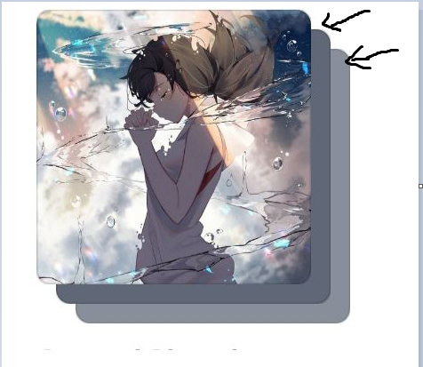
Here is what I have tried so far:

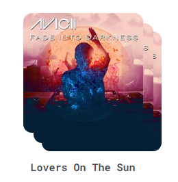
My attempt: I duplicated the main image 3 times and stacked them on top of each other. However, I still have no idea how to style 2nd and 3rd image layer to achieve the same effect as the sample picture. I have tried blurred and frosted glass effects but it just look hideous.

<div v-for="song in top4Songs" :key="song.id" class="song-container">
        <div id="parent">
          <div>               
              <div class="song-image-container">
                  <img :src="song.coverUrl">
              </div>
            
            <div class="song-info">
                <div class="song-image-container2">
                <img :src="song.coverUrl">
                <h2>{{song.title}}</h2>
            </div>           
              
            </div>
            <div class="song-image-container3">
              <img :src="song.coverUrl">
              
            </div>
          </div>
        </div>

CSS

/* second layer */
.song-image-container 
{
  position:absolute;
  top: 12px;
  left: 12px;
  z-index: 1;
}

/* first layer */
.song-image-container2 {
  position: relative;
  top: 0;
  left: 0;
  z-index: 2;
  /*  */ 
}
/*third layer*/
.song-image-container3 
{
  position: absolute; 
  top: 22px;
  left: 22px;
  z-index: 0;  
}

Any suggestions to achieve this specific effect would be really appreciated.

2

Answers


  1. create an overlay that covers the top of each image Ex:

    <div class="song-image-container">
         <img width="300" :src="song.coverURL">
         <div class="song-image-overlay"></div>
     </div>
    

    Give the overlay a low opacity gray and a back-drop blur Ex:

    .song-image-overlay
    {
        width: 100%;
        height: 100%;
        position: absolute;
        top: 12px;
        left: 12px;
        z-index: 1;
        background-color: rgba(0, 0, 0, 0.3);
        backdrop-filter: blur(20px);
    }
    

    adjust the color, opacity, and blur to your liking between the two images behind your original image.

    If this solution doesn’t fit your needs, check this link: Get average color of image via Javascript

    Login or Signup to reply.
  2. You can achieve this with one div and the image. You just need to add a ::before and ::after to the div and style them appropriately. The opacity styling might not be right here for the ::before and ::after, but you should be able to land the plane from here.

    .song-image-container {
      border-radius: 20px;
      height: 360px;
      position: relative;
      width: 360px;
    }
    
    .song-image-container img {
      border-radius: 20px;
      height: 100%;
      object-fit: cover;
      width: 100%;
    }
    
    .song-image-container::before, 
    .song-image-container::after {
      background-image: url(https://images.unsplash.com/photo-1495615080073-6b89c9839ce0?ixlib=rb-4.0.3&ixid=M3wxMjA3fDB8MHxzZWFyY2h8Mnx8c3F1YXJlfGVufDB8fDB8fHww&auto=format&fit=crop&w=800&q=60);
      background-size: cover;
      border-radius: 20px;
      content: '';
      height: 100%;
      left: 12px;
      opacity: 0.5;
      position: absolute;
      top: 12px;
      z-index: -1;
      width: 100%;
    }
    .song-image-container::after {
      border-radius: 20px;
      content: '';
      left: 24px;
      top: 24px;
      z-index: -2;
    }
    
    body {
        display: grid;
        height: 100vh;
        margin: 0;
        place-items: center;
    }
    <div class="song-image-container">
      <img src="https://images.unsplash.com/photo-1495615080073-6b89c9839ce0?ixlib=rb-4.0.3&ixid=M3wxMjA3fDB8MHxzZWFyY2h8Mnx8c3F1YXJlfGVufDB8fDB8fHww&auto=format&fit=crop&w=800&q=60" alt="cover art for...">
    </div>

    If you needed to supply the image for the background via the markup, you could just add style="background-image: url(...imageurl...);". This would give you the same effect and you wouldn’t need to adjust the CSS for each element.

    Login or Signup to reply.
Please signup or login to give your own answer.
Back To Top
Search