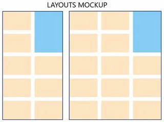
I’m making a React app which renders xy number of cards and a single widget inside a flex container. All cards have the same width and height, but widget’s height equals to card height * 2 + row-gap. The container’s width varries based on viewport width and should visually look as 2 or 3 columns with cards respectively. I’m providing a mockup image of needed layouts for further clarity, widget is depicted with blue color.
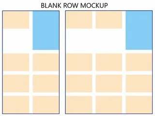
Whatever I tried, I couldn’t get the widget to display in the correct spot without changing the height of the row to its size, leaving a "blank row" where 1 or 2 more cards should be rendered as displayed on the following image.
My current solution involves Javascript, where based on the viewport width I’m loading 2 or 4 cards into a separate small flex container which is rendered as the first child of the main flex container. This workaround works great visually, but complicates my code a lot seeing as i have to cover many different cases for it to function correctly. I want to achieve the same thing using css/flexbox but I’m still a beginner, have never done a layout like this before and obviously can’t figure out how to do so. Widget can’t be absolutely positioned because that breaks the scroll functionality of its child element.
I’m providing test HTML and CSS measurements in correct ratio in case it helps.
.container {
  margin: 50px 300px;
  display: flex;
  flex-wrap: wrap;
  row-gap: 20px;
  column-gap: 20px;
  min-width: 320px; /* Width for 2 columns */
  max-width: 490px; /* Width for 3 columns */
  border: 3px solid rgb(0, 22, 117);
}

.card {
  width: 150px;
  height: 100px;
  background-color: bisque;
}

.widget {
  height: 220px; /* card height * 2 + row-gap */
  width: 150px;
  background-color: rgb(134, 204, 245);
}
<div class="container">
<div class="widget"></div>
<div class="card"></div>
<div class="card"></div>
<div class="card"></div>
<div class="card"></div>
<div class="card"></div>
<div class="card"></div>
<div class="card"></div>
<div class="card"></div>
<div class="card"></div>
<div class="card"></div>
<div class="card"></div>
<div class="card"></div>
<div class="card"></div>
<div class="card"></div>
<div class="card"></div>
<div class="card"></div>
<div class="card"></div>
<div class="card"></div>
</div>
<!-- Original jsx
<div className='container'>
<div className='widget'></div>
<div className='card'></div>
<div className='card'></div>
<div className='card'></div>
<div className='card'></div>
<div className='card'></div>
<div className='card'></div>
<div className='card'></div>
<div className='card'></div>
<div className='card'></div>
<div className='card'></div>
<div className='card'></div>
<div className='card'></div>
<div className='card'></div>
<div className='card'></div>
<div className='card'></div>
<div className='card'></div>
<div className='card'></div>
<div className='card'></div>
</div>
-->I really want to learn how to create layouts such as this one in flexbox, not only because of my current project, but also to expand my knowledge and understanding in general. Please help me if you have any idea on how to solve this. Thank you in advance 🙂


2
Answers
This can be done using grid-layout without javascript, here’s an example:
As @ralph.m mentioned. You can always set
.widgeton the right most column by settinggrid-column-end: -1;to your.widgetFlexbox layout is unable to do this, it does not create a 2d grid, you will have to use the gridbox layout., so elements can be spanning rows and columns without leaving a gap.
here is an example:
row dense,auto-fill&grid-column-endare the rules/value that are usefull here to use 🙂 among these see : https://developer.mozilla.org/en-US/docs/Web/CSS/grid-column-end