I previously asked a question about the Bootstrap 5 navbar here:
Adjust navbar height to be smaller
and I did receive answers that were helpful. Thank you. I do have a follow-up question:
I would like to change the alignment of the links in small view.
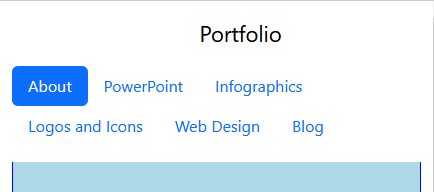
This is what I have:
<header>
    <div class="container fixed-top bg-white py-3">
      <header class="d-flex flex-wrap justify-content-center">
        <a href="/" class="d-flex align-items-center mb-3 mb-md-0 me-md-auto link-body-emphasis text-decoration-none">
          <svg class="bi me-2" width="40" height="32"><use xlink:href="#bootstrap"/></svg>
          <span class="fs-4">Portfolio</span>
        </a>

        <ul class="nav nav-pills">
          <li class="nav-item"><a href="#" class="nav-link active" aria-current="page">About</a></li>
          <li class="nav-item"><a href="#" class="nav-link">PowerPoint</a></li>
          <li class="nav-item"><a href="#" class="nav-link">Infographics</a></li>
          <li class="nav-item"><a href="#" class="nav-link">Logos and Icons</a></li>
          <li class="nav-item"><a href="#" class="nav-link">Web Design</a></li>
          <li class="nav-item"><a href="#" class="nav-link">Blog</a></li>
        </ul>
    </div>
    </header>
This is how it currently looks:
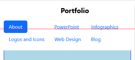
I would like it to look like this:
What I tried was with a separate css file for the smallest view:
@media (min-width: 0px) {
.nav-link-powerpoint{
        margin-top: 5px;
        margin-left: 86px;
    }

    .nav-link-infographic {
      margin-top: 5px;
        margin-left: 39px;
    }
That did fix the horizontal alignment:
but now it seemed to override the vertical alignment and the text-decoration-none in this section:
<a href="/" class="d-flex align-items-center mb-3 mb-md-0 me-md-auto link-body-emphasis text-decoration-none">
Is there a way to align it vertically like this (the red line is to show the alignment) :
But without the underline for the links. Is there a better way to do this?
Thank you,






2
Answers
Instead of using your own written css to style the links, why not use bootstrap classes for breakpoints on the elements you want to style differently on smaller screens.
For example, you can set
mx-sm-autoorms-sm-5andme-sm-5on the powerpoint link to make it behave differently on smaller screens.You can read more about bootstrap breakpoints here Breakpoints-v5 and spacing here Spacing-v5
Maybe this is not better way, buy you can try this :
Most of the time in these situations, using bootstrap grid system saves life.