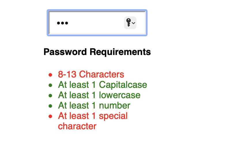
I have an input field that has some validations, such as size, capital letters, special characters, among others.
Validation is like any other input field, if the user enters the requirement, then the requirement turns green, if something is missing, then it turns red.
The problem is, I want to apply these styles only after the user finishes typing the password. For example, if the requirement is to have at least 6 characters, then if the user leaves the input field, and the size of the entered value to 5, then the label turns red.
Initially, I would like all verification labels to be black, and only turn green or red depending on what the user typed.
Here’s my code I put into codesandbox.io
import React from "react";

class Password extends React.Component {
  constructor(props) {
    super(props);
    this.state = {
      text: "",
      req: {
        len: "invalid",
        cap: "invalid",
        num: "invalid",
        spec: "invalid"
      }
    };
  }
  handleChange = (e) => {
    this.setState({ text: e.target.value });
  };
  render() {
    let reqState = {};

    reqState.len = this.state.text.length >= 7 ? "valid" : "invalid";
    reqState.cap = this.state.text.match(/[A-Z]/) ? "valid" : "invalid";
    reqState.low = this.state.text.match(/[a-z]/) ? "valid" : "invalid";
    reqState.num = this.state.text.match(/[0-9]/) ? "valid" : "invalid";
    reqState.spec = this.state.text.match(/[~!@#$%^&*-_]/)
      ? "valid"
      : "invalid";

    return (
      <div style={styles.login}>
        <input
          type="password"
          style={styles.inputs}
          placeholder="Password"
          value={this.state.text}
          onChange={this.handleChange}
        />

        <h4>Password Requirements</h4>
        <div style={styles.reqs}>
          <ul style={styles.requirements}>
            <li style={styles[reqState.len]}>8-13 Characters</li>
            <li style={styles[reqState.cap]}>At least 1 Capitalcase</li>
            <li style={styles[reqState.low]}>At least 1 lowercase</li>
            <li style={styles[reqState.num]}>At least 1 number</li>
            <li style={styles[reqState.spec]}>At least 1 special character</li>
          </ul>
        </div>
      </div>
    );
  }
}

export default Password;
const styles = {
login: {
width: "75%"
},
inputs: {
display: "block",
margin: "0 auto",
marginTop: "20px",
padding: "12px",
borderRadius: "0.5"
},
button: {
padding: "16px",
marginTop: "20px",
backgroundColor: "#113163",
color: "#efefef",
fontSize: "large"
},
reqs: {
margin: "0 auto",
width: "60%"
},
requirements: {
textAlign: "left"
},
valid: {
color: "green"
},
invalid: {
color: "red"
}
};Can u tell me how can I do that? Thank you in advance!!
AFTER @mandy8055 CODE


2
Answers
You can achieve your desired state by using
blurevent. You just need to add a new propertytouchedto your state to keep track of whether the input field has been touched (focused and blurred) by the user. Something like:EDIT:
As per your comment, to apply only the valid styles while user is typing, you need to modify the
getStylefunction which I provided. Add one condition:CODE SANDBOX
This code will work for you on
Password.js:In the code above, I added an onBlur event handler in combination with the untouched style. Therefore, everything will be black until the password is touched and then blurred (lost focus).