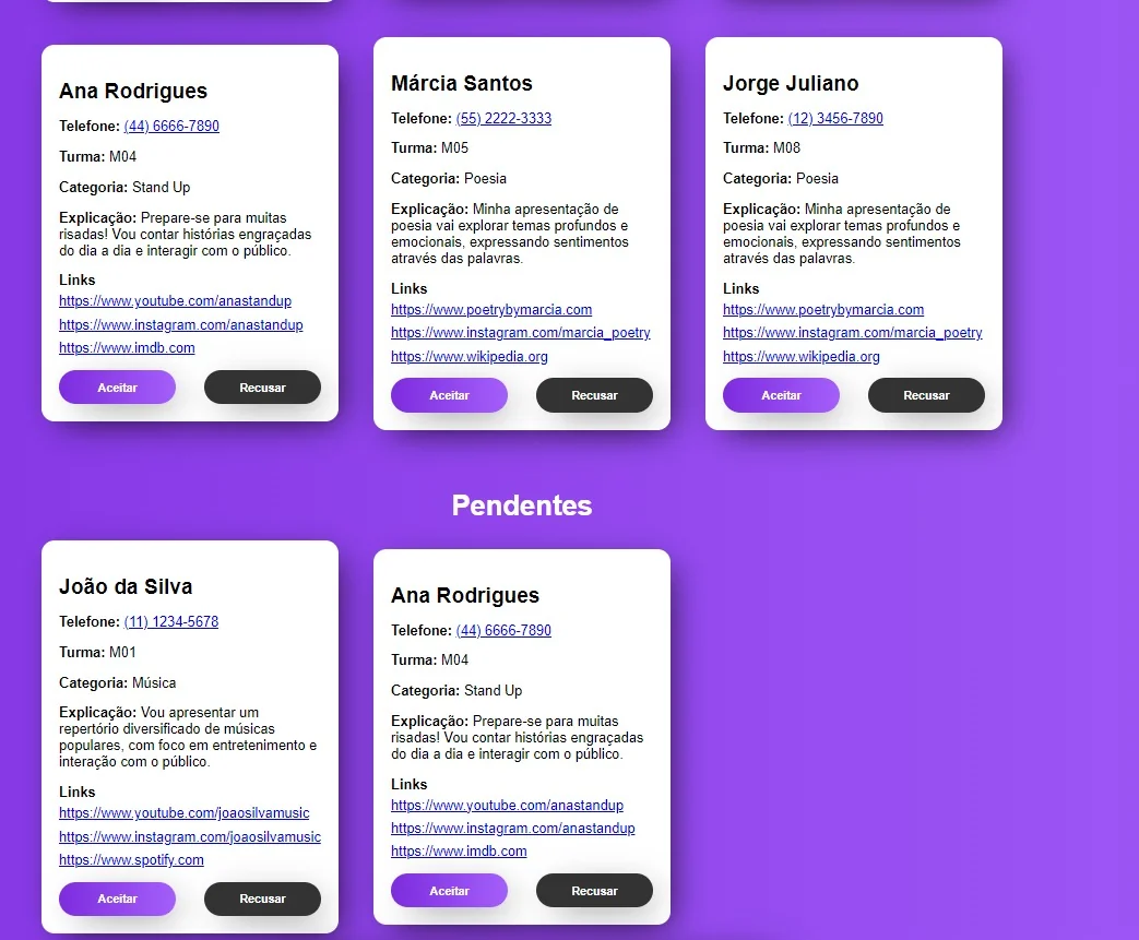
I’m having trouble dealing with display: grid. I made a responsive grid for this site limiting the maximum resolution to only have 3 columns, however, when there are less than 3, the elements are thrown to the corner, and not centered. How do I fix this?
The second line has less than three. I would like that when I got less than 3 they all centered in the middle instead of being in the left corner
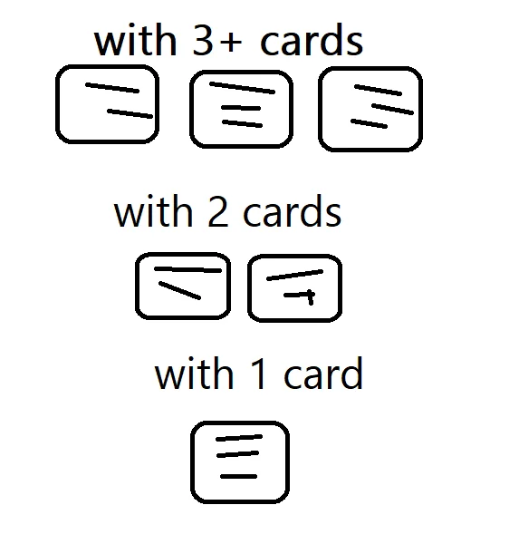
The paint print is a representation of what I’m wanting to do
Codes
REACT
    <div className={classes["wrapper"]}>
      <div className={classes["candidatos"]}>
        <h1>Candidatos pendentes</h1>
        <div className={classes["pendentes"]}>
          {candidatos.map((candidato, index) => (
            <Candidato
              showButtons={true}
              key={index}
              index={index}
              candidato={candidato}
              onAceitar={aceitarHandle}
              onRecusar={recusarHandle}
            />
          ))}
        </div>
        <h1>Candidatos aceitos</h1>
        <div className={classes["aceitos"]}>
          {aceitos.map((candidato, index) => (
            <Candidato showButtons={false} key={index} candidato={candidato} />
          ))}
        </div>
        <h1>Candidatos recusados</h1>
        <div className={classes["recusados"]}>
          {recusados.map((candidato, index) => (
            <Candidato showButtons={false} key={index} candidato={candidato} />
          ))}
        </div>
      </div>
    </div>
SASS
.wrapper
  justify-content: center
  align-items: center
  display: flex
  flex-direction: column
  margin-bottom: 5rem

  h1
    color: #fff

.candidatos
  display: flex
  flex-direction: column
  align-items: center
  align-content: center
  width: 100%

  .pendentes, .aceitos, .recusados
    margin-bottom: 3rem
    display: grid
    gap: 2.5rem
    grid-template-columns: repeat(3, 1fr)

    @media (width <= 780px)
      grid-template-columns: repeat(1, 1fr)

    @media (780px < width <= 1150px)
      grid-template-columns: repeat(2, 1fr)


2
Answers
To center the grid items when there are fewer than three columns, you can add the property justify-items: center; to your grid container. This will align the items horizontally to the center of the grid cells. Here’s how you can modify your SASS code to achieve this:
As for as I can tell, you are defining three grid columns. Grids always put items inside grid areas, not across them. Therefore your existing CSS doesn’t work.
If you want automatic centering, you need to define each row as a flex container, and style them accordingly with
justify-item: space-evenly