


Basically I have two conflicting requirements for my template that I cannot find a solution for:
- it’s a 2×2 grid with 4 images, each image centered in its own cell,
- the image sizes must shrink when the screen height gets too small, and
- the letter ‘O’ div must stay at the bottom right corner of its image
I have spent a significant amount of time creating the minimum reproducible example below that is very well documented. I think the problem is best understood when reading the code and looking at the pictures. I think the easiest way to work with this would be to create two files inside of a folder on your Desktop and then open the index.html file in the browser while using the inspector tool settings that I am showing in the images below. But you can also view the Codepen here.
.outermost-container {
  padding: 40px;
  height: calc(100vh - 80px);
  display: flex;
  justify-content: center;
  align-items: center;
}

.container {
  display: grid;
  grid-template-columns: 1fr 1fr;
  grid-gap: 40px;
  width: 100%;
  height: 100%;
}

.image-centering-div {
  display: flex;
  justify-content: center;
  align-items: center;
  /* without this the images would not shrink in size when the screen height decreases */
  overflow: hidden;
  /* but the height: 100% & width: 100% are also crucial for this to be the case */
  width: 100%;
  height: 100%;
}

.relative-div {
  display: flex;
  justify-content: center;
  align-items: center;
  /* TODO: I have two requirements:
        1. the images should shrink in size when the screen height decreases
        2. the images should have the 'O'-div at the bottom right of their corner
    */
  /* THIS FULFILLS REQUIREMENT 1 */
  /*height: 100%;*/
  /*width: 100%;*/
  /* THIS FULFILLS REQUIREMENT 2 */
  position: relative;
  /* TODO FIXME:
        When having both snippets above commented in at same time,
        then ofc the 'O'-div is not at the bottom right of the image anymore,
        since the relative-wrapper is now full available width/height
        It is two conflicting requirements!
     */
}

.relative-div img {
  max-width: 100%;
  max-height: 100%;
  width: auto;
  height: auto;
}

.relative-div div {
  position: absolute;
  right: 0;
  bottom: 0;
}
<body style="margin: 0">
<div class="outermost-container">
<div class="container">
<div class="image-centering-div">
<div class="relative-div">
<img src="https://wallpapercave.com/dwp2x/wp4471355.jpg" alt="">
<div class="O-div">O</div>
</div>
</div>
<div class="image-centering-div">
<div class="relative-div">
<img src="https://plus.unsplash.com/premium_photo-1699534956827-a02df22f4e3a?q=80&w=3540&auto=format&fit=crop&ixlib=rb-4.0.3&ixid=M3wxMjA3fDB8MHxwaG90by1wYWdlfHx8fGVufDB8fHx8fA%3D%3D" alt="">
<div class="O-div">O</div>
</div>
</div>
<div class="image-centering-div">
<div class="relative-div">
<img src="https://images.unsplash.com/photo-1510505678115-f2a7ae4cfea9?q=80&w=1681&auto=format&fit=crop&ixlib=rb-4.0.3&ixid=M3wxMjA3fDB8MHxwaG90by1wYWdlfHx8fGVufDB8fHx8fA%3D%3D" alt="">
<div class="O-div">O</div>
</div>
</div>
<div class="image-centering-div">
<div class="relative-div">
<img src="https://plus.unsplash.com/premium_photo-1661852207925-4f1d03556a2e?q=80&w=3540&auto=format&fit=crop&ixlib=rb-4.0.3&ixid=M3wxMjA3fDB8MHxwaG90by1wYWdlfHx8fGVufDB8fHx8fA%3D%3D" alt="">
<div class="O-div">O</div>
</div>
</div>
</div>
</div>
</body>I viewed the code in my browser with those settings:
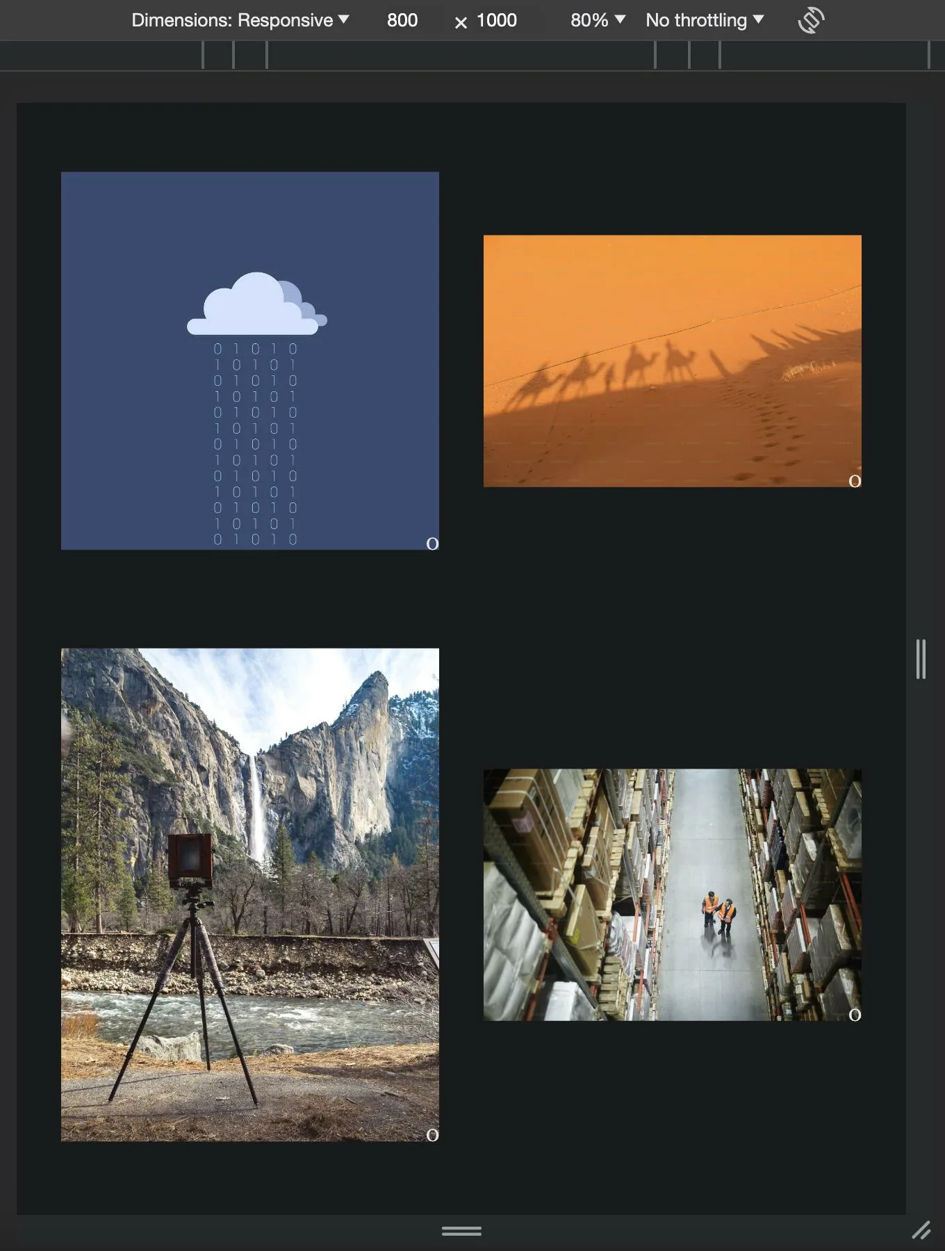
-> as you can see this is my desired result. And it works then the screen is high enough.
Now when you reduce the height the following happens:
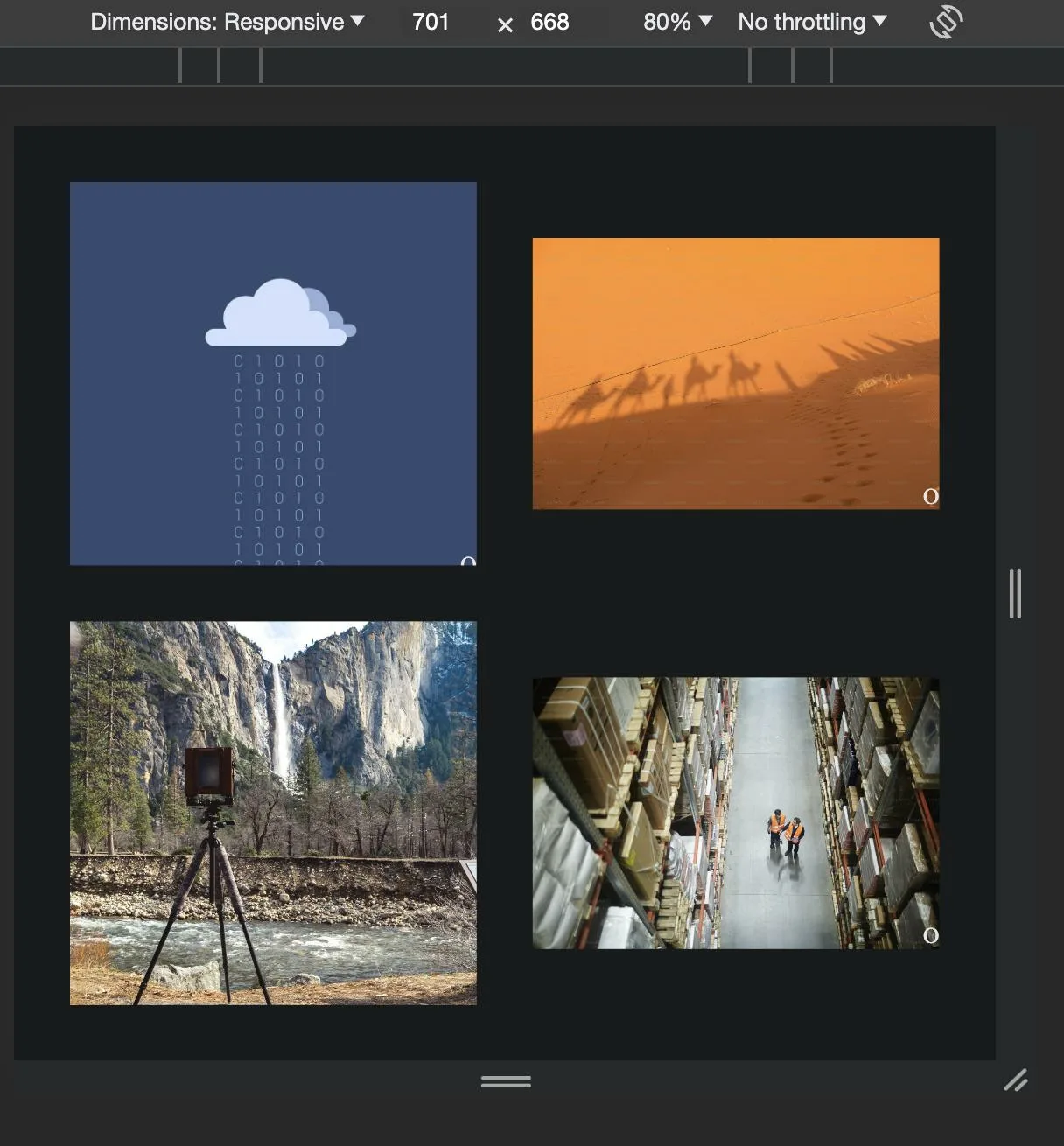
-> as you can see requirement 1 of keeping the images fully visible is not satisfied (and actually neither is requirement 2, even when the o-div is at the bottom right corner of the images, it is not visible for some since for some of the images where the bot right corner is no longer visible)
this is what happens when I comment in the "REQUIREMENT 1 100% width/height styles":
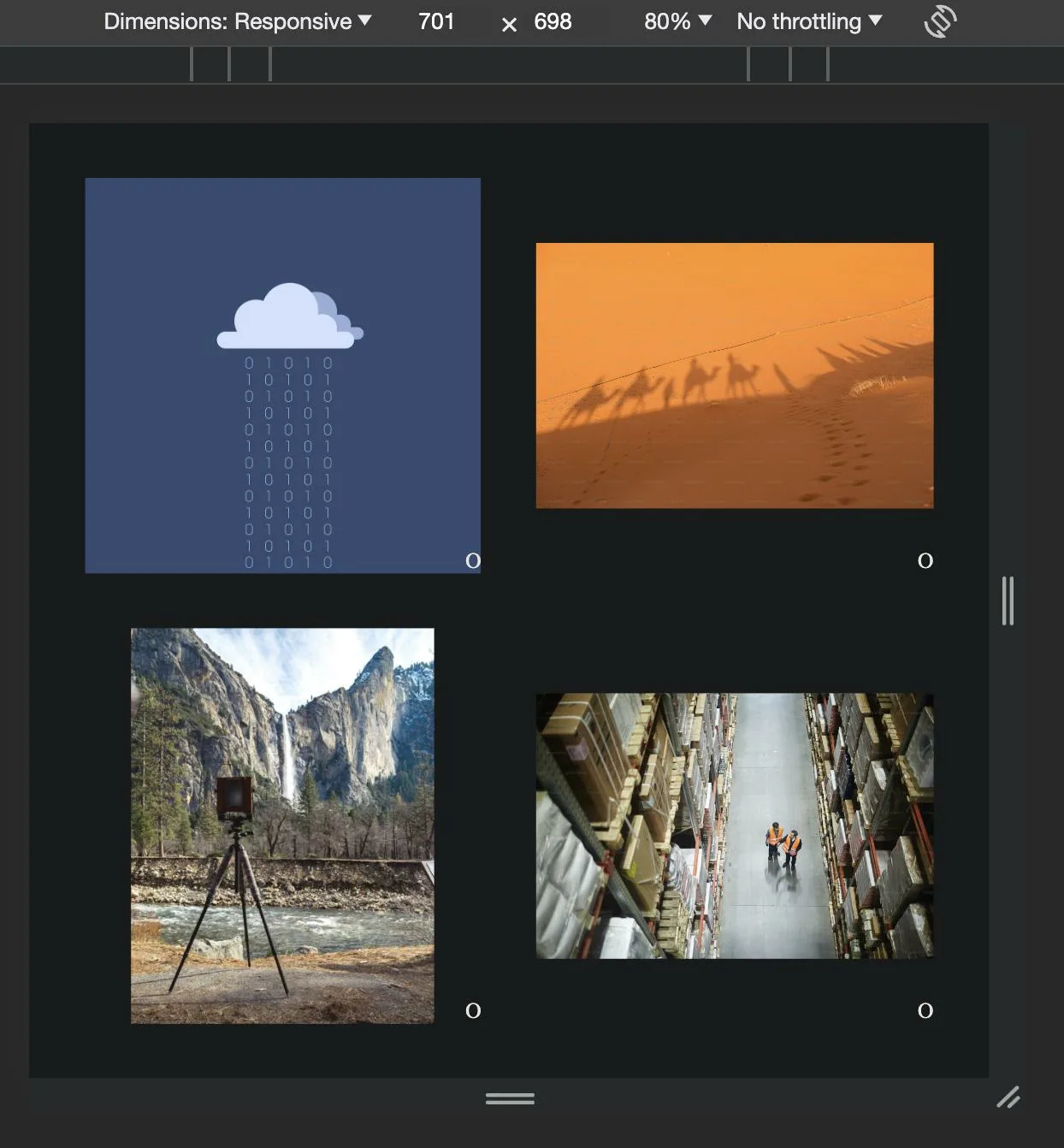
-> requirement 1 is of keeping the images not clipped is satisfied. But the requirement 2 of keeping the o-div at the bottom right corner is not satisfied
2
Answers
One possible approach is as follows, though I’ve taken the liberty of adjusting the HTML in an attempt to be a little more semantic. Explanatory comments are in the code, below:
JS Fiddle demo.
References:
background.background-color.box-sizing.display.gap.grid-area.margin.margin-inline.max-inline-size.max-width.mix-blend-mode.padding.place-content.place-self.<figure>.<figcaption>.<li>.<ol>.A possible solution to your problem without altering the HTML structure is to get rid of absolute positioning since it breaks your 0-marker out of the layout. This can be replaced by making the relative_div a grid container an placing the marker and the image in the same div. Moreover, we need to get rid of the overflow: hidden.
A possible solution can be found in this codepen.
The correpsonding code looks like this.
I hope this helps you resolving your issue.