skip to Main Content

::after pseudo element is used to render an arrow:

enter image description here

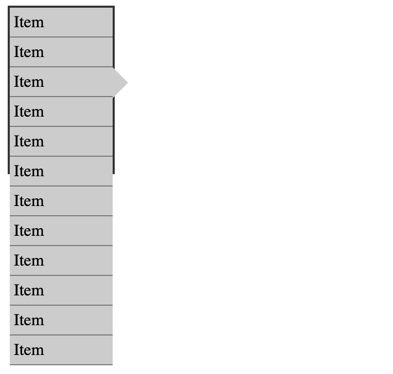
However, when overflow-y: auto is added to the container, the arrow is cut off:

enter image description here

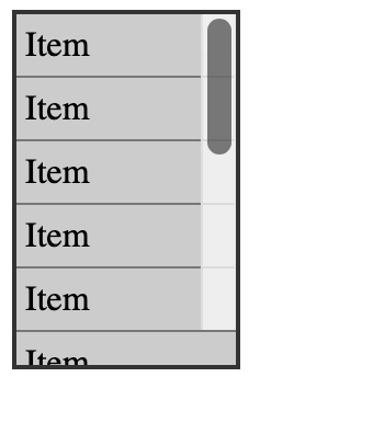
Overflowing in the X direction should be fine (i.e. the arrow should be visible), but overflowing in the Y direction should result in a scrollbar.

Is it possible to keep both the scrollbar and the arrow?

.flex {
  background-color: #eee;
  width: 100px;
  height: 160px;
  display: flex;
  flex-direction: column;
  border: 2px solid #333;
}

.item {
  background-color: #ccc;
  border-bottom: 1px solid #777;
  padding-left: 4px;
  line-height: 28px;
  position: relative;
}

.item3::after {
  content: "";
  width: 0;
  height: 0;
  border-style: solid;
  border-width: 15px 0 15px 15px;
  border-color: transparent transparent transparent #ccc;
  position: absolute;
  left: 100%;
  top: 0;
}
<div class="flex">
  <div class="item">Item</div>
  <div class="item">Item</div>
  <div class="item item3">Item</div>
  <div class="item">Item</div>
  <div class="item">Item</div>
  <div class="item">Item</div>
  <div class="item">Item</div>
  <div class="item">Item</div>
  <div class="item">Item</div>
  <div class="item">Item</div>
  <div class="item">Item</div>
  <div class="item">Item</div>
</div>

2

Answers


  1. Not the most elegant solution but I allowed for some more width for the indicator arrow by adding a wrapper with a wider width around the whole thing. The border is added on top with a pseudo element. See this answer for a more complete explanation of the overflow property.

    .wrapper {
      width: 115px;
      height: 160px;
      position: relative;
    }
    
    .wrapper::before {
      content: "";
      width: 100px;
      height: 100%;
      box-sizing: border-box;
      background-color: #eee;
      position: absolute;
      top: 0;
      left: 0;
    }
    
    
    .wrapper::after {
      content: "";
      width: 100px;
      height: 100%;
      box-sizing: border-box;
      border: 2px solid #333;
      position: absolute;
      top: 0;
      left: 0;
      pointer-events: none;
    }
    
    .flex {
      width: 100%;
      height: 100%;
      display: flex;
      flex-direction: column;
      overflow-y: auto;
    }


    .item {
      background-color: #ccc;
      border-bottom: 1px solid #777;
      padding-left: 4px;
      line-height: 28px;
      position: relative;
      max-width: calc(100% - 15px);
      box-sizing: border-box;
    }
    
    .item3::after {
      content: "";
      width: 0;
      height: 0;
      border-style: solid;
      border-width: 15px 0 15px 15px;
      border-color: transparent transparent transparent #ccc;
      position: absolute;
      left: 100%;
      top: 0;
    }
    <div class="wrapper">
      <div class="flex">
        <div class="item">Item</div>
        <div class="item">Item</div>
        <div class="item item3">Item</div>
        <div class="item">Item</div>
        <div class="item">Item</div>
        <div class="item">Item</div>
        <div class="item">Item</div>
        <div class="item">Item</div>
        <div class="item">Item</div>
        <div class="item">Item</div>
        <div class="item">Item</div>
        <div class="item">Item</div>
      </div>
    </div>
    Login or Signup to reply.
  2. I am guessing that you want the scrollbar bar inside the container (as it appears in your image) and want the arrow outside of the container. That’s not possible. However, I have a few ideas that can be considered.

    As shown in iicaptain’s answer, the width of items can be calculated to compensate for the arrow so that it doesn’t get clipped.

    .item {
      width: calc(100% - 15px);
    }
    

    The snippet includes examples of when there is and isn’t overflow, using your given code with structural modifications.

    *, *:after {
      box-sizing: border-box;
    }
    
    .flex {
      width: 115px;
      height: 160px;
      background-color: #eee;
      border: 2px solid #333;
      overflow-y: auto;
    }
    
    .item {
      position: relative;
      width: calc(100% - 15px);
      padding-left: 4px;
      background-color: #ccc;
      border-bottom: 1px solid #777;
      line-height: 28px;
    }
    
    .item3::after {
      content: "";
      position: absolute;
      left: 100%;
      width: 0;
      height: 0;
      border: 15px solid transparent;
      border-right-width: 0;
      border-left-color: #ccc;
    }
    
    
    .example {
      display: flex;
      column-gap: 5em;
    }
    <div class="example">
    
      <div class="flex">
        <div class="item">Item</div>
        <div class="item">Item</div>
        <div class="item item3">Item</div>
        <div class="item">Item</div>
        <div class="item">Item</div>
        <div class="item">Item</div>
        <div class="item">Item</div>
        <div class="item">Item</div>
        <div class="item">Item</div>
        <div class="item">Item</div>
        <div class="item">Item</div>
        <div class="item">Item</div>
      </div>
    
      <div class="flex">
        <div class="item">Item</div>
        <div class="item">Item</div>
        <div class="item item3">Item</div>
        <div class="item">Item</div>
        <div class="item">Item</div>
      </div>
    
    </div>


    I played around with iicaptain’s answer and can suggest modifications.

    The .wrapper::before pseudo-element was used just to provide a background color. If the background color is wanted, it can be added to the .wrapper rule and there’s no need for this pseudo-element.

    .wrapper {
      background-color: #eee;
    }
    

    The .wrapper::after pseudo-element is used to render the border around the container. The width can be declared so that the right-side border is in a preferable position, such as to the left of the arrow.

    .wrapper {
      width: 115px;
    }
    
    .wrapper::after {
      width: 87px;
    }
    

    The snippet shows examples of this with and without overflow, as well as with and without a background color.

    *, *:before, *:after {
      box-sizing: border-box;
    }
    
    .wrapper {
      position: relative;
      width: 115px;
      background-color: #eee;
    }
    
    .wrapper::after {
      content: "";
      position: absolute;
      top: 0;
      width: 87px;
      height: 100%;
      border: 2px solid #333;
      pointer-events: none;
    }
    
    .flex {
      height: 160px;
      overflow-y: auto;
    }
    
    .item {
      position: relative;
      width: calc(100% - 15px);
      padding-left: 4px;
      background-color: #ccc;
      border-bottom: 1px solid #777;
      line-height: 28px;
    }
    
    .item3::after {
      content: "";
      position: absolute;
      left: 100%;
      width: 0;
      height: 0;
      border: 15px solid transparent;
      border-right-width: 0;
      border-left-color: #ccc;
    }
    
    
    .example {
      display: flex;
      margin-bottom: 3em;
      column-gap: 3em;
    }
    
    .example:nth-of-type(2) .wrapper {
      background-color: inherit;
    }
    <div class="example">
    
      <div class="wrapper">
        <div class="flex">
          <div class="item">Item</div>
          <div class="item">Item</div>
          <div class="item item3">Item</div>
          <div class="item">Item</div>
          <div class="item">Item</div>
          <div class="item">Item</div>
          <div class="item">Item</div>
          <div class="item">Item</div>
          <div class="item">Item</div>
          <div class="item">Item</div>
          <div class="item">Item</div>
          <div class="item">Item</div>
        </div>
      </div>
    
      <div class="wrapper">
        <div class="flex">
          <div class="item">Item</div>
          <div class="item">Item</div>
          <div class="item item3">Item</div>
          <div class="item">Item</div>
          <div class="item">Item</div>
        </div>
      </div>
    
    </div>


    If you want to open a can of accessibility issues and/or have a case where users don’t have to be able to scroll, the width and background-color of the .wrapper::before pseudo-element can be used to hide the scrollbar.

    .wrapper::before {
      width: 115px;
      background-color: white;
    }
    
    *, *:before, *:after {
      box-sizing: border-box;
    }
    
    .wrapper {
      position: relative;
      width: 115px;
    }
    
    .wrapper::before {
      content: "";
      position: absolute;
      width: 115px;
      height: 100%;
      background-color: white;
    }
    
    .wrapper::after {
      content: "";
      position: absolute;
      top: 0;
      width: 87px;
      height: 100%;
      border: 2px solid #333;
      pointer-events: none;
    }
    
    .flex {
      height: 160px;
      overflow-y: auto;
    }
    
    .item {
      position: relative;
      width: calc(100% - 15px);
      padding-left: 4px;
      background-color: #ccc;
      border-bottom: 1px solid #777;
      line-height: 28px;
    }
    
    .item3::after {
      content: "";
      position: absolute;
      left: 100%;
      width: 0;
      height: 0;
      border: 15px solid transparent;
      border-right-width: 0;
      border-left-color: #ccc;
    }
    
    
    .example {
      display: flex;
      column-gap: 5em;
    }
    <div class="example">
    
      <div class="wrapper">
        <div class="flex">
          <div class="item">Item</div>
          <div class="item">Item</div>
          <div class="item item3">Item</div>
          <div class="item">Item</div>
          <div class="item">Item</div>
          <div class="item">Item</div>
          <div class="item">Item</div>
          <div class="item">Item</div>
          <div class="item">Item</div>
          <div class="item">Item</div>
          <div class="item">Item</div>
          <div class="item">Item</div>
        </div>
      </div>
    
      <div class="wrapper">
        <div class="flex">
          <div class="item">Item</div>
          <div class="item">Item</div>
          <div class="item item3">Item</div>
          <div class="item">Item</div>
          <div class="item">Item</div>
        </div>
      </div>
    
    </div>
    Login or Signup to reply.
Please signup or login to give your own answer.
Back To Top
Search