I developed a shiny app ui layout that works with bslib 4, but when I switch to bslib 5 my formatting falls apart. I’m not sure why?
Here is my code
library(shiny)
library(bslib)

ui <- navbarPage("My App",
                 id = "navbar",

  theme = bslib::bs_theme(version = 4, #setting bootstrap version
                          bootswatch = "darkly",
                          base_font = "roboto",
                          font_scale = 1.2),

  tabPanel("TAB 1",
           fluidPage(
               fluidRow(selectInput("dataset", label = "Dataset",
                                    choices = ls("package:datasets")),
                        actionButton("enter", label = "confirm choice",
                                     style = "margin-top: 32px; height: 38px; margin-left: 10px;"
                        )
               ),
               verbatimTextOutput("summary"),
               tableOutput("table")
             )
  ),
  tabPanel("TAB 2",
           h3("bla bla"))
)


server <- function(input, output, session) {

}

shinyApp(ui, server)
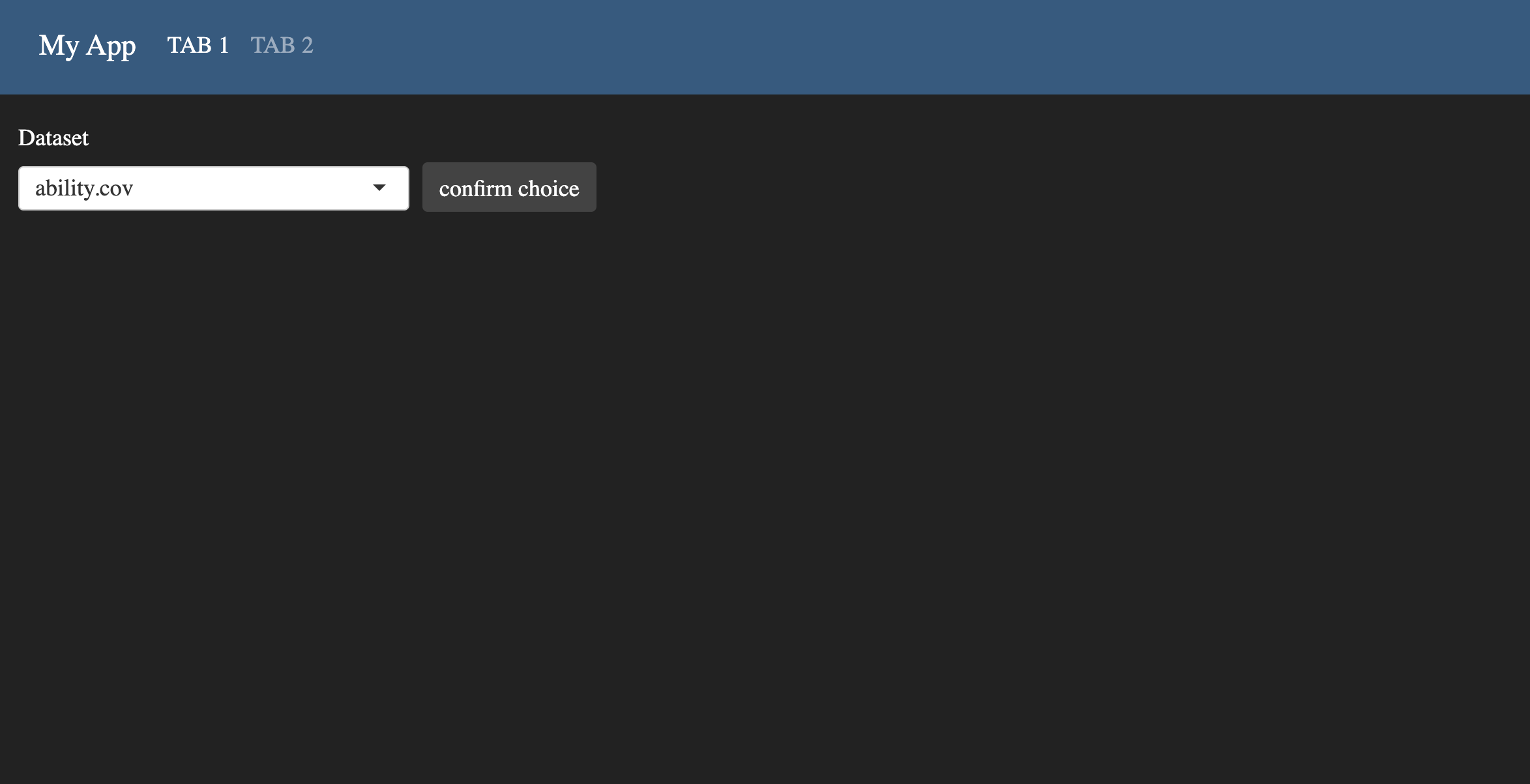
when using bslib 4 it looks like this
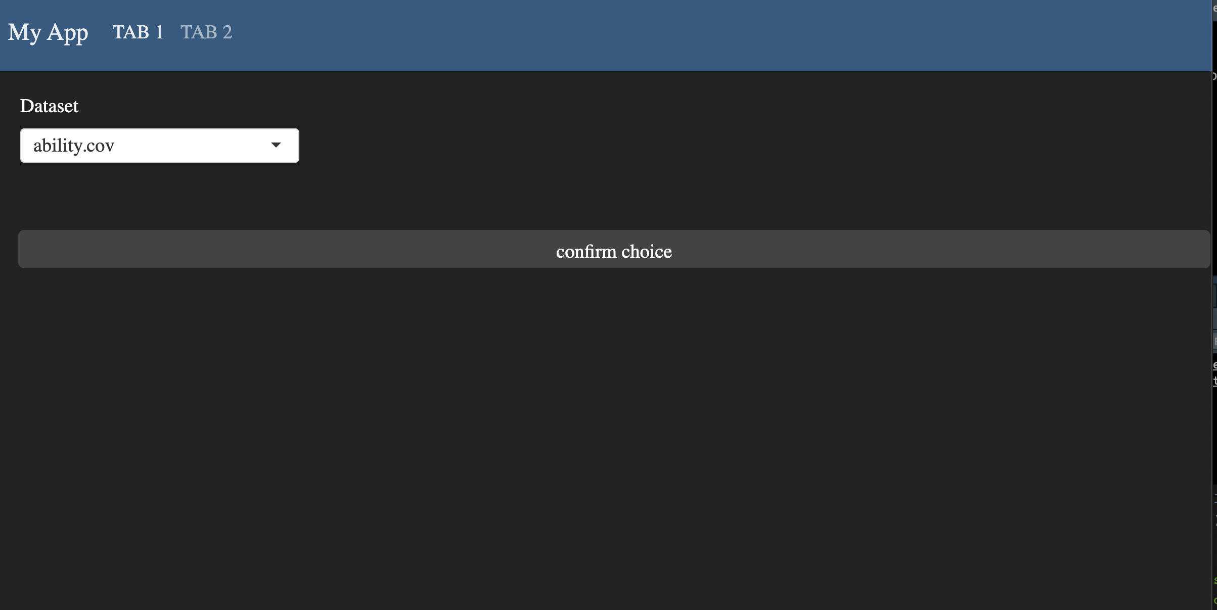
but when I use bslib 5 it looks like this
How can I align buttons in bslib 5? I’d like to use bslib::card() in the results part of the app so I need bslib 5.


2
Answers
In your
fluidRow, you can add:style = "display: flex; flex-wrap: nowrap; width: min-content;"We could use
stypleargument:style = "margin-top: 35px; margin-left: 10px; height: 38px;"