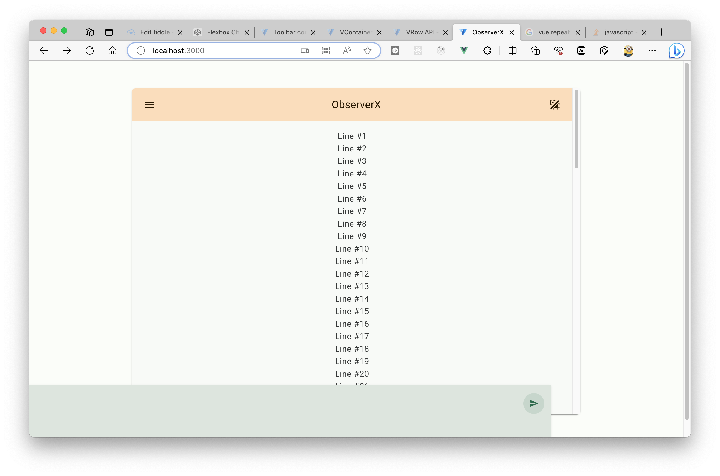
I want to build a chat app with Vuejs 3 and Vuetify 3. However, I am having problem aligning chatbox with v-card component. The chatbox (green) is at the bottom of the page instead of at the bottom of the v-card component (the one with orange header).
~~Here’s the CodeSandbox link for reproduction: CodeSandbox~~
Update: there seems to be a problem with the CodeSandbox link. Use the GitHub link instead: https://github.com/samzhangjy/observerx-web
I want it to be aligned inside the v-card and pin at the bottom even when scrolling (basicly putting it inside v-card). Also, I didn’t find a way to make v-toolbar sticky (the orange header). Is there a builtin way to stick it to the top?
Thanks in advance!!
Code related to this if you don’t want to use CodeSandbox:
MainContainer.vue:
<script lang="ts" setup>
import { useTheme } from "vuetify";

const theme = useTheme();
const changeTheme = () =>
  (theme.global.name.value = theme.global.current.value.dark
    ? "light"
    : "dark");
</script>

<template>
  <v-container class="h-screen py-md-12 py-sm-5">
    <v-row justify="space-around" class="h-100">
      <v-card max-width="1000" height="100%" width="100%" class="overflow-auto">
        <v-toolbar color="tertiary-container" class="position-sticky">
          <template v-slot:prepend>
            <v-btn icon="$menu" color="on-tertiary-container"></v-btn>
          </template>

          <v-toolbar-title class="text-h6"> ObserverX </v-toolbar-title>

          <template v-slot:append>
            <v-btn
              icon="mdi-theme-light-dark"
              color="on-tertiary-container"
              @click="changeTheme"
            ></v-btn>
          </template>
        </v-toolbar>

        <v-card-text class="overflow-auto">
          <slot />
        </v-card-text>
      </v-card>
    </v-row>
  </v-container>
</template>

<style scoped></style>
ChatPage.vue:
<template>
  <v-container class="h-100">
    <v-responsive class="align-center text-center h-100">
      <MainContainer class="container h-100">
        <div class="messages">
          <p class="text-body-1" v-for="i in 100">Line #{{ i }}</p>
        </div>
        <div class="message-input-container">
          <v-textarea
            variant="solo"
            base-color="surface"
            bg-color="surface-variant"
            color="on-surface-variant"
            class="rounded-t-0 message-input"
            rows="3"
            no-resize
            rounded="0"
            v-model="currentMessage"
          >
            <template v-slot:append-inner>
              <v-btn
                icon="mdi-send"
                variant="tonal"
                size="small"
                color="primary"
                @click="sendMessage"
              ></v-btn>
            </template>
          </v-textarea>
        </div>
      </MainContainer>
    </v-responsive>
  </v-container>
</template>

<script lang="ts" setup>
import { ref } from "vue";
import MainContainer from "./MainContainer.vue";

const currentMessage = ref("");

const sendMessage = () => {
  console.log(currentMessage.value);
};
</script>

<style scoped>
.container {
  box-sizing: border-box;
  position: relative;
  overflow: hidden;
  padding-bottom: 100px;
  max-height: 1000px;
  height: 100%;
}

.messages {
  width: 100%;
  height: 100%;
  overflow: auto;
}

.message-input {
  max-width: 1000px;
  width: 100%;
  height: 100px;
  position: fixed;
  bottom: 0;
  left: 0;
  resize: none;
}

.message-input-container {
  position: absolute;
  max-width: 1000px;
  width: 100%;
}
</style>


2
Answers
When you use
position: fixed;it will be positioned fixed on the screen, you should tryposition: absolute;.So your final code should look like this:
By the way you should fix the problem with the CodeBox link, I have not been able to access your project.
Instead of pinning toolbar and message input, you can have the messages list take up the remaining space between them. It is quite simple, just make the card a flex column and put the messages inside an overflow-auto container. However, for this to work, the card has to have a fixed height, as there is no remaining space if space is not limited).
Have a look at the example in the snippet: