skip to Main Content

I tried searching and could not find an exact similar question, so posting it here.
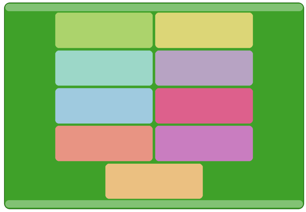
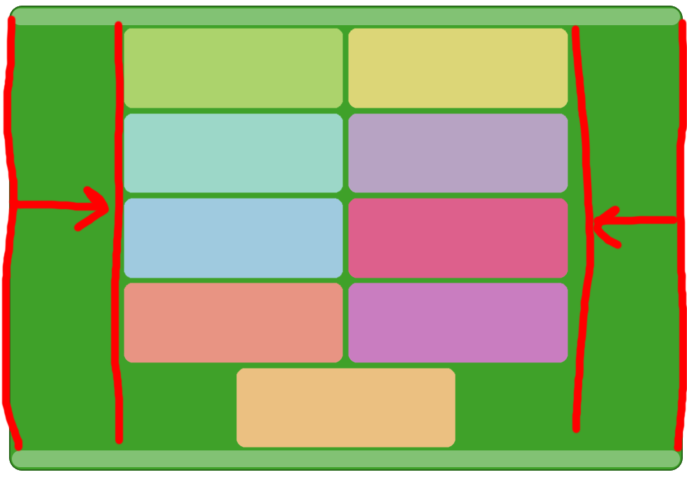
So I have a few block divs inside a flex wrapper with row wrapping, and I want to have a border for the wrapper. The issue I’m running into is that the border will always span 100% of the viewport, instead of being reduced to fit only the items. How can I achieve this without using media queries or JS? I would prefer solutions with inline styles as that’s the most preferable in this scenario.

Code samples:
Basic code for my blocks:

<div id="w1" class=wrapper style="display: flex; flex-direction: row; flex-wrap: wrap; justify-content: center; gap: 3px; border: 3px solid #000">  <!-- wrapper OPEN -->
    <div id="b1" class="block" style="width: 250px;"></div>
    .
    .
    .
    <div id="b9" class="block" style="width: 250px;"></div>
</div><!-- wrapper CLOSE -->

Basic code

So basically, this border should be here:enter image description here

I tried a solution to add another wrapper outside with display:table but it only works when all blocks are on the same row; when blocks wrap to the next row; it again takes up the entire width.

<div id="w0" class=outer style="display:table; margin:auto; border: 3px solid #000;"><!-- border wrapper OPEN -->
    <div id="w1" class=wrapper style="display: flex; flex-direction: row; flex-wrap: wrap; justify-content: center; gap: 3px;"><!-- flex wrapper OPEN -->
        <div id="b1" class="block" style="width: 250px;"></div>
        .
        .
        .
        <div id="b9" class="block" style="width: 250px;"></div>
    </div><!-- flex wrapper CLOSE -->
</div><!-- border wrapper CLOSE -->

Thank you.

2

Answers


  1. The issue I’m running into is that the border will always span 100% of the viewport, instead of being reduced to fit only the items.

    Instead of display:flex; use display: inline-flex.

    <div id="w1" class=wrapper style="display: inline-flex; flex-direction: row; flex-wrap: wrap; justify-content: center; gap: 3px; border: 3px solid #000">  
    
    <!-- wrapper OPEN -->
        <div id="b1" class="block" style="width: 250px;"></div>
     
        <!-- rest of your code -->
    

    SideNote:

    Your div is a block level element.

    A block-level element always takes up the full width available (stretches out to the left and right as far as it can). link

    Block-level elements may contain other block-level elements or inline elements.

    An inline element does not start on a new line.
    An inline element only takes up as much width as necessary. link

    Inline elements cannot contain block-level elements.

    If you define display: inline-flex;, it turns your element into inline-block element and You will get the best of both world.


    EDIT

    it takes up the entire width of the viewport when items have wrapped to the next row.

    It is how flexbox is supposed to behave. Otherwise, you should use grid instead of flexbox.

    Problem with grid: The last div block would be aligned to one of the columns instead of being centered. Would there be a way to archive to center last div?

    Yes possible.

    If you can use external css file or internal css

    assuming you want to columns, you can do something like this

    <div id="w1" class=wrapper style="display: inline-grid; grid-template-columns: 1fr 1fr; flex-wrap: wrap; justify-content: center; gap: 3px; border: 3px solid #000;" >
    ...
    
    .wrapper .block:last-child {
     justify-self: center;
     grid-column-start: span 2;
    }
    

    I would prefer solutions with inline styles as that’s the most preferable in this scenario.

    If you have to use inline css then on the last div.block element, you should define above css styles inline.

    <div id="w1" class=wrapper style="display: inline-grid; grid-template-columns: 1fr 1fr; flex-wrap: wrap; justify-content: center; gap: 3px; border: 3px solid #000;" >  <!-- wrapper OPEN -->
        <div id="b1" class="block" style="width: 250px;"></div>
        .
        .
        .
        <div id="b9" class="block" style="width: 250px; justify-self: center;
     grid-column-start: span 2;"></div>
    </div><!-- wrapper CLOSE -->
    
    
    Login or Signup to reply.
  2. How can I achieve this without using media queries or JS? I would
    prefer solutions with inline styles as that’s the most preferable in
    this scenario.

    Depending on your need, the solution is to easily add a width for the flex wrapper and add the gap value to it. in your case, it should be width: 503px since each child has width: 250px.

    Add margin: 0 auto for centering the wrapper.

    <div id="w1" class=wrapper style="display: flex; flex-direction: row; flex-wrap: wrap; justify-content: center; gap: 3px; border: 3px solid #000;width: 503px;margin: 0 auto" >  <!-- wrapper OPEN -->
        <div id="b1" class="block" style="background-color: skyblue;width: 250px; height: 100px"></div>
        <div id="b1" class="block" style="background-color: skyblue;width: 250px; height: 100px"></div>
        <div id="b1" class="block" style="background-color: skyblue;width: 250px; height: 100px"></div>
        <div id="b1" class="block" style="background-color: skyblue;width: 250px; height: 100px"></div>
        <div id="b1" class="block" style="background-color: skyblue;width: 250px; height: 100px"></div>
        <div id="b1" class="block" style="background-color: skyblue;width: 250px; height: 100px"></div>
        <div id="b1" class="block" style="background-color: skyblue;width: 250px; height: 100px"></div>
        <div id="b1" class="block" style="background-color: skyblue;width: 250px; height: 100px"></div>
        <div id="b1" class="block" style="background-color: skyblue;width: 250px; height: 100px"></div>
    </div><!-- wrapper CLOSE -->
    Login or Signup to reply.
Please signup or login to give your own answer.
Back To Top
Search