


I have two flex containers in a row, one with flex-start, the other with flex-end, and both containers are in one wrapping div set to flex.
With 100% width set on each one, they both stick to the end of the row (start and end).
However, when I minimize the width of the window, the text on the right starts to disappear:
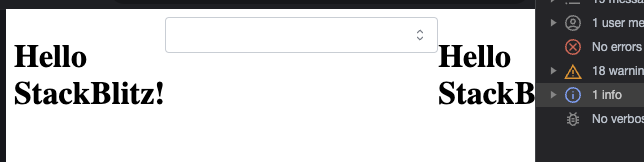
Only when the input box meets the edge of the window does it start to shrink:
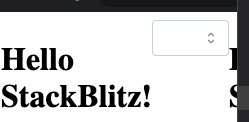
I understand that text cannot shrink, but is it possible that when the text on the right meets the window edge, then the input box will start shrinking?
Stackblitz link:
https://stackblitz-starters-u2rhvf.stackblitz.io
Code:
export default function App() {
  return (
    <div style={{ display: 'flex' }}>
      <div
        style={{ display: 'flex', justifyContent: 'flex-start', width: '100%' }}
      >
        <h1>Hello StackBlitz!</h1>
      </div>
      <div
        style={{ display: 'flex', justifyContent: 'flex-end', width: '100%' }}
      >
        <Select data={[]} style={{ width: '20rem' }} />
        <h1>Hello StackBlitz!</h1>
      </div>
    </div>
  );
}
2
Answers
You could play around with max/min-width settings here to see what suits your application. This may be what you need:
Why this happens?
Because you have set a static width to the input and that’s why it doesn’t change its width by resizing the width of the viewport, but what is the solution?
Well you need to set it dynamically with percentages and you can do this in two ways:
By setting the width of the input dynamically there shouldn’t be a problem anymore but there is something that you might say about this:
When I do set it dynamically, the input’s width is not as long as I want
Well, the solution to this is also the same as above:
The only thing you need to do is to set the width of the right container dynamically too!
For example, you can set the width of the right container to 60% and that means that the right container will fill 60% of the width of the parent flex container and who do you think will fill the space? Of course! The input.
I hope this was helpful and everything is clear