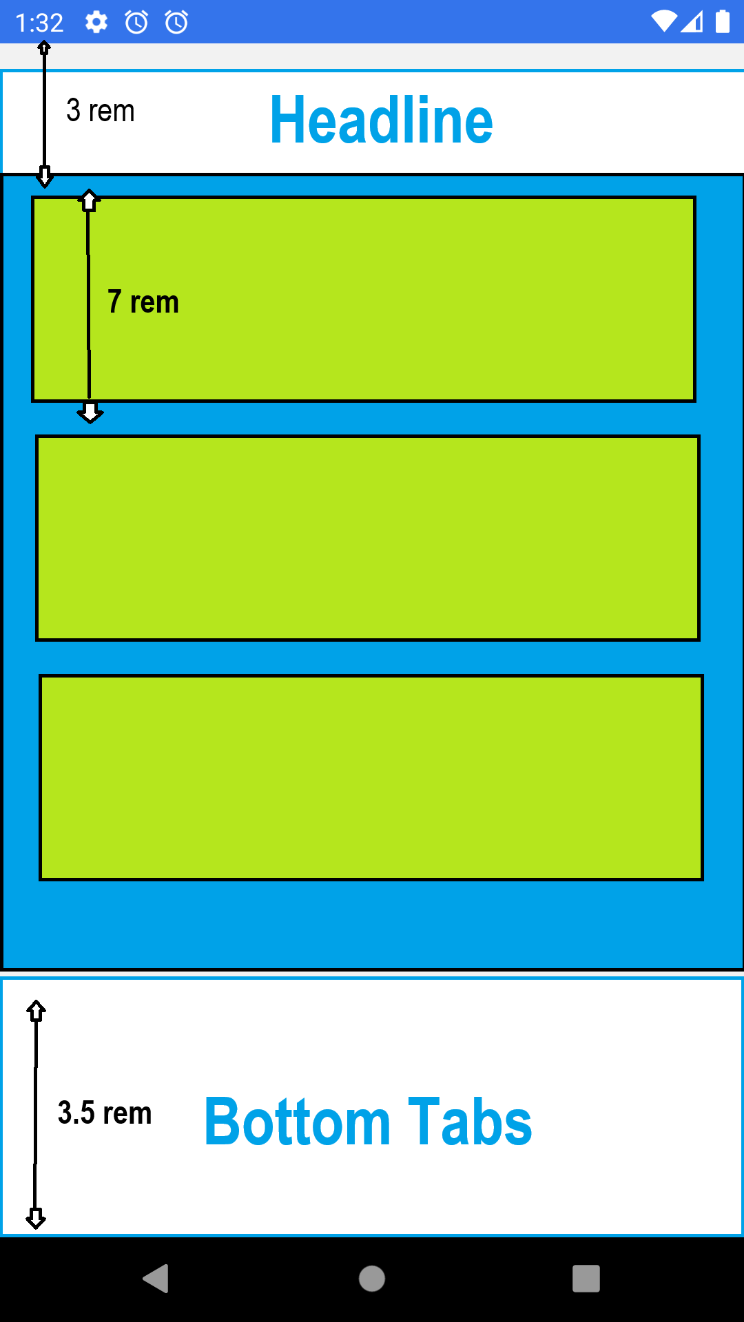
I have 2 static views: Headline and Bottom navigator (as mentioned in the attached visualization) with 3 rem and 3.5 rem height respectively, and I want to put a responsive view between them (the light blue area). The responsive view is supposed to include list views of elements (green ones) with scroll view.
I have 2 questions:
-
How can I make the green view responsive as being between two static views? is there any way to calculate its height in a way that it would be the same on different screens?
-
Every green element is 7 rem in height. How can I display different amounts of (complete) elements in different screens as the maximum as possible according to the wrapper view’s height? I mean that I don’t want that some kind of screen will cut an element between scrolls..
I tried to give percentage height for the top and bottom views but I want their height to be static.


2
Answers
you can try working with "vh" instead of rem for a more responsive design
you can also add a min or max height based on your needs so the elements won’t take more than the desired height
Hi take a look on this package, normally I use this to make the apps responsive:
you can make anything responsive with this:
https://github.com/marudy/react-native-responsive-screen
I hope this can helps.