


I am trying to create a drop-down of categories in react.
function CategoryDropDown() {
  return (
    <>
      {categories.length > 0 &&
        categories.map((category, index) => {
          return (
            <NavDropdown key={index} title={category.name}>
              <Row
                style={{
                  width: "600px",
                  margin: "10px",
                }}
              >
                {category.children?.map((subCategory) => {
                  return (
                    <Col key={index} style={{ textAlign: "center" }}>
                      <b>{subCategory.name}</b>
                      {subCategory.children?.map((s, index) => {
                        return <div key={index}>{s.name}</div>;
                      })}
                      <hr />
                    </Col>
                  );
                })}
              </Row>
            </NavDropdown>
          );
        })}
    </>
  );
}
Category data is going to look like this
[
  {
    "name": "abc",
    "children": [
      {
        "name": "def",
        "children": [
          {
            "name": "xyz",
            "children": []
          }
        ]
      }
    ]
  }
]
Image: https://phpout.com/wp-content/uploads/2023/09/t4mJ8.png
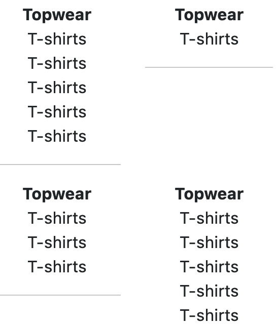
If you see here in the image, second column is having few spaces even though it has fewer items. I want no gaps here and want the row to be started immediately. How can i achieve this?
2
Answers
It looks this way because you’ve organized your code as Rows that contain Columns (meaning that each row will have the height of tallest column). You should instead organize it as Columns that contain Rows, the heights will work themselves out.
If you import the newest Boostrap 5, you can use it to handle the layout with some basic tag use. What you want is the Grid feature. If you image the screen from left to right, with 1 being on the left and 12 being on the right, you can break up the screen into segments based of the value of 12. Being that you want to split the screen with one thing on the left and another on the right, that is simple because half of 12 is 6, so you just need a pair of col-md-6 inside of a row class, as such:
Citation found here –> https://www.w3schools.com/bootstrap5/bootstrap_grid_basic.php