skip to Main Content

I believe there is simple solution to my problem, yet I (honestly) couldn’t find any.

I to create a ‘card’ with the picture, background color and text like on the picture below:
card

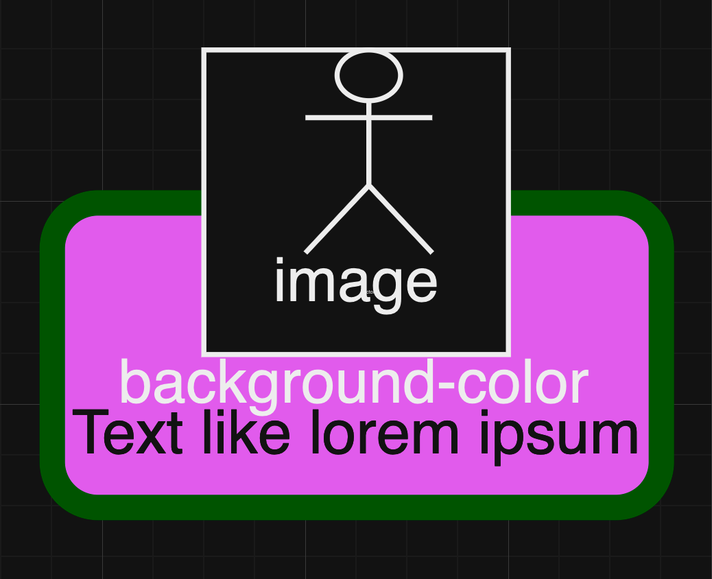
Card consists of background with round border and different color, text under image and the image that goes beyond the top of the background. How can I do this?

My code so far:

<div class="card">
  <div class="card-header">
    <img class="avatar" src="/media/avatar.png" width="130px" height="130px">
  </div>
  <div class="title">Here goes title </div>
  <div class="text">Here goes text</div>
</div>
.card
  background-color: #EFC48F
  border-radius: 15px
  border-color: red
  background-size: 100% 50% /* doesn't work with color */
  background-position: bottom center
  background-repeat: no-repeat

3

Answers


  1. Your image has 3 layers: back, middle and top. The top layer is the image.

    Use position:absolute and z-index to put your top-layer on top.

    Use flexbox (display:flex, justify-content, etc) to move things up/down and to center them inside the layer divs.

    Remember that in HTML, everything is inside boxes. Boxes within boxes. (This is called "the box model"). When struggling with how to organize/style something, ask yourself: what if I add another box and put this thing inside the new box?

    This mock-up is not perfect, but it will get you started.

    .layer-back {position:relative;max-width:300px;height:250px;background:#222;font-family:Arial,Helvetica,sans-serif;}
    
    .layer-middle{background:transparent;z-index:1;}
    
    .layer-top img{margin-top:30px;}
    .layer-top{width:100%;position:absolute;top:0;left:0;background:transparent;z-index:2;}
    
    
    .myPinkRect{position:absolute;bottom:25px;height:75px;font-size:2rem;color:black;background:deeppink;border:12px solid green;border-radius:10px;}
    
    .flex-centerLR{display:flex;justify-content:center;}
    .flex-column-bottom{display:flex;flex-direction:column;justify-content:flex-end;}
    <div class="layer-back">
      <div class="layer-top flex-centerLR">
         <img src="https://placekitten.com/125/150">
      </div>
      <div class="layer-middle flex-centerLR">
         <div class="myPinkRect flex-column-bottom">background color</div>
      </div>
    </div>
    Login or Signup to reply.
  2. Well for starters I tried recreating the image in jsfiddle

    For the card you can use a <div> element. Then if you want rounded borders just use border-radius: 5px, the other border properties you wanted to modify are as follows:

    • border-style
    • border-width
    • border-color
      Their names should be straight forward enough for you to know how to use it, if not just go search it up.

    Also for the background color and text color, the name of their properties are background-color and color respectively.

    Finally if you want to offset all of the element to be offset-ed, please look into the offset-position property here. For this case, you can do:

    offset-position: 50% 30% // its x and y btw, (0, 0) is at the left top corner
    offset-path: ray(90deg) // this has a lot more use cases but i just use it to rotate the stuff
    

    Anyways here’s the mockup:

    * {
      font-family: Arial, sans-serif;
    }
    
    .bg-text {
      color: white;
    }
    
    .card {
      position: absolute;
      display: block;
      top: 50px;
      justify-content: center;
      text-align: center;
      background-color: #ff69b4;
      border-style: solid;
      border-width: 10px;
      border-color: green;
      border-radius: 10px;
      aspect-ratio: 2;
      height: 80px;
    }
    
    .card div {
      offset-position: 50% 30%;
      offset-path: ray(90deg)
    }
    
    .card div img {
      z-index: 1;
      aspect-ratio: 1;
      width: 80px;
    }
    <div class="card">
      <div>
        <img src="https://i.postimg.cc/pT1gdqPN/odd-picture.png" alt="there was supposed to be an image here">
        <span>
          <span class="bg-text">background-color</span>
          <br>Text like lorum ipsum
        </span>
      </div>
    </div>
    Login or Signup to reply.
  3. You could use negative margin (same as half the .header height), and assign that same margin-top for the entire card:

    * {
      margin: 0;
      box-sizing: border-box;
    }
    
    .card {
      --avatar-size: 10;
      background: hsl(var(--hue, 0), 28%, 90%);
      border: 1rem solid hsl(var(--hue, 0), 28%, 60%);
      border-radius: 1rem;
      max-width: 15rem;
      padding: 0 1rem 1rem 1rem;
      margin: calc(var(--avatar-size) / 2 * 1rem) auto 1rem;
      display: flex;
      flex-direction: column;
      filter: drop-shadow(0 2px 5px #0006);
      position: relative;
      
      .header {
        width: calc(var(--avatar-size) * 1rem);
        aspect-ratio: 1;
        align-self: center;
        margin-top: calc(var(--avatar-size) / 2 * -1rem);
        border-radius: 1rem;
        overflow: hidden;
      }
      
      .title {
        padding: 0.5rem 0;
      }
      
      .avatar {
        width: 100%;
        height: 100%;
        object-fit: cover;
      }
    }
    <div class="card" style="--hue:29;">
      <div class="header">
        <img class="avatar" src="//picsum.photos/id/12/200/200">
      </div>
      <h3 class="title">Here goes a title </h3>
      <div class="text">Here goes some text</div>
    </div>
    
    <div class="card" style="--hue:60;">
      <div class="header">
        <img class="avatar" src="//picsum.photos/id/15/200/200">
      </div>
      <h3 class="title">Here goes some title </h3>
      <div class="text">Here goes the text</div>
    </div>
    Login or Signup to reply.
Please signup or login to give your own answer.
Back To Top
Search