 Question posted in


I have the following HTML
<!DOCTYPE html>
<html lang="en">
<body style="
box-sizing: border-box;
max-width: 100vw;
">
<main style="width: 60%; margin: 0 auto;">
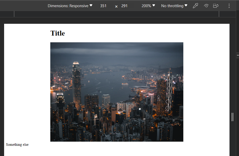
<h1>Title</h1>
<img style="width: 100%; height: auto;"
src="https://images.unsplash.com/photo-1513622790541-eaa84d356909?q=40&w=1974&auto=format&fit=crop"
width="1974" height="1481" alt="">
</main>
<span>Something else</span>
</body>
</html>
- The width of
bodyis locked to being100viewport unit - I have a inner block that should be 60% of the width of the parent’s width
- Inside is a image that I want to take up 100% of it’s parent width (with an automatic height to retain aspect ratio)
This works on desktop
but on iOS don’t get the same behaviour. The image spills off the page and adds a scrollbar?
Why is it not respecting the widths? How do I get it working?
2
Answers
Just set
max-width: 100vwon to the images themselves. Seems like it was fixed in more recent versions of SafariDo you have one of these involved? https://developer.mozilla.org/en-US/docs/Web/HTML/Viewport_meta_tag
If you don’t tell the browser specifically to treat your web page as a responsive layout, it’ll zoom out to account for the content/space. This could be the source of your problem.
(you should also probably set your img element to display: block)