skip to Main Content

enter image description here

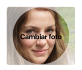
How can I achieve this in pure css? I’m trying to achieve by using pseudo before and after. Maybe some tweaking on the border but I can’t think of a way to recreate this.

This is what I have so far: CSS

.imageDiv {
  background-image:url('https://picsum.photos/id/64/4326/2884')
  width: 160px;
  height: 135px;
  border-radius: 5px;
  opacity: 1;
  display: flex;
  justify-content: center;
  flex-direction: column;
  align-items: center;
  background-position: center;
  background-size: cover;
  margin-left: auto;
  position: relative;
}

.imageDiv::after {
  position: absolute;
  width: 100%;
  height: 100%;
  border-radius: 100%;
  background-color: #ffffff61;
  content: "";
}
<div class="imageDiv" style="background-image:url('https://picsum.photos/id/64/4326/2884')">
  <label class="imageText">
      Cambiar photo
  </label>
</div>

2

Answers


  1. One approach is below, making use of the mask-image() CSS property along with a radial-gradient() to create the circular shape; the code contains explanatory comments:

    :root {
      --main-inline-size: 80%;
      --main-max-inline-size: 1200px;
      --main-min-inline-size: 20rem;
      --spacing: 0.5rem;
    }
    
    *,
    ::before,
    ::after {
      box-sizing: border-box;
      font: inherit;
      margin: 0;
      padding: 0;
    }
    
    body {
      block-size: 100vh;
      font-family: system-ui;
      font-size: 16px;
      font-weight: 400;
      padding: var(--spacing);
    }
    
    menu,
    ol,
    ul,
    li {
      list-style-type: none;
    }
    
    main {
      border: 1px solid currentColor;
      inline-size: clamp(var(--main-min-inline-size), var(--main-inline-size), var(--main-max-inline-size));
      margin-inline: auto;
      min-block-size: 100%;
      padding: var(--spacing);
    }
    
    /* Everything above/prior to this point is irrelevant to the demo
       and is purely to serve as a simple reset, and base-style */
    
    figure {
      /* in order to use grid-layout, while also retaining an inline
         aspect to allow adjacent content: */
      display: inline-grid;
      grid-template-rows: fit-content;
      overflow: hidden;
      position: relative;
    }
    
    figure > * {
      /* placing all the children of <figure> in the first column
         of the first row: */
      grid-column: 1;
      grid-row: 1;
    }
    
    img {
      /* this is for Chrome, and presumably other Chromium-based
         browsers as, despite the comments on both MDN and
         CanIUse (see the links in the "compatibility" section, below)
         it seems that Chrome doesn't (yet) support the non-prefixed
         version of mask-image, unfortunately necessitating the use
         of the prefixed version: */
      -webkit-mask-image: radial-gradient(black 60%, #fffa 60%);
      /* creating the mask, using CSS radial-gradient(),
         from black (the 'transparent'/'clear' central circle)
         to a lightly transparent white color; both color
         stops are at 60% for a transition at that point: */
      mask-image: radial-gradient(black 60%, #fffa 60%);
    }
    
    /* largely irrelevant, just for presentation */
    
    figcaption {
      align-self: end;
      backdrop-filter: blur(3px);
      background-color: #fff9;
      padding-block: 0.25rem;
      padding-inline: 0.5rem;
      transition: translate 0.3s linear;
      translate: 0 100%;
    }
    
    figure:hover figcaption {
      translate: 0 0;
    }
    <main>
      <figure>
          <img src="//picsum.photos/400/400" alt="">
        <figcaption>Cambiar photo</figcaption>
      </figure>
    </main>

    JS Fiddle demo.

    I completely failed to notice the centred text in the example, so my updated demo addresses that failure (though I retain a transition, on clip-path this time) obviously remove if you don’t want one:

    :root {
      --main-inline-size: 80%;
      --main-max-inline-size: 1200px;
      --main-min-inline-size: 20rem;
      --spacing: 0.5rem;
    }
    
    *,
    ::before,
    ::after {
      box-sizing: border-box;
      font: inherit;
      margin: 0;
      padding: 0;
    }
    
    body {
      block-size: 100vh;
      font-family: system-ui;
      font-size: 16px;
      font-weight: 400;
      padding: var(--spacing);
    }
    
    menu,
    ol,
    ul,
    li {
      list-style-type: none;
    }
    
    main {
      border: 1px solid currentColor;
      inline-size: clamp(var(--main-min-inline-size), var(--main-inline-size), var(--main-max-inline-size));
      margin-inline: auto;
      min-block-size: 100%;
      padding: var(--spacing);
    }
    
    figure {
      display: inline-grid;
      grid-template-rows: fit-content;
      overflow: hidden;
      position: relative;
    }
    
    figure>* {
      grid-column: 1;
      grid-row: 1;
    }
    
    img {
      -webkit-mask-image: radial-gradient(black 60%, #fffa 50%);
      mask-image: radial-gradient(black 60%, #fffa 50%);
    }
    
    figcaption {
      backdrop-filter: blur(3px);
      background-color: #fff9;
      clip-path: polygon(50% 0, 50% 0, 50% 100%, 50% 100%);
      font-size: 2rem;
      padding-block: 0.25rem;
      padding-inline: 0.5rem;
      overflow: hidden;
      align-self: center;
      text-align: center;
      transition: clip-path 0.3s linear;
    }
    
    figure:hover figcaption {
      clip-path: polygon(0 0, 100% 0, 100% 100%, 0 100%);
    }
    <main>
      <figure>
        <img src="//picsum.photos/400/400" alt="">
        <figcaption>Cambiar photo</figcaption>
      </figure>
    </main>

    JS Fiddle demo.


    Following the comment left by OP, Benjoe, below, and verifying that statement with Chrome 116, on both Ubuntu 23.04 and Android 13:

    I cannot see the circle on your demo and I’m using [Google Chrome].

    I’ve edited the above code snippets (and updated the linked JS Fiddle demos, [1, 2]) to include the prefixed -webkit-mask-image property. This has been checked in my installations of Chrome 116 on both platforms available. Feedback would be welcomed if there are other problems.

    References:

    Compatibility information from:

    Login or Signup to reply.
  2. .imageDiv {
      width: 160px;
      height: 160px;
      position: relative;
      mix-blend-mode: hard-light;
    }
    .imageDiv img{
      position: absolute;
      width: 100%;
      height: 100%;
    }
    
    .overlay {
      mix-blend-mode: hard-light;
      width: 100%;
      pointer-events: auto;
      inset: 0px;
      overflow: hidden;
      position: absolute;
      top: 0;
      left: 0;
      bottom: 0;
      right: 0;
      z-index: 10000;
      background-color: rgba(255, 255, 255, 0.6);
    }
    .mask {
      height: 80%;
      width: 80%;
      background-color: gray;
      border-radius: 50%;
      position: absolute;
      top: 10%;
      left: 10%;
      display: flex;
      align-items: center;
      justify-content: center;
    }
    <div class="imageDiv">
      <img src="https://picsum.photos/id/64/4326/2884" />
      <div class="overlay">
        <div class="mask">
          Cambiar photo
        </div>
      </div>
    </div>
    Login or Signup to reply.
Please signup or login to give your own answer.
Back To Top
Search