skip to Main Content

In a scrollable flex container, I want all the children should get full height. In the following example you can see div 2 can have large text body and it is causing the scroll behaviour.
When I set the height to both of them only div 2 take the height but not div 1

How can we fix this behaviour using CSS? Here is the jsfiddle

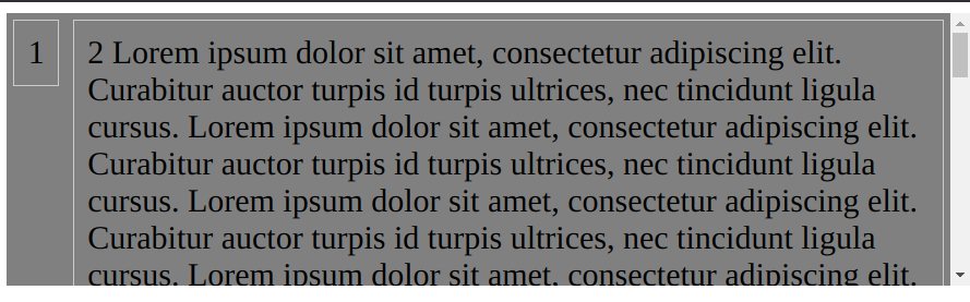
Here is the screenshot
enter image description here

Here is the markup

<div class="flex-container">
  <div class="item1">
    div 1
  </div>
  <div class="item2">
    div 2 
    large text causing scroll behaviour
  </div>
</div>

and here is the CSS

.flex-container {
  display: flex;
  flex-direction: row;
  max-height: 200px;
  background: gray;
  overflow-y: auto;
}


.item1 {
  height: 100%;
  border: 1px solid #ccc;
  padding: 10px;
  margin: 5px;
}

.item2 {
  height: 100%;  
  border: 1px solid #ccc;
  padding: 10px;
  margin: 5px;
}

Thanks in advance.

2

Answers


  1. For a scrollable flex container, you might need to set .item1‘s position to sticky and top to 0, thus:

    .item1 {
      border: 1px solid #ccc;
      padding: 10px;
      margin: 5px;
      position: sticky;
      top: 0;
    }
    

    If that’s not what you want to do, then I’d suggest making the tallest child scrollable, instead of the flex container, thus:

    .flex-container {
      display: flex;
      flex-direction: row;
      background: gray;
    }
    
    .item1 {
      border: 1px solid #ccc;
      padding: 10px;
      margin: 5px;
    }
    
    .item2 {
      height: 100%;  
      border: 1px solid #ccc;
      padding: 10px;
      margin: 5px;
      max-height: 200px;
      overflow-y: auto;
    }
    

    PS: You might want to take a look at the browser compatibility for position: sticky. It’s supported in most modern browsers.

    Login or Signup to reply.
  2. The max-height and overflow should be applied to a wrapper and not to flex-container. The items will be automatically the same size so you can drop the height: 100%.

    .wrapper {
      max-height: 200px;
      overflow-y: auto;
    }
    
    .flex-container {
      display: flex;
      flex-direction: row;
      background: gray;
    }
    
    .item {
      border: 1px solid #ccc;
      padding: 10px;
      margin: 5px;
    }
    <div class="wrapper">
      <div class="flex-container">
        <div class="item">
          1
        </div>
        <div class="item">
          2
          Lorem ipsum dolor sit amet, consectetur adipiscing elit. Curabitur auctor turpis id turpis ultrices, nec tincidunt ligula cursus.
          <!-- Repeat the text to ensure overflow -->
          Lorem ipsum dolor sit amet, consectetur adipiscing elit. Curabitur auctor turpis id turpis ultrices, nec tincidunt ligula cursus.
          <!-- Repeat the text to ensure overflow -->
          Lorem ipsum dolor sit amet, consectetur adipiscing elit. Curabitur auctor turpis id turpis ultrices, nec tincidunt ligula cursus.    Lorem ipsum dolor sit amet, consectetur adipiscing elit. Curabitur auctor turpis id turpis ultrices, nec tincidunt ligula cursus.
          <!-- Repeat the text to ensure overflow -->
          Lorem ipsum dolor sit amet, consectetur adipiscing elit. Curabitur auctor turpis id turpis ultrices, nec tincidunt ligula cursus.
          <!-- Repeat the text to ensure overflow -->
          Lorem ipsum dolor sit amet, consectetur adipiscing elit. Curabitur auctor turpis id turpis ultrices, nec tincidunt ligula cursus.
            Lorem ipsum dolor sit amet, consectetur adipiscing elit. Curabitur auctor turpis id turpis ultrices, nec tincidunt ligula cursus.
          <!-- Repeat the text to ensure overflow -->
          Lorem ipsum dolor sit amet, consectetur adipiscing elit. Curabitur auctor turpis id turpis ultrices, nec tincidunt ligula cursus.
          <!-- Repeat the text to ensure overflow -->
          Lorem ipsum dolor sit amet, consectetur adipiscing elit. Curabitur auctor turpis id turpis ultrices, nec tincidunt ligula cursus.    Lorem ipsum dolor sit amet, consectetur adipiscing elit. Curabitur auctor turpis id turpis ultrices, nec tincidunt ligula cursus.
          <!-- Repeat the text to ensure overflow -->
          Lorem ipsum dolor sit amet, consectetur adipiscing elit. Curabitur auctor turpis id turpis ultrices, nec tincidunt ligula cursus.
          <!-- Repeat the text to ensure overflow -->
          Lorem ipsum dolor sit amet, consectetur adipiscing elit. Curabitur auctor turpis id turpis ultrices, nec tincidunt ligula cursus.
    
        </div>
        <!-- Add more child divs as needed -->
      </div>
    </div>
    Login or Signup to reply.
Please signup or login to give your own answer.
Back To Top
Search