skip to Main Content

I’m trying to add a gradient to past days in a calendar, but the gradient lines not aligning look a bit meh.

div.month {
  flex: 1 1 auto;
  display: grid;
  grid-gap: 1px;
  grid-template-columns: repeat(7, 1fr);
  background-color: var(--color-border);

}

div.day {
  background-color: var(--color-fill);
}

div.day + .past {
  background: repeating-linear-gradient(
    -45deg,
    var(--color-fill),
    var(--color-fill) 1.5rem,
    var(--color-gradient-calendar-past) 1.5rem,
    var(--color-gradient-calendar-past) 3rem
  );
}
<div class="month noselect">
        <div class="day void"><div class="day-number"></div></div>
        <div class="day past"><div class="day-number">1</div></div>
        <div class="day past"><div class="day-number">2</div></div>
        <div class="day past"><div class="day-number">3</div></div>
        <div class="day past"><div class="day-number">4</div></div>
        ...
        <div class="day today"><div class="day-number">17</div></div>

Without making the days square (aspect-ratio: 1/1), is it possible to align these gradients?

enter image description here

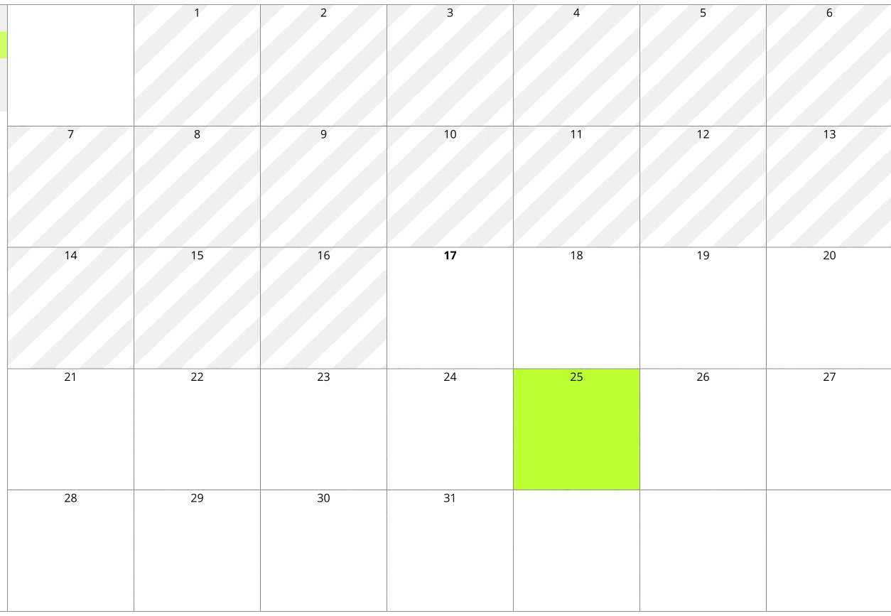
I was thinking maybe I can make the whole component’s background that gradient, but then I run into the same problem if I want to use the same gradient coloured differently on other days.

enter image description here

2

Answers


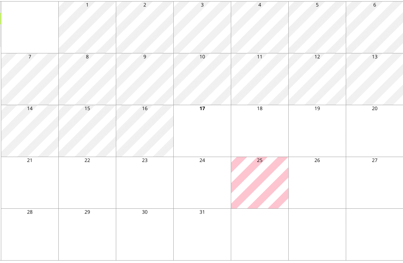
  1. I think this may get you there, but without the actual code, it’s hard to tell.

    1. This sets the background of the whole container to the background-gradient.
    2. It sets a the same background gradient to a pseudo ::after to a day element with the class today (this is where you might need to modify for your application).
    3. We don’t have a position set on the day element so using position: absolute will position the pseudo element against the month element, which I set a position: relative on.
    4. Then you can use clip-path: content-box; to restrict the pseudo view to only the .today class element.
    :root {
      --color-border: lightgray;
      --color-fill: white;
      --color-gradient-calendar-past: lightgray;
      --color-gradient-calendar-now: pink;
    }
    
    div.month {
      position: relative;
      flex: 1 1 auto;
      display: grid;
      grid-gap: 1px;
      grid-template-columns: repeat(7, 1fr);
      background: repeating-linear-gradient( -45deg, var(--color-fill), var(--color-fill) 1.5rem, var(--color-gradient-calendar-past) 1.5rem, var(--color-gradient-calendar-past) 3rem);
    }
    
    div.void {
      background: white;
    }
    
    div.day {
      height: 200px;
    }
    
    div.today::after {
      z-index: 2;
      width: 100%;
      height: 100%;
      position: absolute;
      top: 0;
      left: 0;
      content: '';
      display: block;
      background: repeating-linear-gradient( -45deg, var(--color-fill), var(--color-fill) 1.5rem, var(--color-gradient-calendar-now) 1.5rem, var(--color-gradient-calendar-now) 3rem);
    }
    
    div.today {
      clip-path: content-box;
    }
    <div class="month noselect">
      <div class="day void">
        <div class="day-number"></div>
      </div>
      <div class="day past">
        <div class="day-number">1</div>
      </div>
      <div class="day past">
        <div class="day-number">2</div>
      </div>
      <div class="day past">
        <div class="day-number">3</div>
      </div>
      <div class="day past">
        <div class="day-number">4</div>
      </div>
      <div class="day today">
        <div class="day-number">17</div>
      </div>
      <div class="day past">
        <div class="day-number">1</div>
      </div>
      <div class="day past">
        <div class="day-number">2</div>
      </div>
      <div class="day past">
        <div class="day-number">3</div>
      </div>
      <div class="day past">
        <div class="day-number">4</div>
      </div>
      <div class="day today">
        <div class="day-number">17</div>
      </div>
    </div>
    Login or Signup to reply.
  2. I would do it like this:

    Use the gradient as the background for div.month and make it red. For the normal div.day you add a white background and for the .past you make the background transparent and add a backdrop-filter.

    div.month {
        height: 23vW;
        flex: 1 1 auto;
        display: grid;
        grid-template-columns: repeat(7, 1fr);
        background: repeating-linear-gradient(-45deg, #fff, #fff 1.5rem, #fdc5d0 1.5rem, #fdc5d0 3rem );
    }
    
    div.day {
        border: 1px solid #fff;
        background-color: #fff;
    }
    
    div.day + .past {
        background-color: #0000;
        backdrop-filter: grayscale(1) brightness(1.13);
    }
    
    div.day + .blocked {
        background-color: #0000;
    }
    <div class="month noselect">
        <div class="day void"><div class="day-number"></div></div>
        <div class="day past"><div class="day-number">1</div></div>
        <div class="day past"><div class="day-number">2</div></div>
        <div class="day past"><div class="day-number">3</div></div>
        <div class="day past"><div class="day-number">4</div></div>
        <div class="day past"><div class="day-number">5</div></div>
        <div class="day past"><div class="day-number">6</div></div>
        <div class="day past"><div class="day-number">7</div></div>
        <div class="day blocked"><div class="day-number">8</div></div>
        <div class="day past"><div class="day-number">10</div></div>
        <div class="day past"><div class="day-number">11</div></div>
        <div class="day past"><div class="day-number">12</div></div>
        <div class="day past"><div class="day-number">13</div></div>
        <div class="day past"><div class="day-number">14</div></div>
    </div>

    By using grayscale(1) the background is not red anymore and then I push the brightness a little bit.

    I assumed you want to use red for blocked dates. If you want to use more colors than red and grey (for example green for holidays) you can use hue-rotate:

    div.day + .holiday {
        backdrop-filter: hue-rotate(123deg);
    }
    
    Login or Signup to reply.
Please signup or login to give your own answer.
Back To Top
Search