skip to Main Content

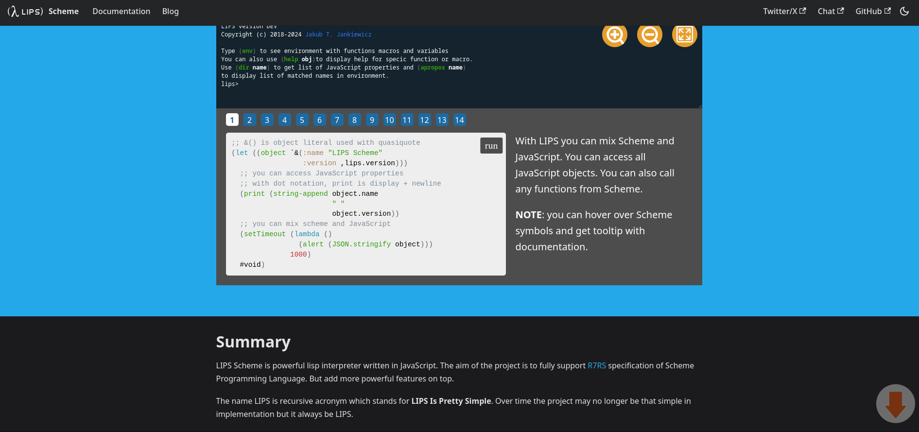
I have an arrow with position fixed to indicate to the users that there are more content below the fold.

Screenshot of a website

This is the CSS:

.arrow {
    position: fixed;
    right: 0;
    top: 100%;
    transform: translateY(-100%);
    margin: -10px 10px 0 0;
    z-index: 100;
    opacity: 0.4;
}
.arrow svg {
    width: 80px;
    height: 80px;
}

I want the arrow to be hidden when it reaches the footer and visible when you scroll up.

Are there any techniques I can use that will be performant? I was trying to use IntersectionObserver, but just found that it doesn’t work with position: fixed. I was thinking maybe changing the CSS for it, but I’m not sure how I can have the same effect.

I was trying position: sticky. But I’m not sure if you can even use for such a thing.

I was also thinking about use Scroll Drive Animation, but I never used them and don’t know if their API allow something like this.

Is there a way to have this behavior with CSS alone, or do I need to use JavaScript and scroll event? I would prefer to use CSS solution or any modern solution that don’t involve execution JavaScript on scroll event.

EDIT Here is reproduction of the issue.

body {
    margin: 0;
}
.arrow {
    position: fixed;
    right: 0;
    top: 100%;
    transform: translateY(-100%);
    margin: -10px 10px 0 0;
    z-index: 100;
    opacity: 0.4;
}
.arrow svg {
    width: 80px;
    height: 80px;
}
.force-scrollbar {
   height: 1000px;
}
footer {
   background: black;
   height: 200px;
}
<div class="force-scrollbar">

</div>

<footer>
<div class="arrow">
<svg width="361.514" height="361.514" viewBox="0 0 95.651 95.651" xmlns="http://www.w3.org/2000/svg"><g transform="translate(-58.796 -13.995)"><circle style="fill:#e6e6e6;fill-opacity:1;fill-rule:evenodd;stroke:none;stroke-width:4.79999;stroke-linecap:round;stroke-linejoin:round;stroke-dasharray:none;stroke-opacity:1" cx="106.621" cy="61.821" r="47.825"></circle><path style="fill:#ff5300;fill-rule:evenodd;stroke-width:3.70417;stroke-linecap:square" d="M94.271 32.634a3.252 3.252 0 0 0-3.26 3.26v31.111h-6.33a2.612 2.01 0 0 0-2.194 3.101l21.58 25.686a2.99 2.3 0 0 0 5.02 0l21.685-25.81a2.507 1.929 0 0 0-2.105-2.977h-6.525V35.894a3.252 3.252 0 0 0-3.26-3.26z"></path></g></svg>
</div>
</footer>

2

Answers


  1. CSS alone cannot solve this issue. (Also, there are workaround solutions that don’t do exactly what you ask for, but from the visitor’s perspective, the result is the same.)

    However, with JavaScript, you can monitor the page scrolling. Upon each scroll, you check if the top of the <footer> element has been reached. The distance between the top of the <footer> element and the top of the page can be queried using getBoundingClientRect(). To determine the current position of the scrolling, you need to add the height of the screen, as it gives you the top of the scroll.

    Therefore, if the <footer> is even 1px visible on the screen, the arrow will disappear.

    const body = document.querySelector("div.force-scrollbar")
    const footer = document.querySelector("footer")
    const arrow = document.querySelector("footer > div.arrow")
    const footerPosition = footer.getBoundingClientRect().top
    
    // We monitor the scrolling within the body and check if we have reached the footer.
    document.addEventListener("scroll", function() {
      // If the sum of the screen height and the scrolling within the body is greater than or equal to the distance of the footer from the top of the page, then we have reached the footer, so we can hide it.
      if (window.innerHeight + window.scrollY >= footerPosition) {
        arrow.style.display = "none"
      } else {
        arrow.style.display = "block"
      }
    })
    body {
        margin: 0;
    }
    .arrow {
        position: fixed;
        right: 0;
        top: 100%;
        transform: translateY(-100%);
        margin: -10px 10px 0 0;
        z-index: 100;
        opacity: 0.4;
    }
    .arrow svg {
        width: 80px;
        height: 80px;
    }
    .force-scrollbar {
       height: 1000px;
    }
    footer {
       background: black;
       height: 200px;
    }
    <div class="force-scrollbar"></div>
    
    <footer>
      <div class="arrow">
        <svg width="361.514" height="361.514" viewBox="0 0 95.651 95.651" xmlns="http://www.w3.org/2000/svg"><g transform="translate(-58.796 -13.995)"><circle style="fill:#e6e6e6;fill-opacity:1;fill-rule:evenodd;stroke:none;stroke-width:4.79999;stroke-linecap:round;stroke-linejoin:round;stroke-dasharray:none;stroke-opacity:1" cx="106.621" cy="61.821" r="47.825"></circle><path style="fill:#ff5300;fill-rule:evenodd;stroke-width:3.70417;stroke-linecap:square" d="M94.271 32.634a3.252 3.252 0 0 0-3.26 3.26v31.111h-6.33a2.612 2.01 0 0 0-2.194 3.101l21.58 25.686a2.99 2.3 0 0 0 5.02 0l21.685-25.81a2.507 1.929 0 0 0-2.105-2.977h-6.525V35.894a3.252 3.252 0 0 0-3.26-3.26z"></path></g></svg>
      </div>
    </footer>

    If you use opacity instead of display, an animation can also be ordered for the disappearance/appearance. However, the element will then remain there. It can prevent you from clicking.

    const body = document.querySelector("div.force-scrollbar")
    const footer = document.querySelector("footer")
    const arrow = document.querySelector("footer > div.arrow")
    const footerPosition = footer.getBoundingClientRect().top
    
    // We monitor the scrolling within the body and check if we have reached the footer.
    document.addEventListener("scroll", function() {
      // If the sum of the screen height and the scrolling within the body is greater than or equal to the distance of the footer from the top of the page, then we have reached the footer, so we can hide it.
      if (window.innerHeight + window.scrollY >= footerPosition) {
        arrow.style.opacity = "0"
      } else {
        arrow.style.opacity = "0.4"
      }
    })
    body {
        margin: 0;
    }
    .arrow {
        transition: opacity 1s;
        position: fixed;
        right: 0;
        top: 100%;
        transform: translateY(-100%);
        margin: -10px 10px 0 0;
        z-index: 100;
        opacity: 0.4;
    }
    .arrow svg {
        width: 80px;
        height: 80px;
    }
    .force-scrollbar {
       height: 1000px;
    }
    footer {
       background: black;
       height: 200px;
    }
    <div class="force-scrollbar"></div>
    
    <footer>
      <div class="arrow">
        <svg width="361.514" height="361.514" viewBox="0 0 95.651 95.651" xmlns="http://www.w3.org/2000/svg"><g transform="translate(-58.796 -13.995)"><circle style="fill:#e6e6e6;fill-opacity:1;fill-rule:evenodd;stroke:none;stroke-width:4.79999;stroke-linecap:round;stroke-linejoin:round;stroke-dasharray:none;stroke-opacity:1" cx="106.621" cy="61.821" r="47.825"></circle><path style="fill:#ff5300;fill-rule:evenodd;stroke-width:3.70417;stroke-linecap:square" d="M94.271 32.634a3.252 3.252 0 0 0-3.26 3.26v31.111h-6.33a2.612 2.01 0 0 0-2.194 3.101l21.58 25.686a2.99 2.3 0 0 0 5.02 0l21.685-25.81a2.507 1.929 0 0 0-2.105-2.977h-6.525V35.894a3.252 3.252 0 0 0-3.26-3.26z"></path></g></svg>
      </div>
    </footer>
    Login or Signup to reply.
  2. A somewhat cheating solution is to rearrange the DOM slightly and bring the footer forward in the third dimension compared to the arrow using z-index.

    body {
        margin: 0;
    }
    .arrow {
        position: fixed;
        right: 0;
        top: 100%;
        transform: translateY(-100%);
        margin: -10px 10px 0 0;
        z-index: 100;
        opacity: 0.4;
    }
    .arrow svg {
        width: 80px;
        height: 80px;
    }
    .force-scrollbar {
       height: 1000px;
    }
    
    footer {
       position: relative; /* here */
       background: black;
       height: 200px;
       z-index: 101; /* here */
    }
    
    /* 
    You can possibly add a fading layer towards the footer (assuming it's empty space). I created a white shadow effect corresponding to the background. This way it looks like it's "fading out" as you reach the bottom of the page.
    */
    footer::before {
        content: "";
        position: absolute;
        top: -100px; /* height */
        left: 0;
        width: 100%;
        height: 100px; /* height */
        background: linear-gradient(to bottom, rgba(255,255,255,0) 0%,rgba(255,255,255,1) 100%);
    }
    <div class="force-scrollbar"></div>
    
    <div class="arrow">
        <svg width="361.514" height="361.514" viewBox="0 0 95.651 95.651" xmlns="http://www.w3.org/2000/svg"><g transform="translate(-58.796 -13.995)"><circle style="fill:#e6e6e6;fill-opacity:1;fill-rule:evenodd;stroke:none;stroke-width:4.79999;stroke-linecap:round;stroke-linejoin:round;stroke-dasharray:none;stroke-opacity:1" cx="106.621" cy="61.821" r="47.825"></circle><path style="fill:#ff5300;fill-rule:evenodd;stroke-width:3.70417;stroke-linecap:square" d="M94.271 32.634a3.252 3.252 0 0 0-3.26 3.26v31.111h-6.33a2.612 2.01 0 0 0-2.194 3.101l21.58 25.686a2.99 2.3 0 0 0 5.02 0l21.685-25.81a2.507 1.929 0 0 0-2.105-2.977h-6.525V35.894a3.252 3.252 0 0 0-3.26-3.26z"></path></g></svg>
    </div>
    
    <footer>
      
    </footer>
    Login or Signup to reply.
Please signup or login to give your own answer.
Back To Top
Search