skip to Main Content

I have a form that looks like this:

wireframe

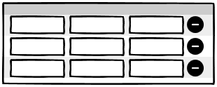
I have laid it out using CSS grid:

<div style="display: inline-grid; grid-template-columns: auto auto auto auto">
  <div><input></div>
  <div><input></div>
  <div><input></div>
  <div style="font-family: sans-serif; font-weight: bold; font-size: 20px; line-height: 20px;">⊖</div>
  <div><input></div>
  <div><input></div>
  <div><input></div>
  <div style="font-family: sans-serif; font-weight: bold; font-size: 20px; line-height: 20px;">⊖</div>
  <div><input></div>
  <div><input></div>
  <div><input></div>
  <div style="font-family: sans-serif; font-weight: bold; font-size: 20px; line-height: 20px;">⊖</div>
</div>

On small screens I would like the layout to change to this:

wireframe

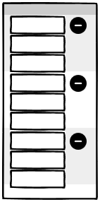
But I don’t know how to change the CSS grid to get this layout, if that’s even possible.

2

Answers


  1. Simply make those <div>s with <input> span 3 columns, those without span 3 rows and ensure that the grid is as dense as possible:

    #container {
      grid-auto-flow: dense;
    }
    
    @media (max-width: 768px) {
      #container > :not(:nth-child(4n)) {
        grid-column: 1 / -2;
      }
      #container > :nth-child(4n) {
        grid-column-start: 4;
        grid-row-end: span 3;
      }
    }
    

    Try it:

    #container {
      display: inline-grid;
      grid-template-columns: repeat(4, auto);
      grid-auto-flow: dense;
    }
    
    #container > :nth-child(4n) {
      font-family: sans-serif;
      font-weight: bold;
      font-size: 20px;
      line-height: 20px;
    }
    
    @media (max-width: 768px) {
      #container > :not(:nth-child(4n)) {
        grid-column: 1 / -2;
      }
      #container > :nth-child(4n) {
        grid-column-start: 4;
        grid-row-end: span 3;
      }
    }
    <div id="container">
      <div><input></div>
      <div><input></div>
      <div><input></div>
      <div>⊖</div>
      <div><input></div>
      <div><input></div>
      <div><input></div>
      <div>⊖</div>
      <div><input></div>
      <div><input></div>
      <div><input></div>
      <div>⊖</div>
    </div>
    Login or Signup to reply.
  2. Here’s some :nth-child() logic that may be helpful.

    (re-size the screen to switch between layouts)

    @media ( max-width: 1500px ) {
        .container > div:nth-child(4) { grid-row: 1; }
        .container > div:nth-child(8) { grid-row: 4; }
        .container > div:nth-child(12) { grid-row: 7; }
        .container > div:not(div:nth-child(4n)) { grid-column: 1 }
        .container > div:nth-child(4n) { grid-column: 2};
    }
    <div class="container" style="display: inline-grid; grid-template-columns: auto auto auto auto">
      <div><input></div>
      <div><input></div>
      <div><input></div>
      <div style="font-family: sans-serif; font-weight: bold; font-size: 20px; line-height: 20px;">⊖</div>
      <div><input></div>
      <div><input></div>
      <div><input></div>
      <div style="font-family: sans-serif; font-weight: bold; font-size: 20px; line-height: 20px;">⊖</div>
      <div><input></div>
      <div><input></div>
      <div><input></div>
      <div style="font-family: sans-serif; font-weight: bold; font-size: 20px; line-height: 20px;">⊖</div>
    </div>
    Login or Signup to reply.
Please signup or login to give your own answer.
Back To Top
Search