skip to Main Content

I have a problem to solve that sounds simple. Let’s say I got a layout of a header, content and footer. Then I have a row of items in the content, filling all the space. Each item in the content section is equal in width and each has one child.

The children need to feel their parents perfectly, taking as much space as they can, but never scaling up. In other words, something that object-fit: scale-down would do if these were images.

Let’s say the sizes of the elements I need to fit in there are:

  1. 200 x 300
  2. 1920 x 1080
  3. 1080 x 1920

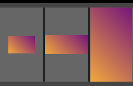
This is the result I’m looking for:

Desired result

I’m struggling to make it work correctly, bigger elements always either overflowing the container or getting clipped.

html,
body {
  background-color: #000;
  height: 100%;
  margin: 0;
  padding: 0;
}

.layout {
  display: flex;
  flex-direction: column;
  height: 100%;
}

.top,
.bottom {
  background-color: #444;
  flex-shrink: 0;
  height: 50px;
}

.middle {
  background-color: #222;
  flex-grow: 1;
  overflow: hidden;
}

.items {
  display: flex;
  gap: 20px;
  height: 100%;
  overflow: hidden;
}

.item {
  align-items: center;
  background-color: #666;
  display: flex;
  flex-grow: 1;
  justify-content: center;
  overflow: hidden;
}

.block {
  background-color: #f80;
  background-image: linear-gradient(45deg, orange, purple);
  height: 100%;
  width: 100%;
}

.block1 {
  max-height: 200px;
  max-width: 300px;
}

.block2 {
  max-height: 1080px;
  max-width: 1920px;
}

.block3 {
  max-height: 1920px;
  max-width: 1080px;
}
<div class="layout">
  <div class="top"></div>
  <div class="middle">
    <div class="items">
      <div class="item">
        <div class="block block1"></div>
      </div>
      <div class="item">
        <div class="block block2"></div>
      </div>
      <div class="item">
        <div class="block block3"></div>
      </div>
    </div>
  </div>
  <div class="bottom"></div>
</div>

So to sum up, I got rectangles of certain size that can be scaled down, not up, and obviously can’t change the aspect ratio. By the way, I tried to experiment with aspect-ratio too, without success.

Can it be done without JavaScript calculations?

2

Answers


  1. It does seem to be achievable with aspect-ratio property and @container queries:

    1. Remove height: 100%; width: 100%; from .block to allow auto width and height.
    2. For "horizontal" blocks (width > height):
    • Remove max-height, keep max-width, add width: 100%.
    • Add aspect-ratio containing width / height values without pixels (aspect-ratio: 300 / 200; for .block1);
    • Add @container query to flip the sizing when there is not enough space. For .block1:
    @container (aspect-ratio > 300 / 200) and (height < 200px) {
      .block1 {
        height: 100%;
        width: auto;
      }
    }
    
    1. For "vertical" blocks (height > width):
    • Remove max-width, keep max-height, add height: 100%.
    • Add aspect-ratio similarly as to "horizontal" – width / height (aspect-ratio: 1080 / 1920; for .block3);
    • Add @container query to flip the sizing when there is not enough space. For .block3:
    @container (aspect-ratio < 1080 / 1920) and (width < 1080px) {
      .block3 {
        width: 100%;
        height: auto;
      }
    }
    
    1. Add container-type: size; to .item so it’s declared as a size query container.

    Snippet:

    html,
    body {
      background-color: #000;
      height: 100%;
      margin: 0;
      padding: 0;
    }
    
    .layout {
      display: flex;
      flex-direction: column;
      height: 100%;
    }
    
    .top,
    .bottom {
      background-color: #444;
      flex-shrink: 0;
      height: 50px;
    }
    
    .middle {
      background-color: #222;
      flex-grow: 1;
      overflow: hidden;
    }
    
    .items {
      display: flex;
      gap: 20px;
      height: 100%;
      overflow: hidden;
    }
    
    .item {
      align-items: center;
      background-color: #666;
      display: flex;
      flex-grow: 1;
      justify-content: center;
      overflow: hidden;
      container-type: size;
    }
    
    .block {
      background-color: #f80;
      background-image: linear-gradient(45deg, orange, purple);
    }
    
    .block1 {
      max-width: 300px;
      width: 100%;
      aspect-ratio: 300 / 200;
    }
    
    @container (aspect-ratio > 300 / 200) and (height < 200px) {
      .block1 {
        height: 100%;
        width: auto;
      }
    }
    
    .block2 {
      max-width: 1920px;
      width: 100%;
      aspect-ratio: 1920 / 1080;
    }
    
    @container (aspect-ratio > 1920 / 1080) and (height < 1080px) {
      .block2 {
        height: 100%;
        width: auto;
      }
    }
    
    .block3 {
      max-height: 1920px;
      height: 100%;
      aspect-ratio: 1080 / 1920;
    }
    
    @container (aspect-ratio < 1080 / 1920) and (width < 1080px) {
      .block3 {
        width: 100%;
        height: auto;
      }
    }
    <div class="layout">
      <div class="top"></div>
      <div class="middle">
        <div class="items">
          <div class="item">
            <div class="block block1"></div>
          </div>
          <div class="item">
            <div class="block block2"></div>
          </div>
          <div class="item">
            <div class="block block3"></div>
          </div>
        </div>
      </div>
      <div class="bottom"></div>
    </div>
    Login or Signup to reply.
  2. This can be achieved without @container requests. You say you know the dimensions… That way you can give them to the <canvas> element and it will be sized according to self aspect ratio.
    Here is an example based on your code:

    html {
      height:100%;
    }
    
    body {
      background-color: #000;
      height: 100%;
      margin: 0;
      display: flex;
      flex-direction: column;
    }
    
    .layout {
      display: flex;
      flex-direction: column;
      flex: auto;
      overflow: hidden;
    }
    
    .top,
    .bottom {
      background-color: #444;
      flex: none;
      height: 50px;
    }
    
    .middle {
      background-color: #222;
      display: flex;
      flex-direction: column;
      flex: auto;
      overflow: hidden;
    }
    
    .items {
      display: grid;
      grid-template-columns: repeat(3, 1fr);
      gap: 20px;
      flex: auto;
      overflow: hidden;
    }
    
    .items-cell {
      overflow: hidden;
      display: flex;
      flex-direction: column;
      justify-content: center;
      align-items: center;
    }
    
    .item {
      position: relative;
      max-width: 100%;
      max-height: 100%;
    }
    
    .item canvas{
      max-width: 100%;
      max-height: 100%;
    }
    
    .block {
      position: absolute;
      inset: 0;
      background-image: linear-gradient(45deg, orange, purple);
    }
    <div class="layout">
      <div class="top"></div>
        <div class="middle">
          <div class="items">
            <div class="items-cell">
            <div class="item">
              <canvas width="200" height="300"></canvas>
              <div class="block"></div>
            </div>
          </div>
          <div class="items-cell">
            <div class="item">
              <canvas width="1080" height="1920"></canvas>
              <div class="block"></div>
            </div>
          </div>
          <div class="items-cell">
            <div class="item">
              <canvas width="1920" height="1080"></canvas>
              <div class="block"></div>
            </div>
          </div>
        </div>
      </div>
      <div class="bottom"></div>
    </div>
    Login or Signup to reply.
Please signup or login to give your own answer.
Back To Top
Search