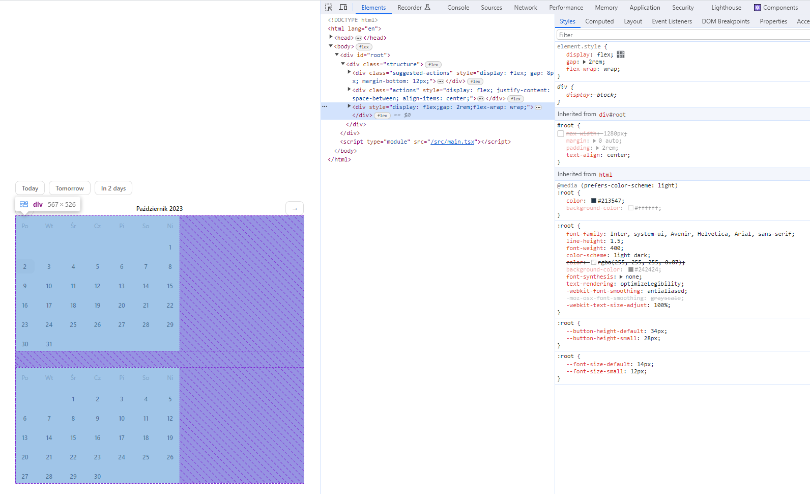
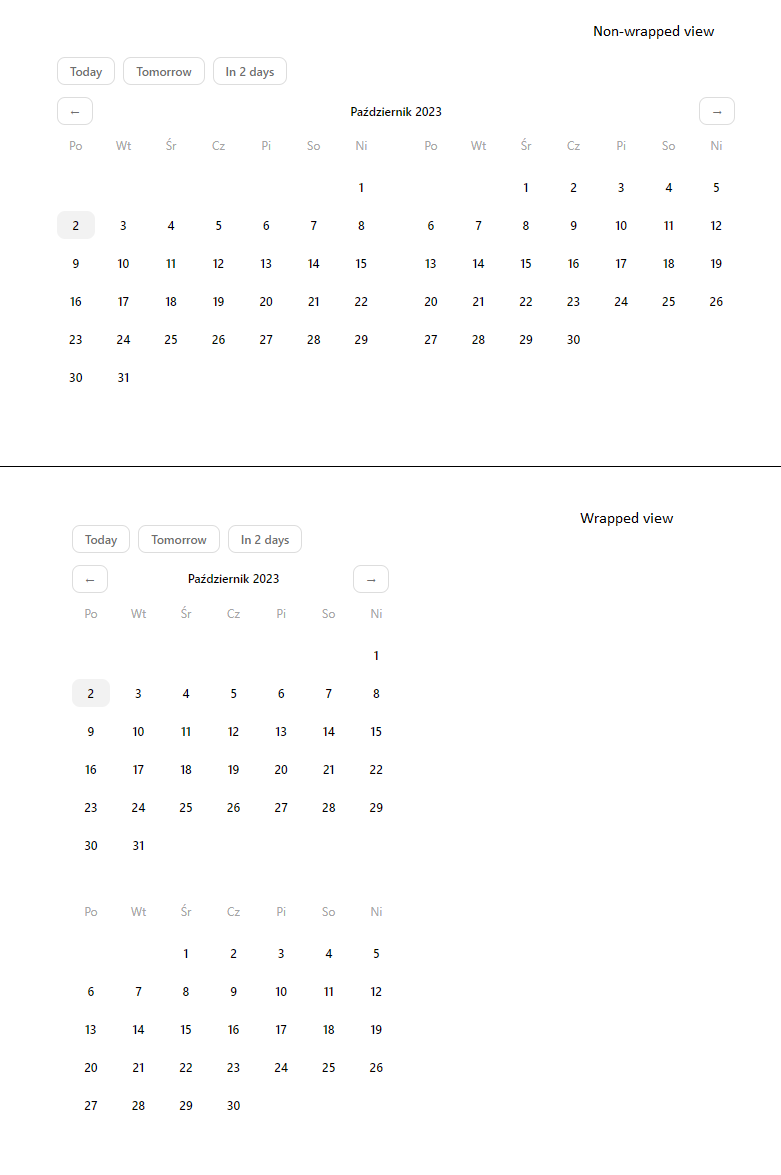
When a display: flex container has flex-wrap: wrap applied the elements still try to take all the available space left. Is there a way to get rid of that extra space on the right of the inner elements or rather the parent element no trying to be 100% of the outer space by default?
As you can see on the image the <- {month} -> could have been narrower if the flex element wasn’t trying to take the entire space that’s left after the wrap.
Here’s similar case but just made simpler. When you start making the window smaller for the elements to wrap, calendars‘ inner elements take entire width even though they don’t have to. What am I missing here? Can the "< January >" block automatically take less space?
.actions {
  display: flex;
  justify-content: space-between;
}

.calendars {
  display: flex;
  gap: 24px;
  flex-wrap: wrap;
}

.no {
  display: inline-block;
  width: 30px;
  background: lightgreen;
}
<div>
<div class="actions">
<span><</span>
<span>January</span>
<span>></span>
</div>
<div class="calendars">
<div>
<span class="no">1</span>
<span class="no">2</span>
<span class="no">3</span>
<span class="no">4</span>
<span class="no">5</span>
<span class="no">6</span>
<span class="no">7</span>
</div>
<div>
<span class="no">1</span>
<span class="no">2</span>
<span class="no">3</span>
<span class="no">4</span>
<span class="no">5</span>
<span class="no">6</span>
<span class="no">7</span>
</div>
</div>
<div>


2
Answers
Does this grid-based solution do what you need? The key style is to set the
actionselement to span all grid columns.The only limitation I’ve found with it is that if you have fewer months than will fill the screen horizontally, the actions element will still be too wide.
Make sure you use the full page link when running this snippet, then adjust the width of your browser to see how it responds.
EDIT Piggy backing on this solution above:
Consider switch to a grid layout. Here I show the 7 days in a week in
a-rowfor the CSS and then only have to put the correct number of blanks at the start.I’m afraid the available tools in CSS for automatic width can’t exactly handle it the way you want. When using a wrapping content, either with simple inline text or with flex wrapping, there’re 3 relevant automatic width modes:
stretchwhich takes the full width of the container.max-contentwhich disables the wrapping and takes as much horizontal space as needed.min-contentwhich always wrap so you can as well just useflex-direction: columnTrue, there’s also
fit-contentwhich smartly switches between the other modes (it’s actually an alias formin(max-content, max(min-content, stretch))[1]), but it does no recursive logic, means it doesn’t say "alright ifmax-contentturns out to be wider thanstretchthen I’ll go tomin-content".It’s algorithm picks
stretchunless evenmin-contentis wider thanstretchor unless evenmax-contentis smaller thanstretch, so it doesn’t really help if you want to exactly fit wrapped content.The best I can suggest you is give the wrapping up and instead use a grid to define the number of columns based on a media query (perhaps there’s a way to fit it automatically with grid but I failed to find one).
[1] https://drafts.csswg.org/css-sizing-4/#valdef-width-fit-content