 Question posted in


I have this
img {
  display: block;
  max-width: 100%;
}

.hero {
  padding-inline: 2rem;
  margin-inline: auto;
  margin-block: 10rem;
  border: 1px solid blue;
}

.hero-layout {
  display: grid;
  gap: 2rem;
  grid-template-columns: 1fr 2fr;
  max-width: 800px;
  border: 1px solid red;
  margin-inline: auto;
}
<div class="hero">
<div class="hero-layout">
<div class="hero-content">
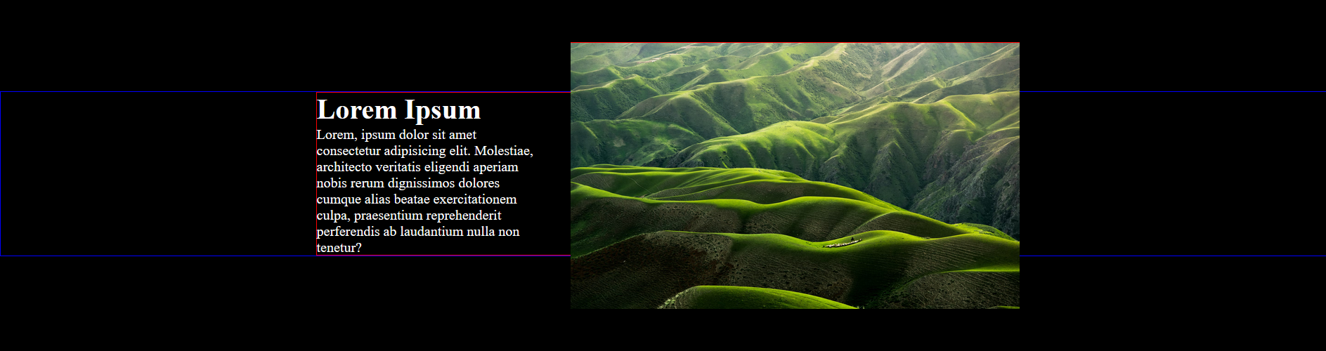
<h1>Lorem Ipsum</h1>
<p> Lorem, ipsum dolor sit amet consectetur adipisicing elit. Molestiae, architecto veritatis eligendi aperiam nobis rerum dignissimos dolores cumque alias beatae exercitationem culpa, praesentium reprehenderit perferendis ab laudantium nulla non tenetur?
</p>
</div>
<img src="https://images.unsplash.com/photo-1501854140801-50d01698950b?q=80&w=1950&auto=format&fit=crop&ixlib=rb-4.0.3&ixid=M3wxMjA3fDB8MHxwaG90by1wYWdlfHx8fGVufDB8fHx8fA%3D%3D" alt="" class="hero-image">
</div>
</div>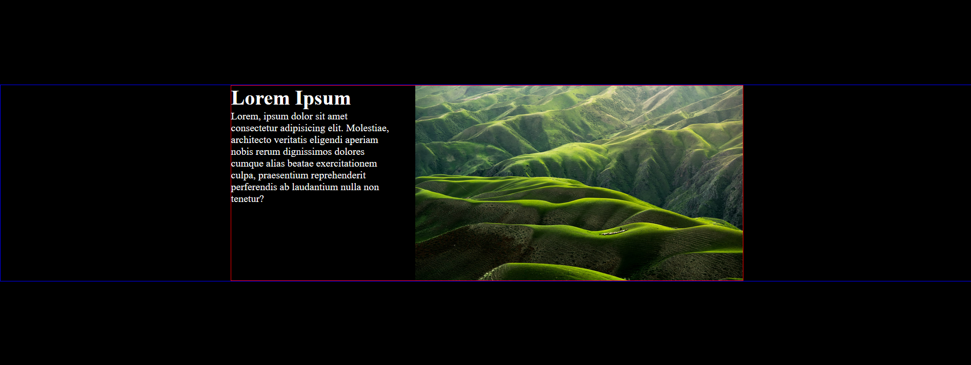
I want to achieve this (did with photoshop), what is the best approach?
I tried using position relative and negative top, but that doesn’t shrink the hero-layout div.
3
Answers
The
.hero-layoutis already has same height as the content. It’s just being affected by the image.So what you need is to modify the styles of the
img:I set the
max-heightto 20% more so it will span bigger than the container.topto -10% so it will be positioned in the middle.Also, you need to add
position: relative;in your .hero-layout so thepositionof theimgwill work.Here is a working sample:
Run the snippet in Full page for better view.
Note: this snippet gets only part way to a complete answer and is given here in the hope someone can build on it.
As the lines are there only for visual effect we can use pseudo elements to draw them.
This snippet draws the horizontal blue lines on a before pseudo element as it is possible to use the height of the hero-content.
However, to place a left hand vertical line we’d have to position left relative to the body element but keep the height relative to the hero-content. I can’t see a way of doing this without adding elements to the DOM.